Chapter 1 Visualizing data
1.1 Introduction
Good statistical analyses begin and end with visualizations. By visualizing your data before conducting statistical analyses, you will discover patterns and identify interesting observations in your data. Many of the techniques involved in exploring and acquainting yourself with data have been pioneered in the field of exploratory data analysis (Tukey 1977).
There are several parts to the data analysis life cycle, and visualizing data should be done frequently during this process:
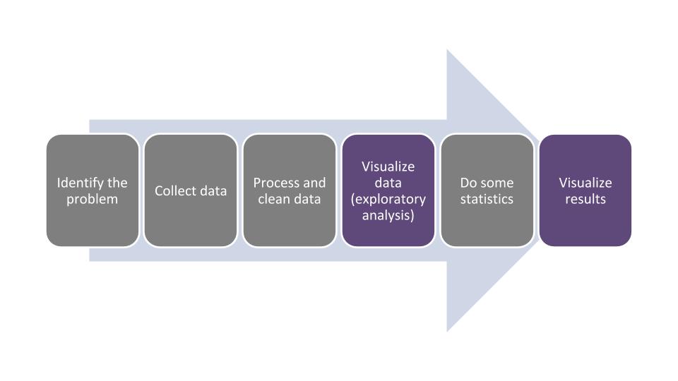
FIGURE 1.1: The data analysis life cycle.
In this chapter we will learn how to describe different components of data. This will make visualizing the data much easier because we will use the terminology that is appropriate for the variables we are working with. After we visualize the data, this usually gives us a good indication about which kinds of statistical analyses can be done with our data.
To implement the visualizations in the chapter, we will use the ggplot2 package, one of the core packages found in the tidyverse megapackage. The gg in ggplot2 is an abbreviation of “grammar of graphics,” a language that provides insight into the deep structure behind visualizations. Resources developed by Wilkinson (2005) and Wickham (2010) provide much more on the theory and application of this language.
If this is your first time using the tidyverse package, you will need to install it:
install.packages("tidyverse")Then, you will need to load the package using the library() function:
library(tidyverse)We will use the ggplot2 functions extensively throughout this chapter to learn about data through visualizations.
Visualizing and graphing data are grouped in the area of descriptive statistics. It is important to learn these skills so that we can inform our statistical tasks in later chapters. And because all good analyses end with visualization, our last chapter will focus on how we design graphs and visualizations to clearly convey our statistical results.
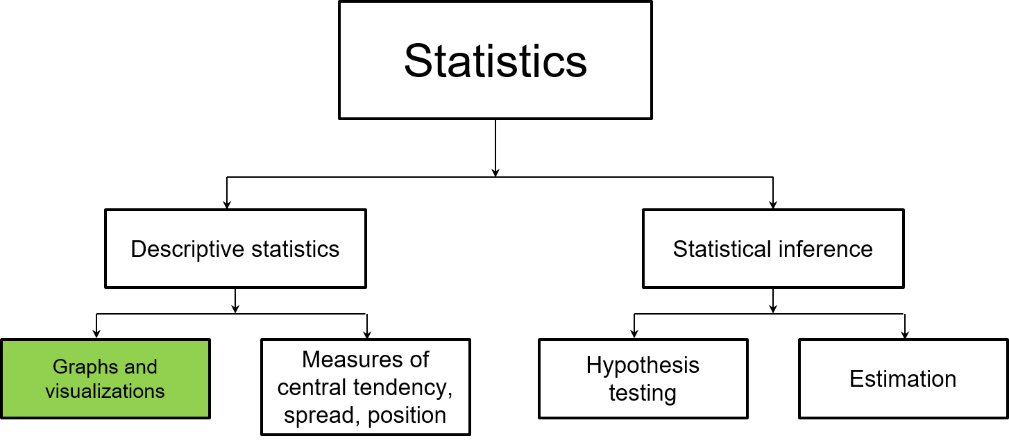
FIGURE 1.2: This chapter focuses on how graphs and visualizations are used in descriptive statistics.
1.2 Components of data
In the simplest sense, data are a collection of facts. In natural resources disciplines, data are often collected across long time periods and at multiple resolutions. Increasingly, natural resources professionals are integrating data they collect with other data. For example, a study about the productivity of forests might integrate both forest inventory data with current and future climate data to understand the effects of global change patterns on tree growth (e.g., Weiskittel et al. 2011).
To be effective in visualizing data, it will help if we understand how to describe the various components of data. First, data need to be organized in a structured format to get the most value from them. Structuring data in a tidy format facilitates this, that is, where every variable is a column, every observation is a row, and each type of observational unit is contained in a table (Wickham 2014). Keeping data tidy often involves creating “rectangles” of data within a spreadsheet-like format (Broman and Woo 2018). Natural resources data can also be unstructured, such as documents with large amounts of text from transcripts or environmental remote sensing data with voluminous pixels, but data will need to be wrangled to transition it into a usable format.
In R, most natural resources data are best analyzed by importing and working with data as data frames. Within these data frames, variables are stored as columns and observations (also defined as cases or records) as rows. When we visualize data, the variable names are plotted along the axes of graphs and the observations make up the elements of a graph.
1.2.1 Categorical variables
A categorical variable (also known as a factor) places an observation into a group or category. Examples include season of the year (i.e., spring, summer, fall, or winter) and plant and animal taxonomy (e.g., genus and species). Categorical variables use a nominal approach to label observations that fit into a group.
The number of categories that a variable can take can be numerous. Generally, as the number of categories for a variable increases, it will be more difficult to visualize and test for differences across the categories. At the other extreme, a categorical variable can be binary in which it takes only one of two possible outcomes. Examples include presence or absence, alive or dead, and positive or negative. While categorical variables are not necessarily quantifiable, if a categorical variable is ordinal it indicates that the order of values is important, but the difference between each order cannot be quantified.
1.2.2 Quantitative variables
Quantitative variables take numerical values. These variables can be discrete, where data are based on integers or counts. An example of discrete data includes the number of plant species found within a genus. Discrete variables are common in natural resources where they are often referred to as count data.
Quantitative variables can also be continuous where they take on any value within an interval. An example is the current air temperature. Generally, if you can add, subtract, multiply, and divide a variable by another variable, it has the properties of a quantitative variable and is not categorical.
DATA ANALYSIS TIP: Oftentimes categorical variables are coded as quantitative variables in a data set. For example, a study on the biology of deer may code its sex as a 1 (male) or 0 (female). This may not matter much in the data exploration stage (although you’ll need to know which sex each number represents), but it will have tremendous impacts at the stage of statistical analysis. It is a good practice to recode these “categorical variables in disguise” so that R recognizes them as categorical variables, e.g., “Male” and “Female.”
1.2.3 The elm data set
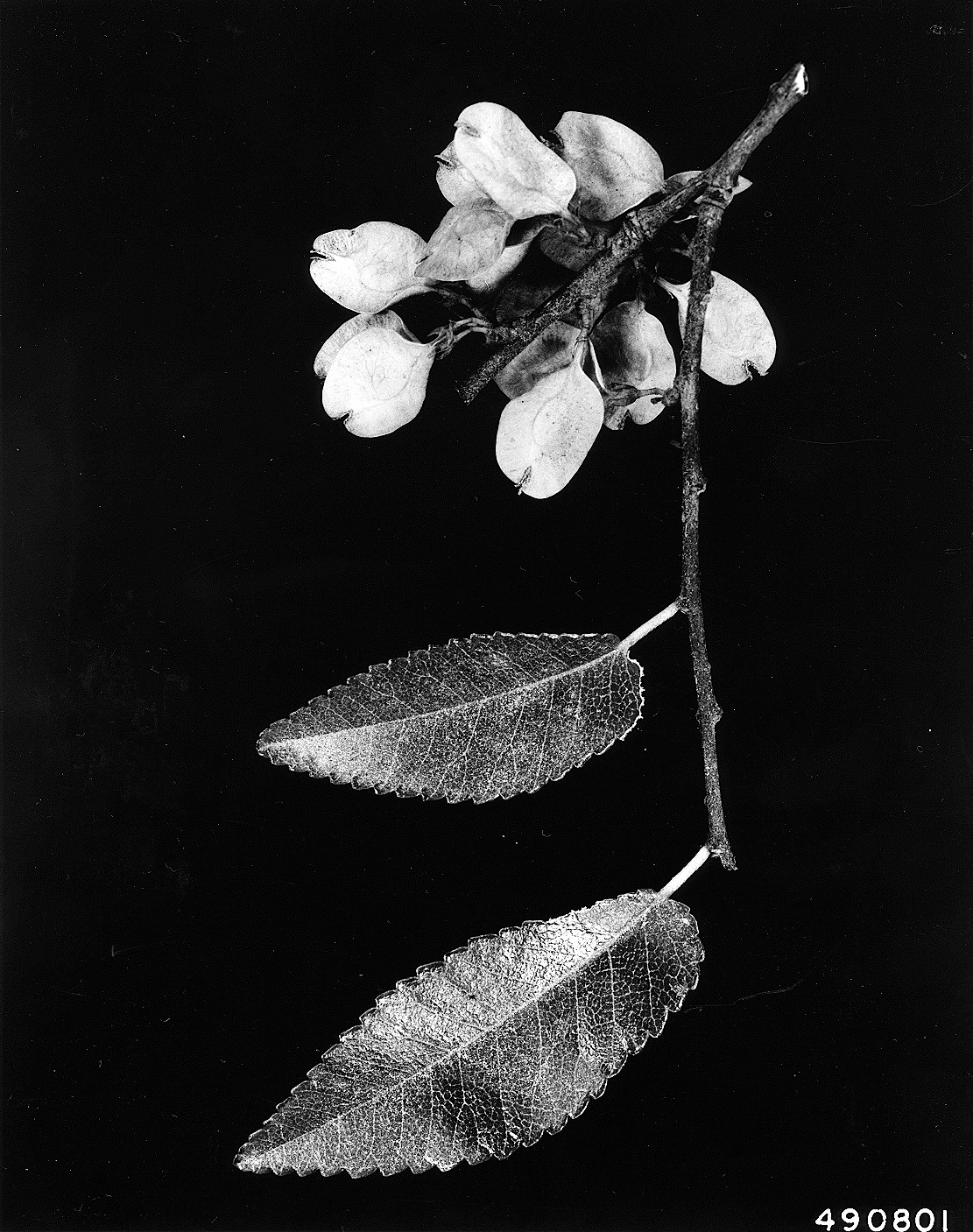
FIGURE 1.3: Leaves and flowers of a cedar elm tree (photo: W.D. Brush, USDA-NRCS PLANTS Database).
The elm data set in the stats4nr package contains several variables that are useful for understanding the components of data. These data contain observations on 333 cedar elm trees (Ulmus crassifolia Nutt.) measured in Austin, Texas (Russell 2020). We will load the data as a data frame and then print out to the R console:
library(stats4nr)
elm
## # A tibble: 333 x 8
## STATUSCD SPCD DIA HT CROWN_HEIGHT CROWN_DIAM_WIDE
## <dbl> <dbl> <dbl> <dbl> <dbl> <dbl>
## 1 1 838 5 32 19.2 19
## 2 1 838 5 25 11.3 11
## 3 1 838 5.1 21 6.3 10
## 4 1 838 5.1 27 18.9 13
## 5 1 838 5.1 22 18.7 6
## 6 1 838 5.1 27 18.9 11
## 7 1 838 5.2 29 11.6 12
## 8 1 838 5.2 20 7 9
## 9 1 838 5.2 18 17.8 12
## 10 1 838 5.2 17 6 17
## # ... with 323 more rows, and 2 more variables:
## # UNCOMP_CROWN_RATIO <dbl>, CROWN_CLASS_CD <dbl>By default, R will print the first 10 rows of a data frame in the tibble format. Tibbles are essentially data frames used within the tidyverse package. Note that R reads in the variables in the col_double() format, or a quantitative variable that is not an integer.
The variables in elm include:
DIA, the tree’s diameter at breast height, measured in inches,HT, the total height of the tree, measured in feet,CROWN_HEIGHT, the height at the base of the crown, measured in feet,CROWN_DIAM_WIDE, the width of the live crown at the widest point, measured in feet, andCROWN_CLASS_CD, the tree’s crown class code that indicates the relative crown position of the tree: Open grown (1), Dominant (2), Co-dominant (3), Intermediate (4), or Suppressed (5).
A few handy functions allow you to inspect the contents of any data frame. The dim() function returns the number of observations and variables, or dimensions in a data frame:
dim(elm)## [1] 333 8head() and tail() return the first and last six lines of observations, respectively:
head(elm)## # A tibble: 6 x 8
## STATUSCD SPCD DIA HT CROWN_HEIGHT CROWN_DIAM_WIDE
## <dbl> <dbl> <dbl> <dbl> <dbl> <dbl>
## 1 1 838 5 32 19.2 19
## 2 1 838 5 25 11.3 11
## 3 1 838 5.1 21 6.3 10
## 4 1 838 5.1 27 18.9 13
## 5 1 838 5.1 22 18.7 6
## 6 1 838 5.1 27 18.9 11
## # ... with 2 more variables: UNCOMP_CROWN_RATIO <dbl>,
## # CROWN_CLASS_CD <dbl>tail(elm)## # A tibble: 6 x 8
## STATUSCD SPCD DIA HT CROWN_HEIGHT CROWN_DIAM_WIDE
## <dbl> <dbl> <dbl> <dbl> <dbl> <dbl>
## 1 1 838 23.7 37 27.8 53
## 2 1 838 24.7 52 44.2 42
## 3 1 838 28.1 39 37.1 48
## 4 1 838 28.7 62 55.8 55
## 5 1 838 29 46 27.6 45
## 6 1 838 43 70 66.5 50
## # ... with 2 more variables: UNCOMP_CROWN_RATIO <dbl>,
## # CROWN_CLASS_CD <dbl>The summary() function provides summary statistics for all quantitative variables in the data, including the mean, median, and quantile values:
summary(elm)## STATUSCD SPCD DIA HT
## Min. :1 Min. :838 Min. : 5.00 Min. :15.00
## 1st Qu.:1 1st Qu.:838 1st Qu.: 6.60 1st Qu.:24.00
## Median :1 Median :838 Median : 8.80 Median :30.00
## Mean :1 Mean :838 Mean :10.42 Mean :31.53
## 3rd Qu.:1 3rd Qu.:838 3rd Qu.:12.70 3rd Qu.:37.00
## Max. :1 Max. :838 Max. :43.00 Max. :70.00
## CROWN_HEIGHT CROWN_DIAM_WIDE UNCOMP_CROWN_RATIO CROWN_CLASS_CD
## Min. : 4.8 Min. : 4.00 Min. :15.0 Min. :1.000
## 1st Qu.:15.0 1st Qu.:15.00 1st Qu.:50.0 1st Qu.:3.000
## Median :18.9 Median :20.00 Median :65.0 Median :3.000
## Mean :20.3 Mean :23.41 Mean :64.8 Mean :3.174
## 3rd Qu.:24.7 3rd Qu.:30.00 3rd Qu.:80.0 3rd Qu.:3.000
## Max. :66.5 Max. :57.00 Max. :99.0 Max. :5.000You might notice that the summary() function does not provide much detail on the categorical variable for CROWN_CLASS_CD. For categorical variables, the table() function works well and provides the number of observations for each category. You can follow this by using prop.table() to calculate each category’s proportion of observations relative to the entire data set.
We can call any variable from a data frame by typing \(dataframe\$variable\). To calculate the number and proportion of observations in the elm data, we can use:
n_Crowns <- table(elm$CROWN_CLASS_CD)

n_Crowns
##
## 1 2 3 4 5
## 4 6 269 36 18prop.table(n_Crowns)##
## 1 2 3 4 5
## 0.01201201 0.01801802 0.80780781 0.10810811 0.05405405As the data show, over 80% of the cedar elm trees in Austin, Texas have a co-dominant crown class.
1.2.4 Exercises
1.1 In your own discipline, find a data set or experiment that you’re familiar with and reflect on the variables contained in the data. For categorical variables, list which variables are binary or ordinal. For quantitative variables, list which ones are discrete or continuous.
1.2 R has several built-in data sets that can be explored. Load CO2, a data set containing carbon dioxide uptake in plant grasses, by typing CO2 <- tibble(CO2). Learn about the variables in the data by typing ?CO2. Inspect the data and report the minimum and maximum values for the uptake variable. Determine how many plants were measured in the experiment and the number of chilled observations in the Treatment variable.
1.3 We can create new variables in existing data frames by using the mutate() function from the dplyr package. To add a new variable to an existing data frame, we can type the name of the data frame followed by “the pipe,” written as %>% (or sometimes |>). The pipe is shorthand for saying “then.” In other words, use my data frame “then” make a new variable in it.
As an example, we might be interested in making a new variable in the elm data that converts the diameter in inches to centimeters. To accomplish this, we would type elm %>% mutate(DIA_cm = DIA * 2.54). The result is a new column called DIA_cm that contains the tree’s diameter at breast height in centimeters. Multiple pipes can be written in a block of code, which we’ll see later in this book.
Add a new variable to the CO2 data frame, by collapsing the conc variable into a binary one. Research the ifelse() function and use it within the mutate() function to label all observations with an ambient carbon dioxide concentrations of 500 mL/L or greater as “HIGH” and all others as “LOW.”
1.3 Graphics for visualizing data
Run the following code to plot data from the elm data set using the ggplot2 package. In this example, we will create a scatter plot showing the diameter of elm trees on the x-axis and their height on the y-axis:
ggplot(data = elm, aes(x = DIA, y = HT)) +
        geom_point()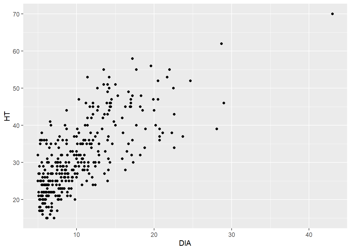
What results is a trend that we would expect—trees that are larger in diameter are also taller. This is helpful because a tree’s diameter is relatively easy to measure, but a tree’s height often requires more time and effort to obtain.
Now, we’ll step through the code that produced the scatter plot above:
- The
ggplot()function tells R that we want to produce a plot, and we need to tell it which data set and variables to use. - The
data =statement specifies that we want to plot variables from the elm data set. - We specify the variables
DIAandHTwithin theaes()statement. Theaesis the abbreviation for aesthetics, which allows us to change the properties of how the data are shown in the graph. As it turns out, we have not done anything special with the current aesthetics in the scatter plot, but in the future we can add to the aesthetics by specifying different colors, shapes, and sizes for the data points. - The
geom_point()statement tells R that we want to produce a geometric object with points, i.e., a scatter plot. We will learn there are many “geom” types that can plot different layers of objects depending on the nature of the data and what you want to see.
Note that we add a + at the end of the line when we use ggplot(). This indicates we have more instructions to R before creating our scatter plot.
The way that we created the elm scatter plot will be the same style we’ll use for all of our graphs. That is, the first line will tell ggplot() the data set and variables to plot (along with any additional aesthetics). The second line will specify which kind of graph to create (i.e., which “geom”).
1.3.1 Visualizing categorical data
1.3.1.1 Bar plots
Bar plots are one of the most effective ways to display categorical data. These plots represent the categories as bars and their length shows the counts or percentages within each category. Before creating a bar plot, it is useful to investigate the values of the data in the plot. As an example, we may wish to analyze the number of trees in the elm data set by crown class codes. We can find the number of tree observations within each CROWN_CLASS_CD by using the count() function with a pipe:
elm %>%
   count(CROWN_CLASS_CD)
## # A tibble: 5 x 2
## CROWN_CLASS_CD n
## <dbl> <int>
## 1 1 4
## 2 2 6
## 3 3 269
## 4 4 36
## 5 5 18We observe that the greatest and fewest number of trees have a co-dominant and open grown crown class, respectively. We can also obtain the counts of observations with different code. The count() function makes this easy, but we also might want to determine the percentage of trees within each crown class category by grouping the data and then summarizing it.
To do this, we will start by grouping the data by CROWN_CLASS_CD using the group_by() statement. Then, we use the summarize() function to make a new variable called n_trees that sums the number of observations by CROWN_CLASS_CD. This step produces the same output that the count() function provides in the previous step, so it’s not particularly novel. In the last line, we use the mutate() function to calculate a new variable Pct that provides the percentage of observations in the data within each crown class.
We’ll also want to use this new data set in the future, so we will assign it a name elm_summ. These operations are handy tools found in the dplyr package, a core package in the tidyverse that allows you to transform and reshape data:
elm_summ <- elm %>%
   group_by(CROWN_CLASS_CD) %>%
   summarize(n_trees = n()) %>%
   mutate(Pct = n_trees / sum(n_trees) * 100)
elm_summ
## # A tibble: 5 x 3
## CROWN_CLASS_CD n_trees Pct
## <dbl> <int> <dbl>
## 1 1 4 1.20
## 2 2 6 1.80
## 3 3 269 80.8
## 4 4 36 10.8
## 5 5 18 5.41We observe that the co-dominant and open grown crown classes represent 80.8% and 1.2% of the data, respectively.
1.3.1.2 Pie charts
Pie charts show the distribution of variables as a “pie” whose slices are sized by the counts or percentages for the categories. We can plot the elm tree crown class data as a pie chart, recalling the elm_summ data we created in an earlier step. Because we are plotting specific values in that data set, we’ll specify stat = "identity" in the geom_bar() layer. The key to creating a pie chart is to specify coord_polar() in the last line. A pie chart shows the same information as a bar plot, but in polar coordinates:
ggplot(data = elm_summ, aes(x = "", y = n_trees,
                            fill = CROWN_CLASS_CD)) +
        geom_bar(stat = "identity") +
        coord_polar("y")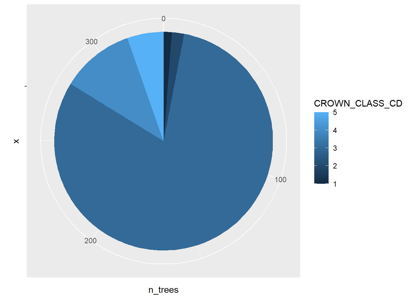
Pie charts should be used with caution. There are several reasons for overlooking pie graphs and instead favoring other kinds of graphs. Several reasons behind this are pointed out in early work by Cleveland and McGill (1984, 1985):
- The human eye does a poor job in judging angles. This makes it difficult to discern the values within pie graphs.
- Pie graphs contain color, and the human eye does a very poor job in judging color in graphs. This is especially true for individuals that are color blind or have other visual impairments.
Regardless, because of the widespread use of pie graphs it is helpful to learn how to construct and interpret them. As an alternative, place more priority in developing graphs such as bar plots when displaying categorical data because the human eye does a good job of discerning position and lengths of objects.
1.3.1.3 Polar area graphs
Another use of polar coordinates in graphing is a polar area graph, also called a coxcomb plot or rose diagram. Florence Nightingale, a nurse and pioneer in statistical graphics, popularized the use of the polar area graphs in the mid-19th century. They are similar to pie charts, but they have identical angles and extend from the plot’s center depending on the magnitude of the values that are plotted.
Think of the polar area diagram as a pie chart meets a histogram. A few advantages of polar area diagrams include:
- They are useful for plotting cyclical data. For example, the counts of a phenomenon in each of the 12 calendar months of a year.
- They are easy to read around the “rose” because data are presented chronologically.
- Multiple layers can be added within a diagram. Nightingale presented these kinds of layers in her visualizations of soldier deaths and wounds during the Crimean War.
In R, a polar area graph can be created by combining the geom_bar() and coord_polar() layers:
ggplot(data = elm, aes(x = CROWN_CLASS_CD)) +
        geom_bar() +
        coord_polar()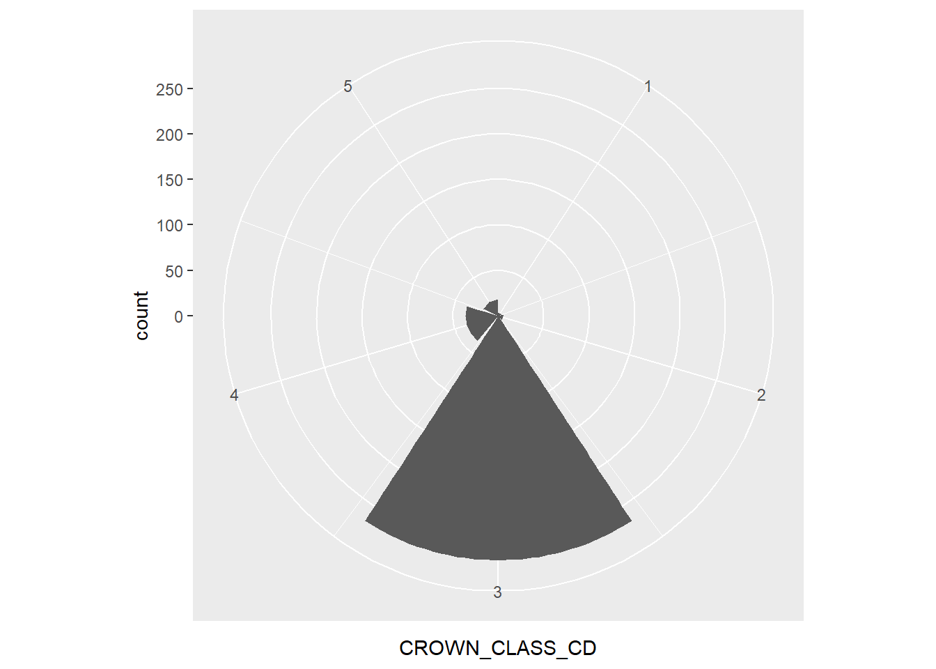
For the elm data, the polar area graph reveals the large number of co-dominant trees. As you can see, polar area graphs have an advantage over pie charts because they allow the reader to see the depth within each category.
1.3.2 Visualizing quantitative data
1.3.2.1 Stem plots
Stem plots, also termed stem-and-leaf plots, are useful to separate each observation into a stem (all but the rightmost digit) and a leaf (the remaining digit). The process involves first positioning the stems in a vertical column, then drawing a vertical line to the right of the stems. The last step positions each leaf in the row to the right of its stem.
In R, the stem() function produces a stem plot and sorts its leaves ascending. Here is an example of a stem plot of the HT variable from the elm data set:
stem(elm$HT, width = 50)##
## The decimal point is 1 digit(s) to the right of the |
##
## 1 | 55566777777778888888999999
## 2 | 00000000001111111111111222222222222223+11
## 2 | 55555555555555555566666666666677777777+27
## 3 | 00000000000000000011111112222222222222
## 3 | 55555555555555555666666666666667777777+1
## 4 | 00000001122222333344444
## 4 | 555555555666666677777888899
## 5 | 00011122333
## 5 | 55568
## 6 | 2
## 6 |
## 7 | 0We can quickly observe that the greatest number of observations are between 25 and 29 feet tall.
1.3.2.2 Histograms and density plots
Histograms divide the possible values of a variable into classes or intervals of equal widths. The histogram shows how many observations fall within each interval. The height of each bar is equal to the number (or percent) of observations in its interval. The following code creates a histogram for HT:
ggplot(data = elm, aes(HT)) +
        geom_histogram()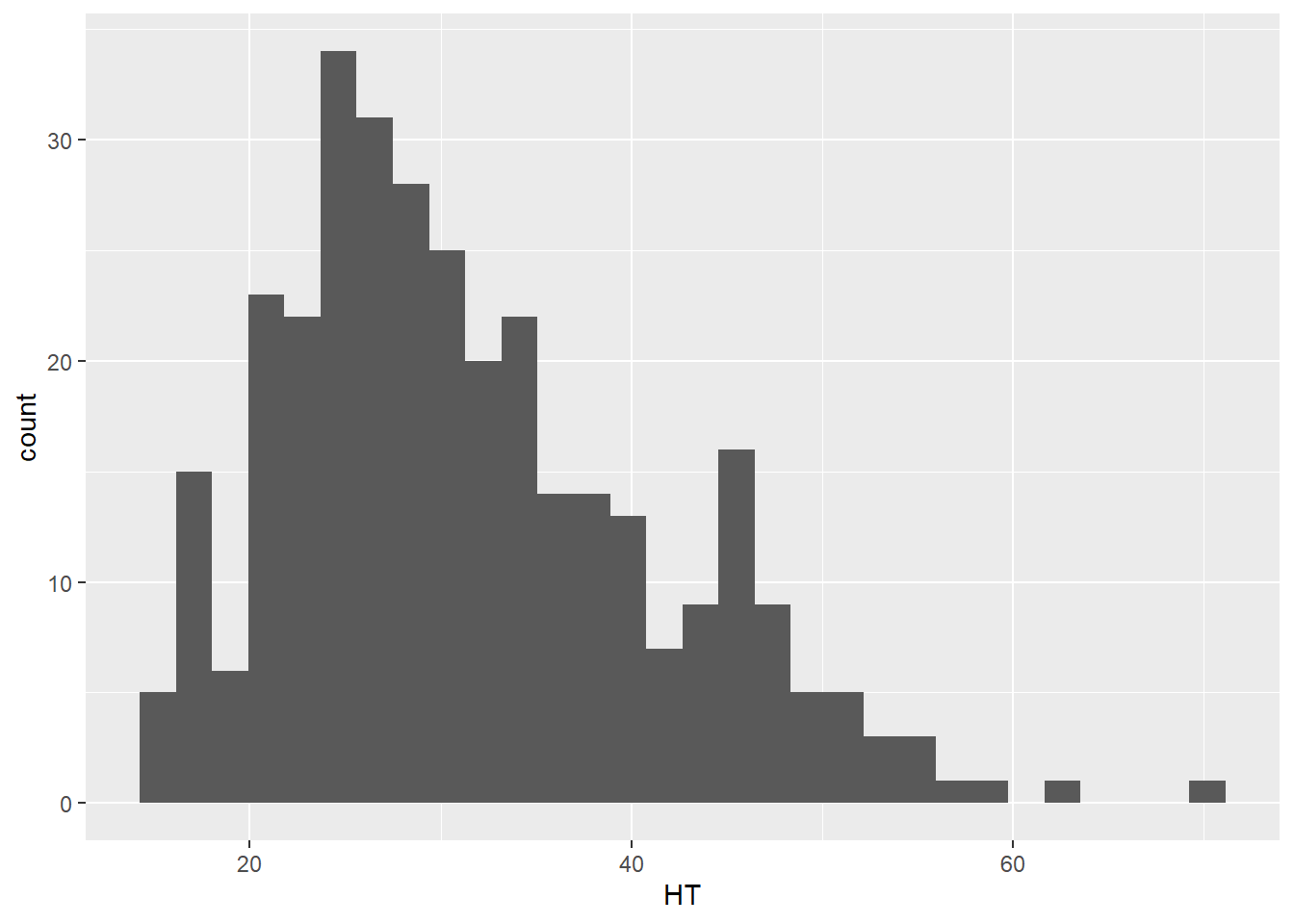
Any histogram can be reshaped depending on how many bins you specify in the geom_histogram() layer. For most applications, a bin width between 20 and 30 works well, but the appropriate number of bins will depend on the number of observations and the distribution of the data. Here is an example with 10 bins where you can see the coarser resolution that the histogram provides:
ggplot(data = elm, aes(HT)) +
        geom_histogram(bins = 10)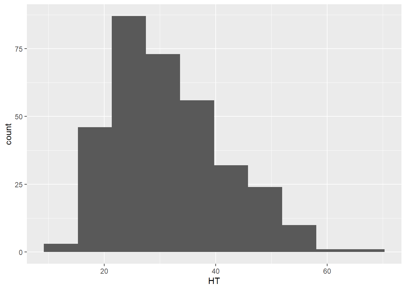
Density plots are similar to histograms but show the distribution of a variable using a smoothed curve. They may be advantageous over histograms because they show a detailed distribution and are not affected by the number of bins you select. The geom_density() layer provides density plots:
ggplot(data = elm, aes(HT)) +
        geom_density(color = "blue")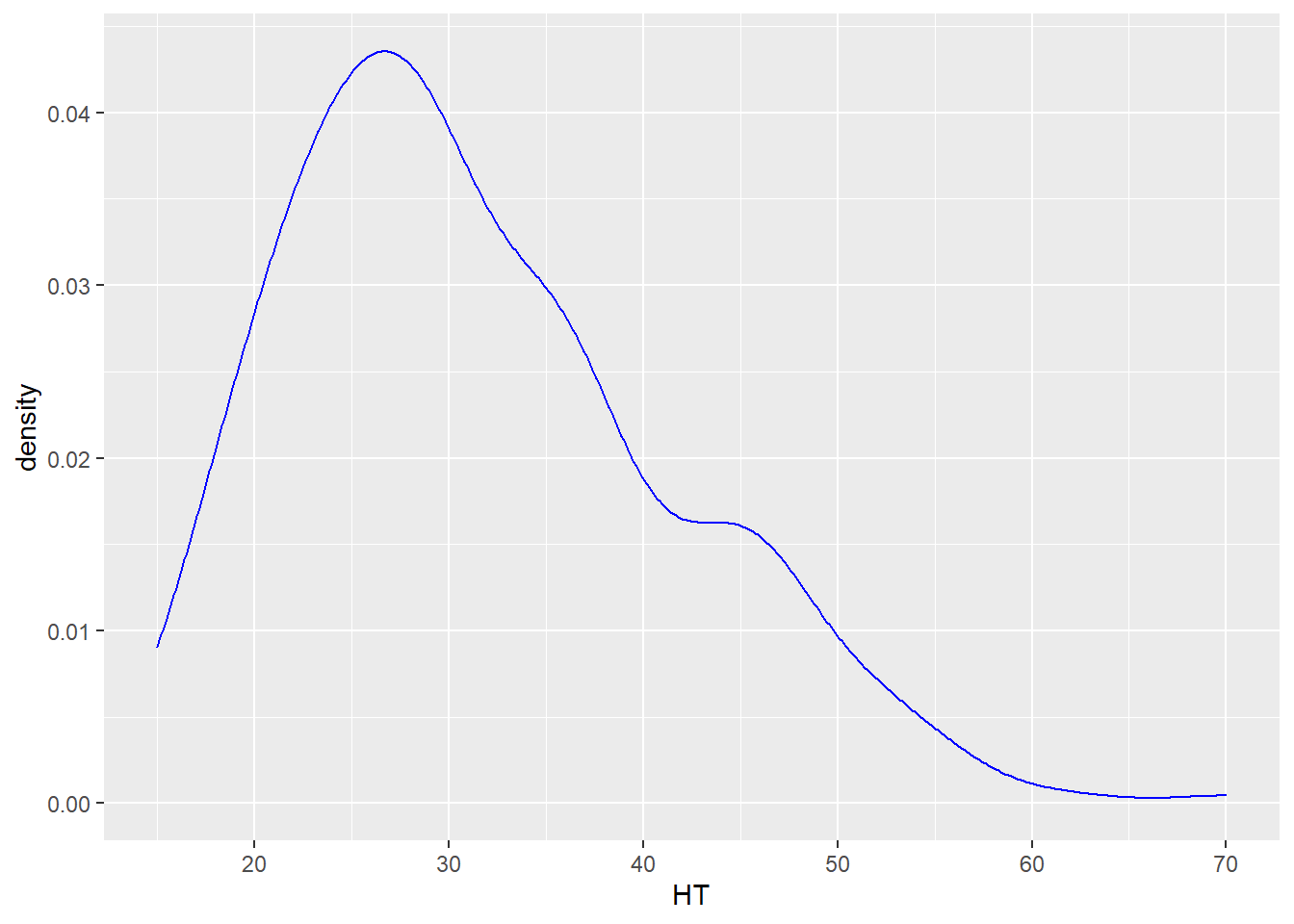
DATA ANALYSIS TIP We can describe the density or distribution of a variable as symmetric, left-skewed, or right-skewed. A distribution is symmetric if the right and left sides of the graph are approximately mirror images of each other. A distribution is right-skewed if the right side of the graph is much longer than the left side. A distribution is left-skewed if the left side of the graph is much longer than the right side. For the elm heights we can say that the distribution is right-skewed, indicating that there a few tall trees relative to many shorter trees.
1.3.2.3 Box plots and violin plots
The median of a variable and its quartiles divide the distribution roughly into quarters. The median is the middle value when a quantitative variable is sorted by its value. Three quartiles separate a variable into four parts, where the second quartile represents the median that separates the upper and lower half of observations. The first and third quartiles contain 25 and 75% of values below them, respectively. A box plot shows the minimum, first quartile (Q1), median, third quartile (Q3), and maximum values of a variable. Here is a box plot for the height of elm trees:
ggplot(data = elm, aes(x = 1, y = HT)) +
        geom_boxplot()
The Q1 and Q3 values make up the ends of the “box” in the box plot, while the minimum and maximum values make the “whiskers,” leading to the alternative “box-and-whisker” plot name. You will also note that three observations are categorized as outliers. These outliers are greater than 55 feet tall and are shown as points. We will discuss how to deal with outliers in our statistical analyses later, but for now, you can understand that the tree observations are considered outliers because their magnitude sets them apart from the range of all the other observations.
Violin plots are similar to a box plot, but also show a kernel probability density of the data. Violin plots are quite similar to density plots. In a violin plot that shows the heights of the elm trees, we can see that the height peaks between 25 and 30 feet:
ggplot(data = elm, aes(x = 1, y = HT)) +
        geom_violin()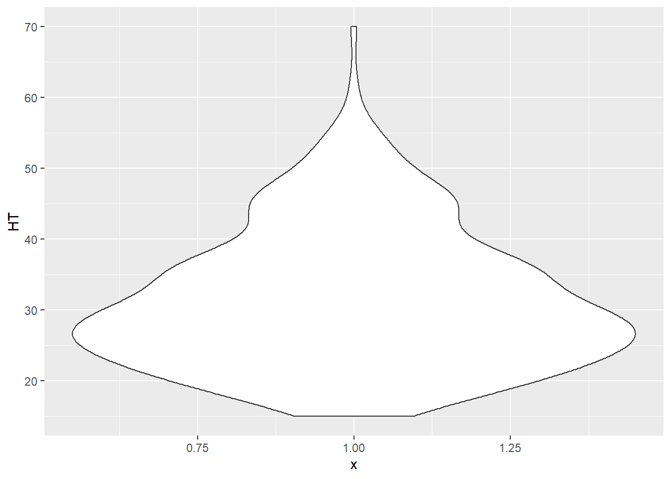
One of the greatest attributes of the ggplot2 package is the relative ease that you can add additional variables to existing plots. For example, we can add the variable CROWN_CLASS_CD in the box plots and violin plots along the x-axis to investigate the trends in height across different tree crown classes. Note that although the crown class codes are numeric, we use factor(CROWN_CLASS_CD) to tell R to treat them as categorical variables:
ggplot(data = elm, aes(x = factor(CROWN_CLASS_CD), y = HT)) +
geom_boxplot() 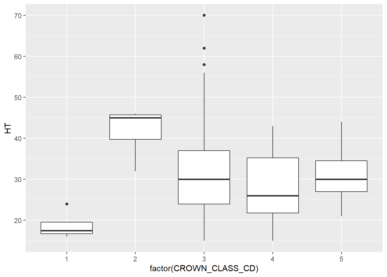
ggplot(data = elm, aes(x = factor(CROWN_CLASS_CD), y = HT)) +
        geom_violin()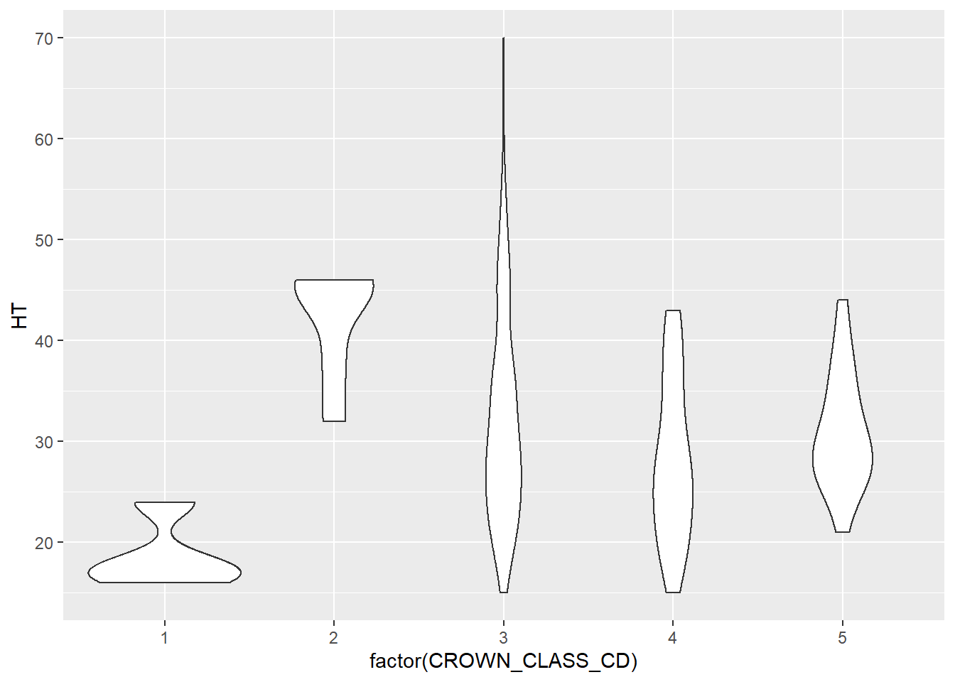
1.3.2.4 Scatter plots
Scatter plots, like we saw with the elm data previously, are some of the best tools for visualizing bivariate numerical data. The power of the aesthetics and geom features in ggplot() allow us to present the same general scatter plot of elm diameter and height that we saw previously, but “supercharging” them with some advanced features.
To start, we can add the tree’s crown class code as a mapping variable in the aes() statement to add color to our scatter plot. We see that most of the tallest trees are a co-dominant crown class (CROWN_CLASS_CD = 3):
ggplot(data = elm, aes(x = DIA, y = HT,
                       color = factor(CROWN_CLASS_CD))) +
        geom_point()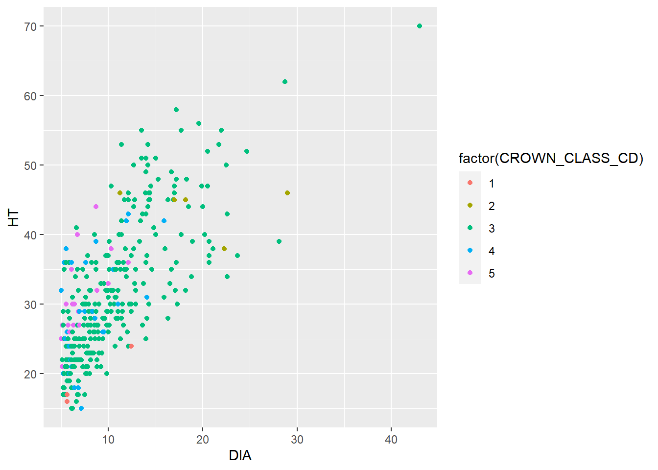
Adding a trend line can easily reveal a relationship between two continuous variables. This is helpful if you need to make a quick approximation between two variables. Adding a trend line can also reveal whether or not a linear or nonlinear relationship exists in the data. The geom_smooth() can be added to the code and will reveal the trends between the two variables. This function fits a smoothed conditional mean to the data (in blue), along with confidence intervals surrounding the estimate (in gray). After fitting a trend line to the elm data you could say “A 20-inch diameter elm tree will be approximately 45 feet tall.”
ggplot(data = elm, aes(x = DIA, y = HT)) +
        geom_point() +
        geom_smooth()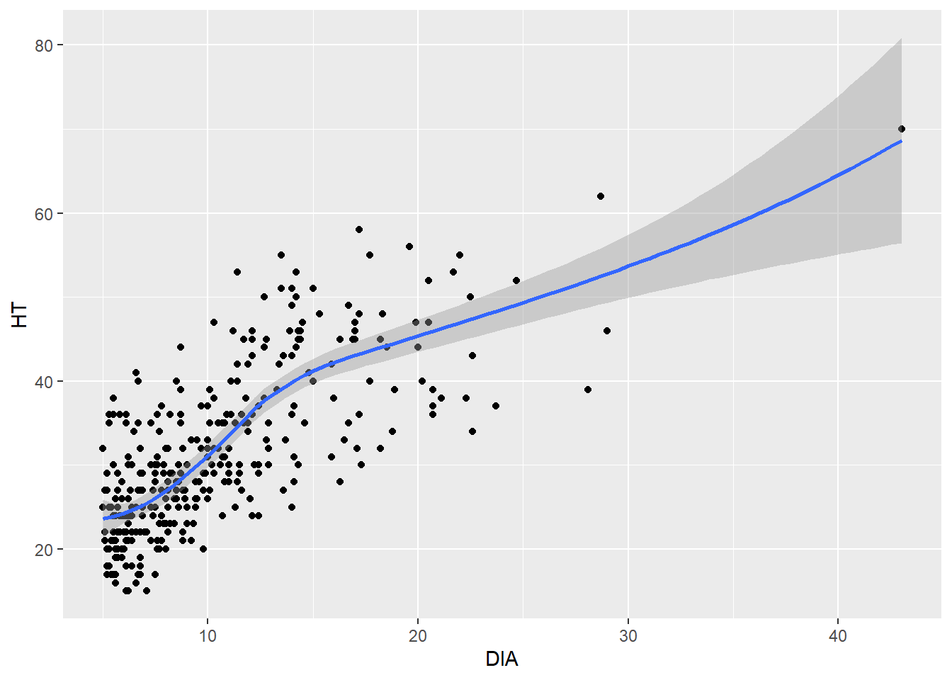
Another way to easily see the differences in ranges of two numerical variables in a scatter plot is to plot each level of a categorical variable in its own panel. The facet_wrap() statement allows you to do this.
In this case we easily see that co-dominant trees have a full range of DBH-HT, while the other crown classes have a narrower range with fewer observations:
ggplot(data = elm, aes(x = DIA, y = HT)) +
        geom_point() +
        facet_wrap(~CROWN_CLASS_CD)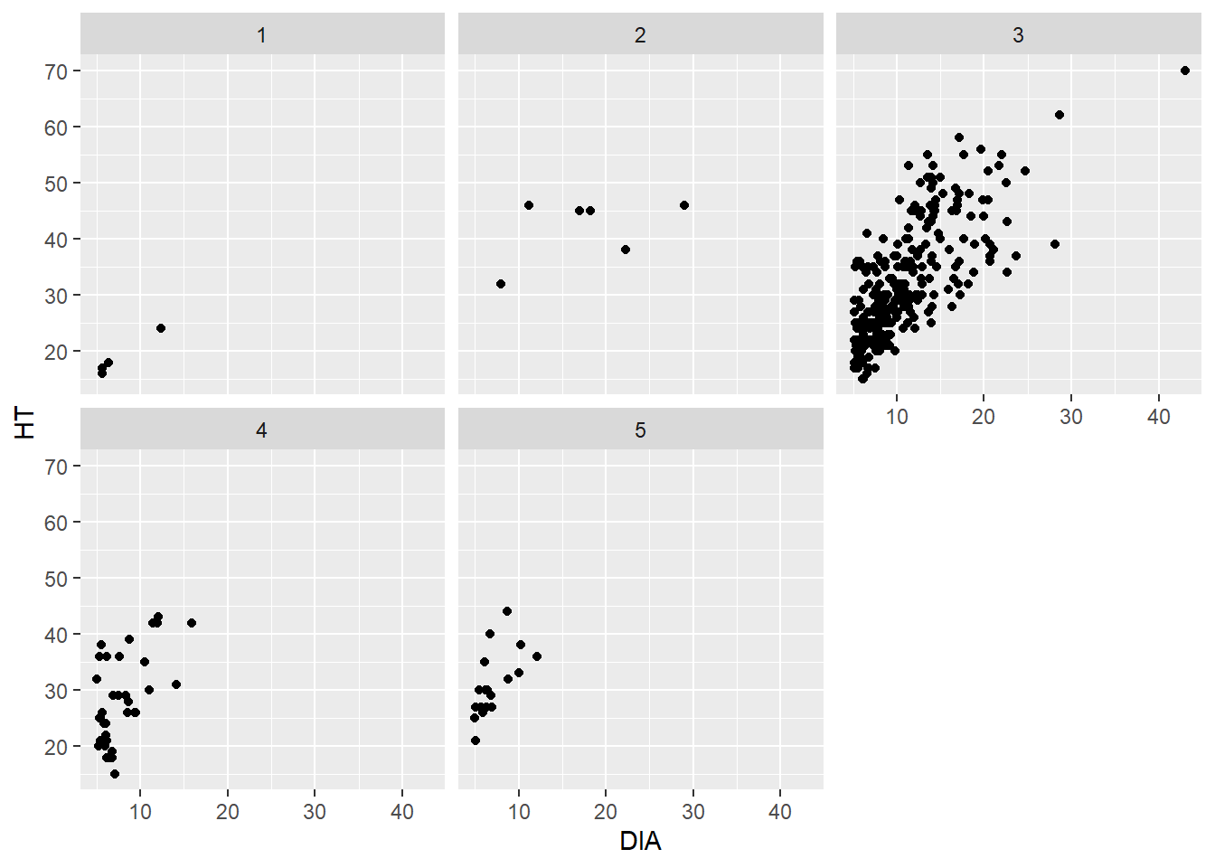
The facet_wrap() function works well when you have a single categorical variable to facet. The facet_grid() function allows you to plot two categorical variables simultaneously. We don’t have another categorical variable in the elm data that could serve as a second variable. But you could imagine that if we had multiple tree species in the data set, we could plot the five crown classes vertically and the species horizontally.
A “hexagonal scatter plot” can be produced in ggplot(), divides the x- and y-axes into hexagons, and the color of that hexagon reflects the number of observations in each hexagon. The geom_hex() layer fills in the number of observations within each hexagon. You can think of this as a scatter plot meets a histogram, where the colors indicate how many observations are contained within each bin.
The hexbin package in R provides functions to plot hexagonal scatter plots. Install the package first, and then load it to use the functions. Here’s an example with the number of bins along the x- and y-axis set to 20:
install.packages("hexbin")
library(hexbin)ggplot(data = elm, aes(x = DIA, y = HT)) +
geom_hex(bins = 20) 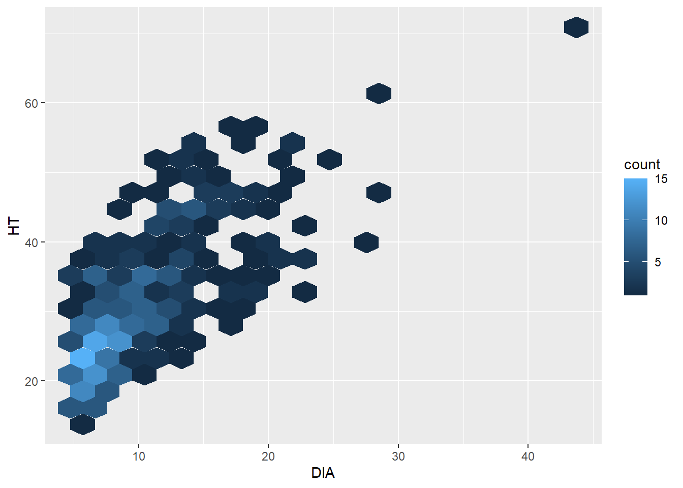
The hexagonal scatter plot shows that most of the observations in the elm data set are less than 10 inches in diameter and are shorter than 30 feet tall. In the original scatter plot, due to overlapping points in “busy” areas of the graph, this finding can’t really be observed. Knowing that this pattern exists can be insightful for future data analysis.
The number of bins in geom_hex() can be increased to see a finer resolution (with fewer observations grouped into each hexagon). Or it can can be decreased to see a coarser resolution (with more observations grouped into each hexagon).
1.3.3 Exercises
1.4 Run the code ggplot(data = elm, aes(x = DIA, y = HT)). What is the result and why do you see what you see?
1.5 Using the CO2 data set, write code using ggplot() that creates a bar plot displaying the number of measurements for each plant. Note that because the number of measurements are the same for each plant, the plot will look uniform.
1.6 Create a series of hexagonal scatter plots using the uptake variable in the CO2 data set. Change the observations contained within each hexagonal bin to 5, 20, 40, and 60. (Remember to load the hexbin package.) What do you notice as the number of bins increases?
1.7 Create a grid of scatter plots by specifying the facet_grid statement in ggplot(). This statement creates a matrix of panels using two faceting variables. Plot the conc and uptake variables from the CO2 data set within the scatter plot. Then, specify Type and Treatment as the faceting variables. Which Type, i.e., the location of the plants in the data set, contains the greater values of uptake?
1.4 Enhancing graphs
1.4.1 Adding text elements
Up to now, we’ve been using some of the basic plotting features available in ggplot2. Oftentimes these techniques are all that we need to complete our stage of exploratory data analysis. However, you will likely need to produce publication-quality graphs and figures to share with a broader audience as you continue your journey in data analysis. This section describes some additional code you can use in the ggplot() function to improve the quality of your graphs.
To start, we have already broken the cardinal sin in designing figures: we have not added units to the x- and y-axes to our plots. The labs() statement can be added, as we see here in the diameter and height trends from the elm data:
ggplot(data = elm, aes(x = DIA, y = HT)) +
        geom_point() +
        labs( x = "Tree diameter (inches)",
              y = "Tree height (feet)")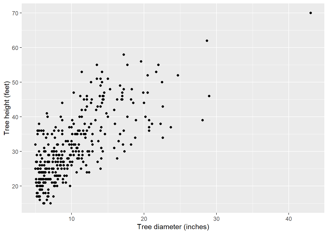
With labs() you can also add a title, subtitle, and caption to a graph. This can be helpful for describing the contents of the graph, a key result that the graph displays, and the source of the data:
ggplot(data = elm, aes(x = DIA, y = HT)) +
        geom_point() +
        labs( x = "Tree diameter (inches)",
              y = "Tree height (feet)",
              title = "Cedar elm trees in Austin, Texas",
              subtitle = "Trees that have a larger
              diameter are taller.",
              caption = "Source: USDA Forest Inventory and Analysis")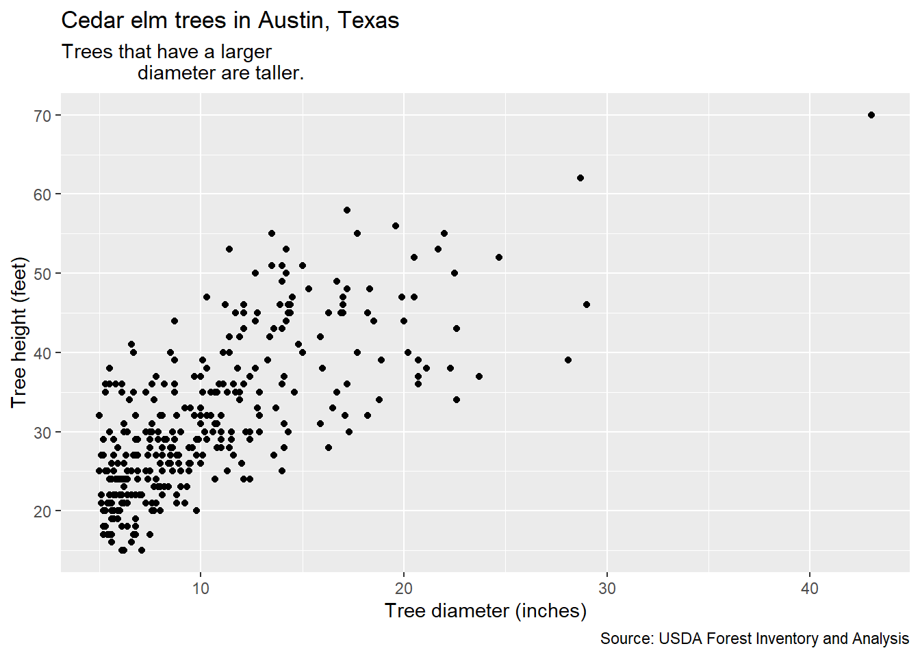
You can also arrange the elements of a graph so that it is easier for the reader to understand. One of the key messages from the work of Cleveland and McGill (1984, 1985) is that trends are easily distinguished when they arranged as objects representing length along a common scale. This is helpful when displaying categorical variables such as bar plots. You can order elements of a graph ascendingly using the fct_infreq() statement. This function is available in the forcats package, another core set of functions in the tidyverse that deals with factor level variables (also known as categorical variables). Here is a bar plot of the number of trees by different crown classes from the elm data set with the values ascending:
ggplot(data = elm,
       aes(x = fct_infreq(factor(CROWN_CLASS_CD)))) +
geom_bar() 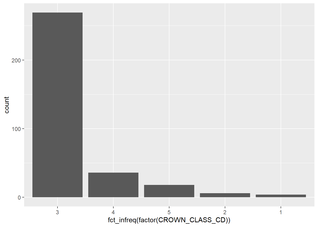
You can also use the fct_rev() function within forcats combined with fct_infreq() to sort the values in ascending order:
ggplot(data = elm, aes(
    x = fct_rev(fct_infreq(factor(CROWN_CLASS_CD))))) +
        geom_bar()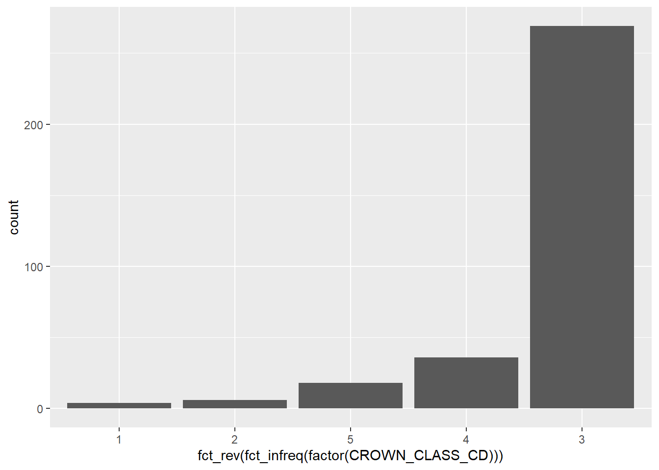
Natural resources data contain many ordinal variables. If a variable is ordinal in its design, it is effective in ordering the graph manually depending on the values of the variable. For example, because the tree crown classes depict how much sunlight a tree receives, we could reorder the elm data from the categories from open grown, dominant, dominant, intermediate, suppressed.
After exploring your data to understand trends, spending time to arrange the values and graphs so that they make more sense from a biological or numerical perspective will help the reader to better understand your analysis.
1.4.2 Adjusting plot layouts and themes
We have also been using the default ggplot output when looking at our graphs. A number of additional components can be adjusted to change the layout of a plot. A few examples include:
- The scale of x and y-axes can be adjusted with the statements
scale_x_continuous()andscale_y_continuous(). Thelimits =statement can be specified here and allows you to change the upper and lower bounds of the axis. - Legends can be repositioned to appear on the top, bottom, left, or right of the graph within the
theme()statement. - You can change the default style to a white background using
panel.background = element_rect(fill = "NA")
You can continue to modify elements within the theme statement in ggplot(), however, there are also several default themes you can select. For example, here are the scatter plots for the elm data with the theme_bw(), theme_classic(), and theme_void() themes available in ggplot2:
ggplot(data = elm, aes(x = DIA, y = HT)) +
        geom_point() +
        labs(title = "theme_bw()") +
        theme_bw()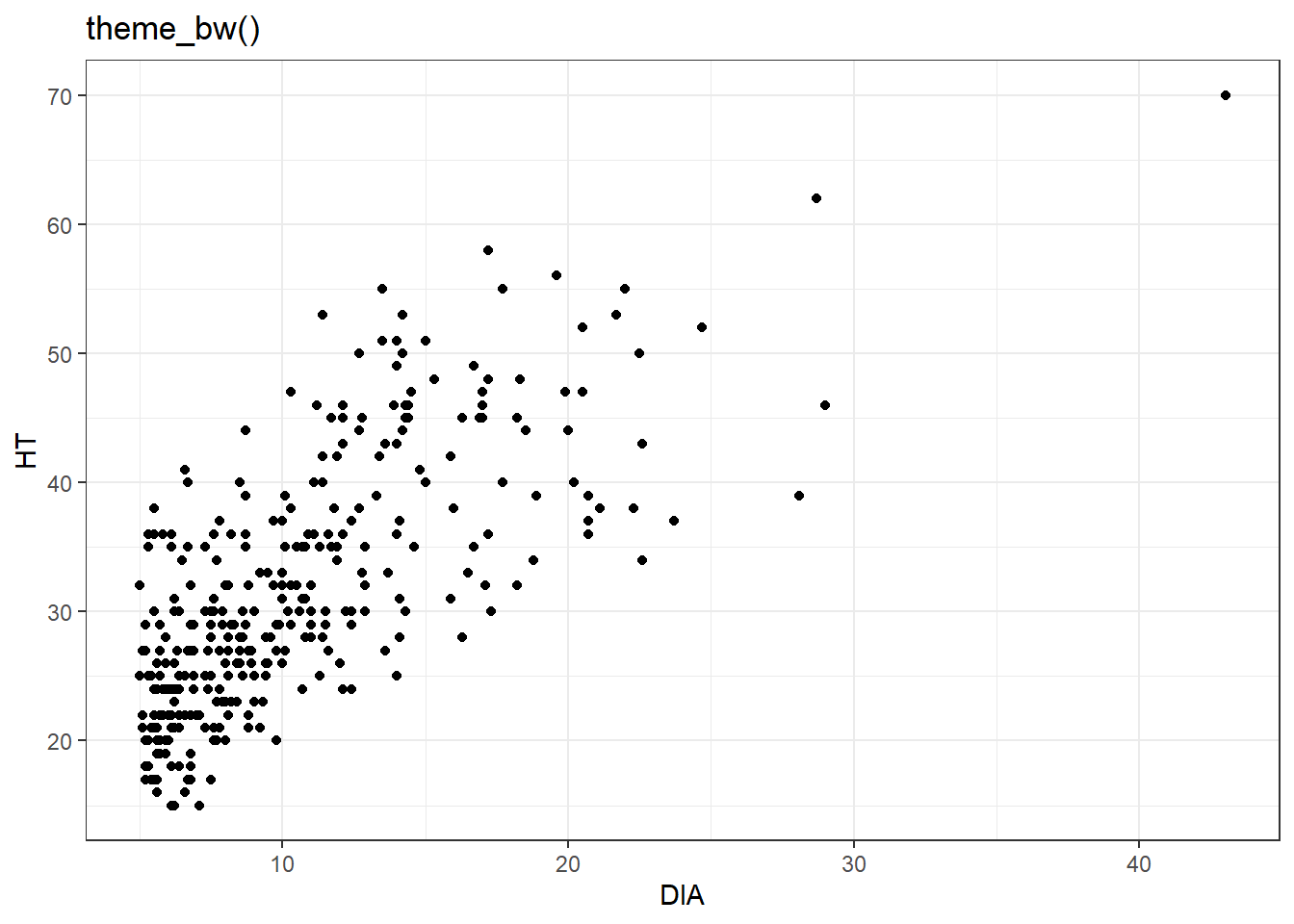
ggplot(data = elm, aes(x = DIA, y = HT)) +
        geom_point() +
        labs(title = "theme_classic()") +
        theme_classic()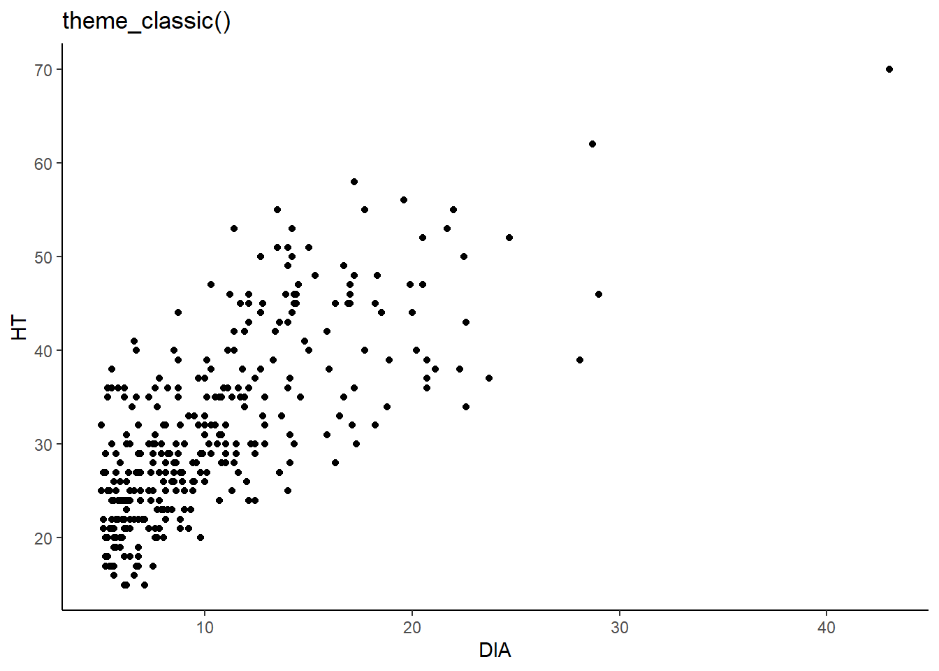
ggplot(data = elm, aes(x = DIA, y = HT)) +
        geom_point() +
        labs(title = "theme_void()") +
        theme_void()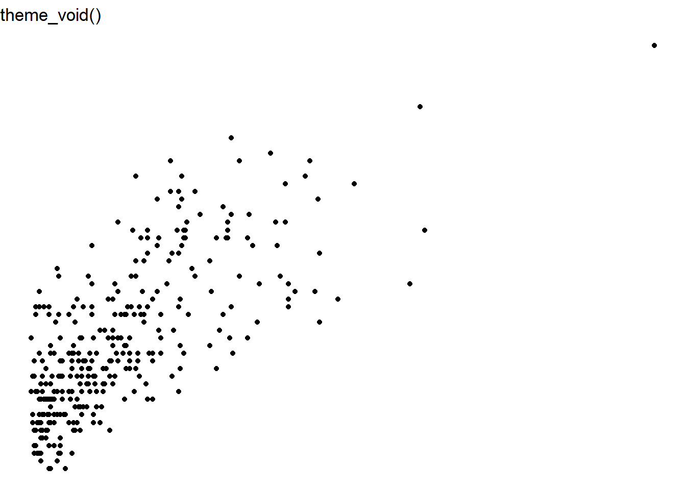
You also may want to save your plot to your desktop to use in a report or to share on the web. The ggsave() function allows you to output a plot to disk. The ggsave() function allows you to create common image formats such as jpeg, tiff, png, and pdf. You can also change the width and height of the figure as an argument within ggsave(). Here’s an example that will save a JPEG image named elm_scatter.jpg that saves a scatter plot of the elm data that is 3 inches in height and 5 inches width:
ggplot(data = elm, aes(x = DIA, y = HT)) +
        geom_point()

ggsave("elm_scatter.jpg", height = 3, width = 5, units = "in")
1.4.3 Exercises
1.8 Make a series of box plots for the uptake variable from the CO2 data set. Each box plot should display the origin of the location of the plants in the data set, i.e., Quebec or Mississippi. Label the axes with the appropriate units and use the theme_bw() theme for your graph.
1.9 As you might have guessed, there is a “geom” for a bar plot and it’s called geom_bar(). We discussed how the CROWN_CLASS_CD variable is an ordinal variable representing how much sunlight a tree receives. Create a bar plot showing the crown class codes on the x-axis and the number of observations on the y-axis using ggplot().
1.10 Use ggsave() to save the graph you made in exercise 1.9 as a png image to your computer. Set the height and width of the figure to 10 cm and 10 cm, respectively.
1.11 Use scale_x_continuous() and scale_y_continuous() to “zoom in” on the scatter plot of elm diameter and height. Use the limits = statement to set the lower and upper bounds from 10 to 15 inches along the x-axis for diameter and 30 to 40 feet along the y-axis for height. Are there any trends in the data when looking at this region of the scatter plot?
1.5 Summary
Visualizing your data should be one of the first steps you take before doing any statistical analysis. Visualizing data allows you to better understand the data, spot any unusual trends or observations within your data, and provides you inspiration for deciding which kinds of statistical analyses might be appropriate for your data. It is important to be able to characterize the variables in your data. Whether data are categorical or quantitative, this will impact which types of visualizations are appropriate. For categorical data, bar charts, pie graphs, and polar area diagrams are tools to help visualize patterns. For quantitative data, histograms, box plots, and scatter plots are examples that work well. The ggplot2 package is a core part of the tidyverse and provides a framework for visualizing data. There are a lot of options to supercharge your code for effective data visualization, but the components from this chapter will allow you to quickly visualize data so that we’re better prepared to run statistical analysis in the following chapters.
1.6 References
Broman, K.W., and K.H. Woo. 2018. Data organization in spreadsheets. American Statistician 72(1): 2–10.
Cleveland, W.S., and R. McGill. 1984. Graphical perception: theory, experimentation, and application to the development of graphical methods. Journal of the American Statistical Association 79: 531–554.
Cleveland, W.S., and R. McGill. 1985. Graphical perception and graphical methods for analyzing scientific data. Science 229: 828–833.
Russell, M.B. 2020. Nine tips to improve your everyday forest data analysis. Journal of Forestry 118(6): 636–643.
Tukey, J.W. 1977. Exploratory data analysis. Addison-Wesley, Reading, MA. 712 p.
Weiskittel, A.R., N.L. Crookston, and P.J. Radtke. 2011. Linking climate, gross primary productivity, and site index across forests of the western United States. Canadian Journal of Forest Research 41: 1710–1721.
Wickham, H. 2010. A layered grammar of graphics. Journal of Computational and Graphical Statistics 19: 3–28.
Wickham, H. 2014. Tidy data. Journal of Statistical Software 59: 1–24. Available at: http://dx.doi.org/10.18637/jss.v059.i10
Wilkinson, L. 2005. The grammar of graphics (2nd ed.). Statistics and Computing. New York: Springer. 688 p.