Chapter 8 Linear regression
8.1 Introduction
Regression is one of the most useful concepts in statistics because it involves numerical prediction. Regression predicts something we do not know, where the answer is a number. We often collect data on things that are easy to measure and call these the independent or explanatory variables. Regression is used to tell us about the things that are often hard to measure, termed the dependent or response variable.
As an example, consider you go fishing. It is relatively easy to measure the length of a fish when you bring it out of the water, but it is more difficult to measure how much it weighs. Using regression, we might develop a statistical model to predict the weight of the fish (the dependent variable) using its length (the independent variable). This would be an example of simple linear regression, or using a single independent variable in a regression to predict the dependent variable.
Regression allows us to make estimations and inference from one variable to another. When viewing the data as a scatter plot, if a linear pattern is evident, we can describe the relationships between variables by fitting a straight line through the points. Regression techniques will allow us to draw a line that comes as close as possible to the points.
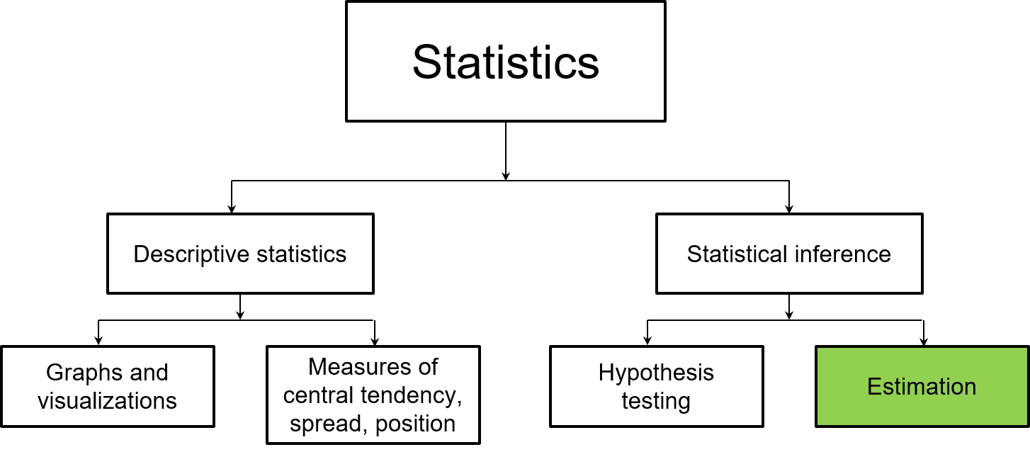
FIGURE 8.1: The remainder of this book focuses largely on estimation, a core component of statistical inference.
8.2 Correlation
While regression allows us to make predictions, correlation measures the degree of association between two variables. Correlation coefficients range from -1 to 1, with negative correlations less than 0 and positive correlations greater than 0. Coefficients that are “extreme,” i.e., they are closer to -1 or 1, are considered strongly correlated. A correlation coefficient near 0 indicates no correlation between two variables.
The Pearson correlation coefficient, denoted r, is appropriate if two variables x and y are linearly related. We can use all observations in our data from i=1 to n and employ the following formula to determine the coefficient:
\[r = \frac{\sum_{i = 1}^{n} (x_i-\bar{x})(y_i-\bar{y})}{\sqrt{\sum_{i = 1}^{n} (x_i-\bar{x})^2\sum_{i = 1}^{n}(y_i-\bar{y})^2}}\]
The following graphs show examples of correlations between three sets of variables:
- a store’s price for a gallon of milk and their corresponding monthly sales,
- the length and width of sepals measured on four different species of iris flowers, and
- the number of chirps per second a ground cricket makes based on the air temperature.
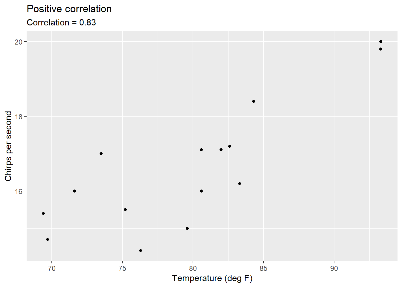
FIGURE 8.2: Correlation between temperature and the number of chirps a striped ground cricket makes.
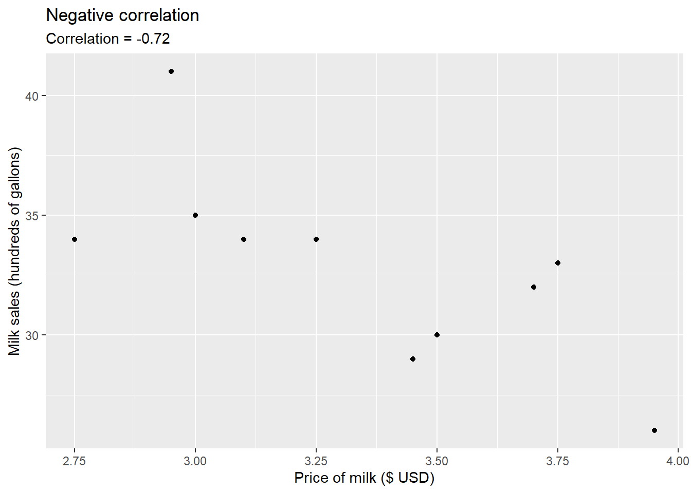
FIGURE 8.3: Correlation between milk price and sales.
In R, the cor() function computes the correlation between two variables x and y. We can apply it to determine the correlation between the length and width of sepal measurements contained in the iris data set:
iris <- tibble(iris)

cor(iris$Sepal.Length, iris$Sepal.Width)
## [1] -0.1175698The coefficient of 0.1176 indicates weak correlation between sepal length and width. The cor.test() function also computes the correlation coefficient and provides additional output. This function tests for the association between two variables by running a hypothesis test and providing a corresponding confidence interval:
cor.test(iris$Sepal.Length, iris$Sepal.Width)##
## Pearson's product-moment correlation
##
## data: iris$Sepal.Length and iris$Sepal.Width
## t = -1.4403, df = 148, p-value = 0.1519
## alternative hypothesis: true correlation is not equal to 0
## 95 percent confidence interval:
## -0.27269325 0.04351158
## sample estimates:
## cor
## -0.1175698In the case of the sepal measurements, the value 0 is included within the 95% confidence interval, indicating we would accept the null hypothesis that the correlation is equal to zero.
8.2.1 Exercises
8.1 Try out the game “Guess the Correlation” at http://guessthecorrelation.com/. The game analyzes how we perceive correlations in scatter plots. For each scatter plot, your guess should be between zero and one, where zero is no correlation and one is perfect correlation. Points are awarded and deducted if you do the following:
- Guess within 0.05 of the true correlation: +1 life and +5 coins
- Guess within 0.10 of the true correlation: +1 coin
- Guess within >0.10 of the true correlation: -1 life
- You will also receive bonus coins if you make good guesses in a row.
You have three “lives” and the game will end when your guesses in three consecutive tries are outside of the 0.10 value of the true correlation. After your game ends, what was your mean error and how many total points did you receive?
8.2. Use the filter() function to subset the iris data into two data sets that include the setosa and virginica species, separately. Run the cor() function to find the Pearson correlation coefficient between sepal length and sepal width for each data set. How would you describe the strengths of the correlations between the variables. What values do you find that are different from what was observed when the cor() function was presented in the text?
8.3 Run the cor.test() function to find the Pearson correlation coefficient between petal width and sepal width for the Iris virginica observations. If the null hypothesis is that the true correlation between the two variables is equal to 0, do you reject or fail to reject the test?
8.3 Concepts that build to regression
8.3.1 How hot is it?
Many international researchers are well aware of the process for converting between Fahrenheit and Celsius scales of temperature. We’ll create a small data set called degs that has a range of temperatures that contain the equivalent values in both units:
degs <- tribble(
  ~degC, ~degF,
  0, 32,
  10, 50,
  20, 68,
  30, 86,
  40, 104
)
In our example, we wish to predict the degrees Fahrenheit (the dependent variable) based on the degrees Celsius (the independent variable). In regression, dependent variables are traditionally plotted on the y-axis and independent variables on the x-axis:
ggplot(degs, aes (x = degC, y = degF)) +
  geom_point() +
  geom_line()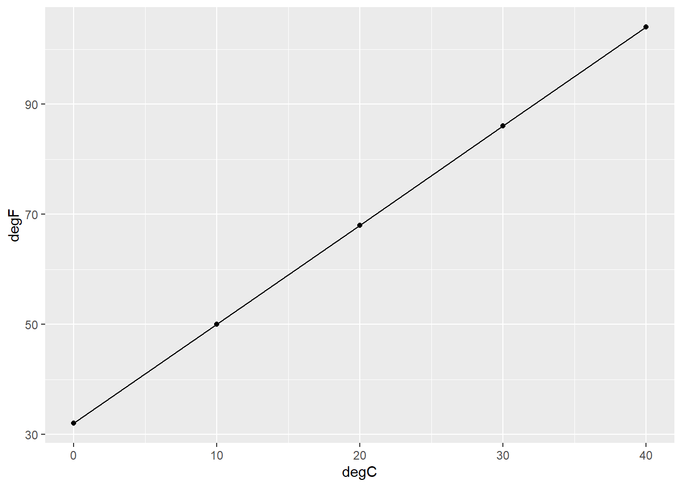
FIGURE 8.4: The (perfect) relationship between degrees Fahrenheit and Celsius.
Clearly, the relationship between degrees Fahrenheit and Celsius follows a linear pattern. To find the attributes of the fitted line, consider the equation \(degF = \beta_0 + \beta_1degC\), where \(\beta_0\) and \(\beta_1\) represent the y-intercept and slope of the regression equation, respectively. The y-intercept represents the value of y when the value of x is 0. To determine the y-intercept in our example, we can find the values in our equation knowing that when it’s 0 degrees Celsius, its 32 degrees Fahrenheit:
\[32 = \beta_0 + \beta_1(0)\]
\[\beta_0 = 32\]
The slope can be determined by quantifying how much the line increases for each unit increase in the independent variable, or calculating the “rise over run.” In our example, we know that when it’s 10 degrees Celsius, its 50 degrees Fahrenheit. This can be used to determine the slope:
\[ 50 = 32 + \beta_1(10)\]
\[ 18 = \beta_1(10)\]
\[ \beta_1 = 18/10 = 1.8\]
So, we can determine the temperature in degrees Fahrenheit if we know the temperature in degrees Celsius using the formula \(degF = 32 + 1.8(degC)\). This formula is widely used in the weather apps on your smartphone and in online conversion tools. While there is no doubt a linear relationship exists between Celsius and Fahrenheit, more specifically we can say that there is a perfect relationship between the two scales of temperature: when it is 30 degrees Celsius, it is exactly 86 degrees Fahrenheit.
8.3.2 How hot will it be today?
Imagine you’re outdoors with eight friends and ask each of them what they think the current air temperature is. People perceive temperatures differently, and other weather conditions such as wind, humidity, and cloud cover can influence a person’s guess. You glance at your smartphone and note that the actual temperature is 28 degrees Celsius, but your friends have different responses, recorded in the temp_guess data set:
temp_guess <- tribble(
  ~FriendID, ~degC,
  1, 31,
  2, 25,
  3, 26,
  4, 27,
  5, 33,
  6, 29,
  7, 28,
  8, 30
)ggplot(temp_guess, aes (x = degC, y = 1)) +
geom_boxplot()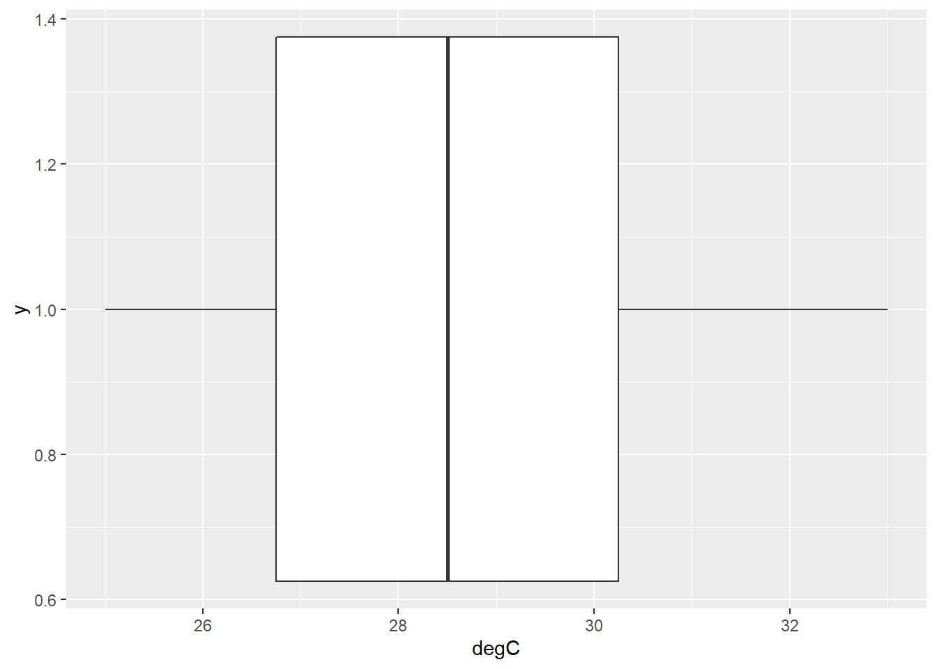
FIGURE 8.5: Box plot showing the distribution of temperature guesses around the true temperature of 28 degrees.
These true values and “predicted” values get us thinking about the error (or noise) that is inherent to all predictions. Your friends have made predictions with errors which can be characterized by the following equation:
\[\hat{y} = y + \varepsilon_i\]
where \(\hat{y}\) is the temperature guess, \(y\) is the true temperature, and \(\varepsilon_i\) is the measurement error. In regression, \(\varepsilon_i\) is the residual, or a measure of the difference between an observed value of the response variable and the prediction. We can create a variable called resid which calculates the residual values for temperature guesses and graphs them:
temp_guess  %>%
  mutate(resid = 28 - degC) %>%
  ggplot(aes(x = FriendID, y = resid)) +
  geom_point()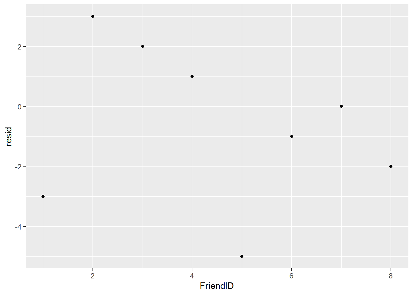
FIGURE 8.6: Residuals from the temperature guesses of friends.
One person (Friend 7) correctly guessed the temperature, indicated by a residual of 0. Three friends predicted more than the true value of 28 degrees Celsius and four friends predicted less than the true value. This example can be considered a location problem, with guesses surrounding the true value.
8.3.3 How much heat can you tolerate?
Assume you present the same eight friends with a scenario: you ask them how much time they are willing to spend outdoors (in number of hours) doing physical activity when it is 20 degrees Celsius (68 degrees Fahrenheit). You ask the same question to your friends but inquire about how much time they are willing to do an activity at 40 degrees Celsius (104 degrees Fahrenheit).
outdoors <- tribble(
  ~FriendID, ~degC, ~hours,
  1, 20, 3.5,
  2, 20, 3.5,
  3, 20, 2,
  4, 20, 4,
  5, 20, 5,
  6, 20, 2.5,
  7, 20, 4,
  8, 20, 3,
  1, 40, 1,
  2, 40, 2,
  3, 40, 0.5,
  4, 40, 1,
  5, 40, 3,
  6, 40, 1,
  7, 40, 1,
  8, 40, 2
)
To view the responses, we can make a scatter plot that shows the number of hours spent for each friend. Using col = factor(FriendID) provides the scatter plot:
ggplot(outdoors, aes(x = degC, y = hours, col = factor(FriendID))) +
  geom_point()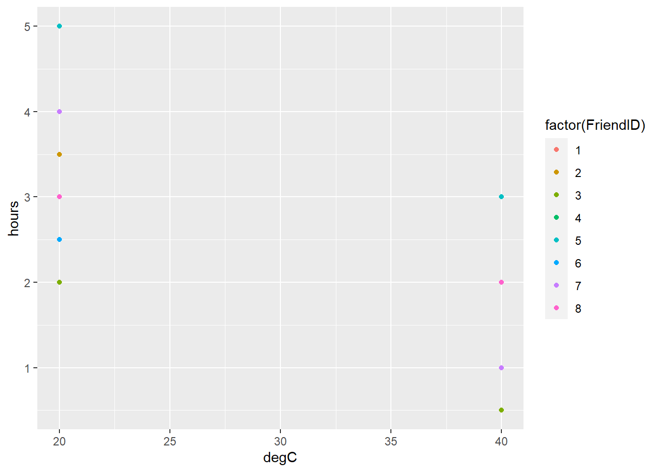
FIGURE 8.7: Number of hours people are willing to spend outdoors doing physical activity at 20 and 40 degrees Celsius.
Data indicate that your friends would spend more time outdoors at 20 degrees rather than 40 degrees Celsius. But what if the temperature was 30 degrees Celsius? You could visualize that the mean value across your eight friends would be somewhere between 20 and 40 degrees Celsius. This is a slightly more difficult problem that requires interpolation.
Consider the regression equation \(\hat{y}=\beta_0 + \beta_1(x) + \varepsilon_i\). We can find the values for \(\beta_0\) and \(\beta_1\) by first finding the mean values for the number of hours spent outdoors at 20 and 40 degrees Celsius:
\[\bar{y}_{20} = \frac{3.5 + 3.5 + ... + 3}{8}=3.44\]
\[\bar{y}_{40} = \frac{1 + 2 + ... + 2}{8}=1.44\]
In this case, we can use a centered regression equation to predict the number of hours spent outdoors:
\[\hat{y}=\beta_0 + \beta_1(x-\bar{x})\]
An obvious estimate when the air temperature is 30 degrees Celsius is the average of values calculated above, or
\[\beta_0 = \frac{3.44 + 1.44}{2}=2.44\]
So, as the temperature goes from 30 to 40 degrees Celsius, the number of estimated hours spent outdoors goes from 2.44 to 3.44. So,
\[\beta_1 = \frac{2.44-3.44}{10} = -0.10\]
Hence, an equation predicting the number of estimated hours spent outdoors is
\[\hat{y} = 2.44 - 0.10(x-30)\]
The benefit of this equation is that is can be applied to any temperature. For example, when it’s 36 degrees Celsius, the number of estimated hours spent outdoors is \(\hat{y}=2.44 - 0.10(36-30)=1.84\).
8.3.4 Exercises
8.4 Find the parameters for a regression equation that converts the distance measurement meters to feet. The dist data set has a range of measurements that contain equivalent values for both units:
dist <- tribble(
  ~dist_m, ~dist_ft,
  2, 6.56,
  5, 16.40,
  10, 32.80,
  20, 65.62
)- Using the dist data, create a scatter plot with lines using
ggplot()that shows the measurements in feet on the y-axis (the dependent variable) and the measurements in meters on the x-axis (the independent variable). - On paper, find the parameters of the fitted line using the equation: dist_ft = beta_0 + beta_1(dist_m).
- Write a function in R that uses the equation you developed. Apply it to determine the distance in feet for the following measurements in meters: 4.6, 7.7, and 15.6.
8.5 Christensen et al. (1996) reported on the relationship between coarse woody debris along the shorelines of 16 different lakes in the Great Lakes region (their Table 1). They observed a positive relationship between the density of coarse woody debris (cwd_obs; measured in \(m^2km^{-1}\)) and the density of trees (TreeDensity; measured in number of trees per hectare). The cwd data set is from the stats4nr package and contains the data:
library(stats4nr)
head(cwd)
## # A tibble: 6 x 2
## cwd_obs TreeDensity
## <dbl> <dbl>
## 1 121 1270
## 2 41 1210
## 3 183 1800
## 4 130 1875
## 5 127 1300
## 6 134 2150- The authors developed a regression equation to predict the density of coarse woody debris. The equation was \(CWD= -83.6 + 0.12*TreeDensity\). Add a variable to the cwd data called
cwd_predthat predicts the density of coarse woody debris for the 16 lakes. Add a variable to the cwd data calledresidthat calculates the residual value for each observation. - Create a scatter plot using
ggplot()of the residuals (y-axis) plotted against the observed CWD values (x-axis). Add thestat_smooth()statement to your plot to add a smoothed line through the plot. What do you notice about the trends in the residuals as the CWD values increase?
8.4 Linear regression models
Two primary linear regression techniques can be employed when a single independent variable is used to inform a dependent variable. These include the simple proportions model and the simple linear regression.
8.4.1 Simple proportions model
A simple proportions model makes the assumption that when the dependent variable is zero, the independent variable is also zero. This makes sense in many biological applications. You may have observed this in completing question 8.1, i.e., when the distance in meters is zero, the distance in feet is also zero. In this approach, imagine you “scale” the independent variable x by some value to make our predictions \(\hat{y}\). In doing this, we multiply the independent variable by a proportion.
The simple proportion model is also termed a no-intercept model because the intercept \(\beta_0\) is set to zero. The model is written as
\[y = \beta_1{x} + \varepsilon\]
Predictions of y are proportional to x, but \(\varepsilon\) is not proportional to x. To determine the estimated slope \(\hat\beta_1\) for the simple proportions model, we can employ the following formula:
\[\hat{\beta}_1 = \frac{\sum_{i = 1}^{n} x_iy_i}{\sum_{i = 1}^{n} x_i^2}\]

FIGURE 8.8: Smog in New York City, May 1973. Image: US Environmental Protection Agency.
To see how R implements regression, we’ll use the air quality data set in R that provides daily ozone measurements collected in New York City from May to September 1973. We’ll name the data set air using the tibble() function:
air <- tibble(airquality)Two variables of interest are (1) Ozone, the mean ozone in parts per billion from 1300 to 1500 hours measured at Roosevelt Island and (2) Temp, the maximum daily temperature in degrees Fahrenheit at LaGuardia Airport:
We’ll make a scatter plot using ggplot() that shows the amount of ozone as the response variable and temperature as the explanatory variable. Note you will see a warning message indicating the plot removed rows containing missing values. You can see that generally when temperature is less than 80 degrees F there is little variation in ozone, but when temperature is greater than 80 degrees F ozone increases with warmer temperatures:
ggplot(air, aes(x = Temp, y = Ozone)) +
  geom_point() +
  labs(y = "Ozone (ppb)", x = "Temperature (deg F)")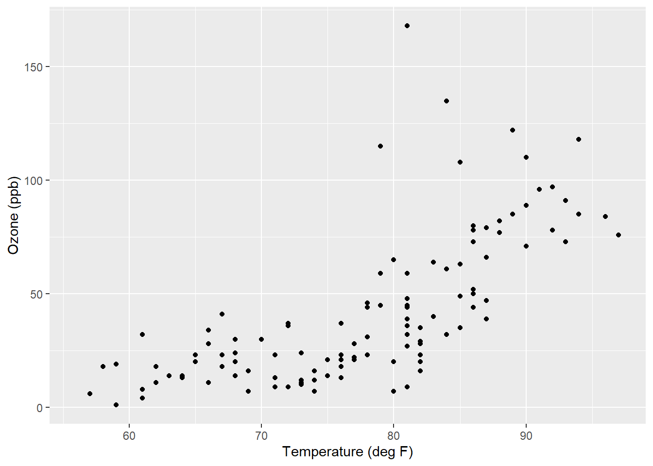
In R, the lm() function fits regression models. We will use it to model ozone (the response variable) using temperature (the independent variable). Response variables are added to the left of the ~ sign and independent variables to the right. Adding a -1 after the independent variable will specify that we’re interested in fitting a simple proportions model. We’ll name the regression model object lm.ozone and use the summary() function to obtain the regression output:
lm.ozone <- lm(Ozone ~ Temp -1, data = air)
summary(lm.ozone)
##
## Call:
## lm(formula = Ozone ~ Temp - 1, data = air)
##
## Residuals:
## Min 1Q Median 3Q Max
## -38.47 -23.26 -12.46 15.15 121.96
##
## Coefficients:
## Estimate Std. Error t value Pr(>|t|)
## Temp 0.56838 0.03498 16.25 <2e-16 ***
## ---
## Signif. codes: 0 '***' 0.001 '**' 0.01 '*' 0.05 '.' 0.1 ' ' 1
##
## Residual standard error: 29.55 on 115 degrees of freedom
## (37 observations deleted due to missingness)
## Multiple R-squared: 0.6966, Adjusted R-squared: 0.6939
## F-statistic: 264 on 1 and 115 DF, p-value: < 2.2e-16The R output includes the following metrics:
- a recall of the function fit in
lm(), - a five-number summary of the residuals of the model,
- a summary of the coefficients of the model with significant codes, and
- model summary statistics including residual standard error and R-squared values.
The estimated slope \(\hat\beta_1\) is found under the Estimate column next to the variable Temp. To predict the ozone level, we multiply the temperature by 0.56838. In other words, the formula can be written as \(Ozone = 0.56838*Temp\). As an example, if the temperature is 70 degrees, the model would predict an ozone level of \(0.56838*70 = 39.8ppb\).
8.4.2 Simple linear regression
The simple linear regression model adds back the y-intercept value \(\beta_0\) that we exclude in the simple proportions model:
\[y = \beta_0 + \beta_1{x} + \varepsilon\]
When we predict y, we want the regression line to be as close as possible to the data points in the vertical direction. This means selecting the appropriate values of \(\beta_0\) and \(\beta_1\), bringing us to the concept of least squares. We will find the values for the intercept and slope that minimizes the residual sums of squares (SSR), calculated as:
\[SSR = {\sum_{i = 1}^{n} \varepsilon_i^2} = {\sum_{i = 1}^{n} (y_i - (\hat\beta_0 + \hat\beta_1{x}))^2}\]
The residuals \(\varepsilon_i\) can be visualized as the vertical distances between the points and the least-squares regression line:
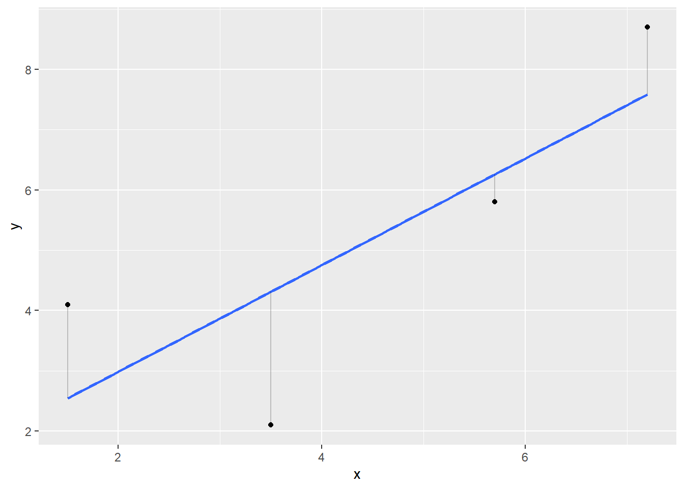
FIGURE 8.9: Regression line (blue) with observed values (black) and residual values representing the vertical distance between observed values and the regression line.
If we were to manually calculate the values for the intercept and slope in a simple linear regression, we need to determine the mean and standard deviation of both x and y and make some other calculations. The slope \(\hat\beta_1\) is calculated as:
\[\hat\beta_1 = \frac{S_{xy}}{S_{xx}}\]
where
\[S_{xy} = \sum_{i = 1}^{n} (x_i-\bar{x})(y_i-\bar{y})\]
\[S_{xx} = \sum_{i = 1}^{n} (x_i-\bar{x})^2\] You can read both \(S_{xy}\) and \(S_{xx}\) as the “sum of all x and y values” and the “sum of all squared x values.” After calculating the slope, the intercept can be found as:
\[\hat\beta_0 = \bar{y} - \hat\beta_1\bar{x}\]
The lm() function in R is much simpler for a simple linear regression model because we can remove the -1 statement that we added for the simple proportions model. The regression model object lm.ozone.reg specifies the simple linear regression for the New York City ozone data:
lm.ozone.reg <- lm(Ozone ~ Temp, data = air)
summary(lm.ozone.reg)
##
## Call:
## lm(formula = Ozone ~ Temp, data = air)
##
## Residuals:
## Min 1Q Median 3Q Max
## -40.729 -17.409 -0.587 11.306 118.271
##
## Coefficients:
## Estimate Std. Error t value Pr(>|t|)
## (Intercept) -146.9955 18.2872 -8.038 9.37e-13 ***
## Temp 2.4287 0.2331 10.418 < 2e-16 ***
## ---
## Signif. codes: 0 '***' 0.001 '**' 0.01 '*' 0.05 '.' 0.1 ' ' 1
##
## Residual standard error: 23.71 on 114 degrees of freedom
## (37 observations deleted due to missingness)
## Multiple R-squared: 0.4877, Adjusted R-squared: 0.4832
## F-statistic: 108.5 on 1 and 114 DF, p-value: < 2.2e-16Note that in the Coefficients section we now have an estimate for both the intercept and slope. The simple linear regression formula can be written as \(Ozone = -146.9955+2.4287*Temp\). If the temperature is 70 degrees, the model would predict an ozone level of \(-146.9955+2.4287*70 = 23.0ppb\).
The slopes for the simple proportions and simple linear regression model result in starkly different values: 0.56838 and 2.4287. This also explains the differences noted between the prediction of ozone when the temperature is 70 degrees (39.8 versus 23.0 ppb). The positioning of where the regression line crosses the y-axis (i.e., the y-intercept) influences your predictions. For the ozone predictions, we can add linear regression lines for the simple proportions and simple linear regression model using the geom_abline() statement and adding the values for the slope and intercept:
ggplot(air, aes(x = Temp, y = Ozone)) +
  geom_point() +
  labs(y = "Ozone (ppb)", x = "Temperature (deg F)") +
  geom_abline(intercept = 0, slope = 0.56838, col = "blue") +
geom_abline(intercept = -146.9955, slope = 2.4287, col = "red") 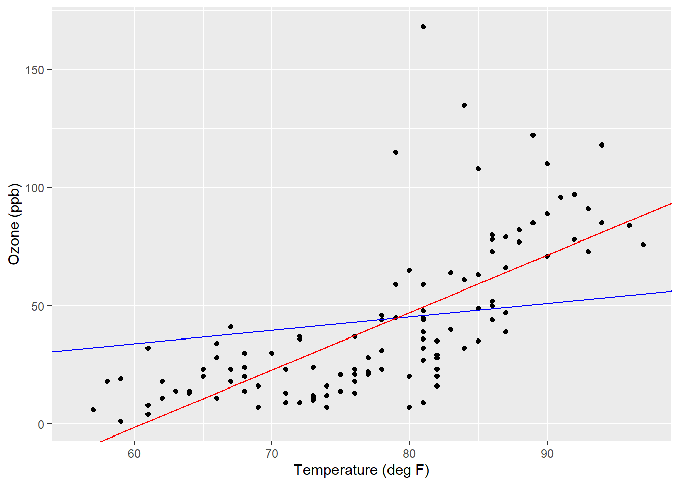
FIGURE 8.10: Regression lines for a simple proportions model (blue) and simple linear regression model (red) applied to the ozone data.
Note the differences in slopes as they appear through the data. We can “zoom out” to see the intercept values and where they cross the y-axis. To do this we can alter the scale of the axes using scale_x_continuous() and scale_y_continuous() and change the minimum and maximum values in the limits statement:
ggplot(air, aes(x = Temp, y = Ozone)) +
  geom_point() +
  labs(y = "Ozone (ppb)", x = "Temperature (deg F)") +
  geom_abline(intercept = 0, slope = 0.56838, col = "blue") +
  geom_abline(intercept = -146.9955, slope = 2.4287, col = "red") +
  scale_x_continuous(limits = c(0, 100)) +
scale_y_continuous(limits = c(-200, 200)) 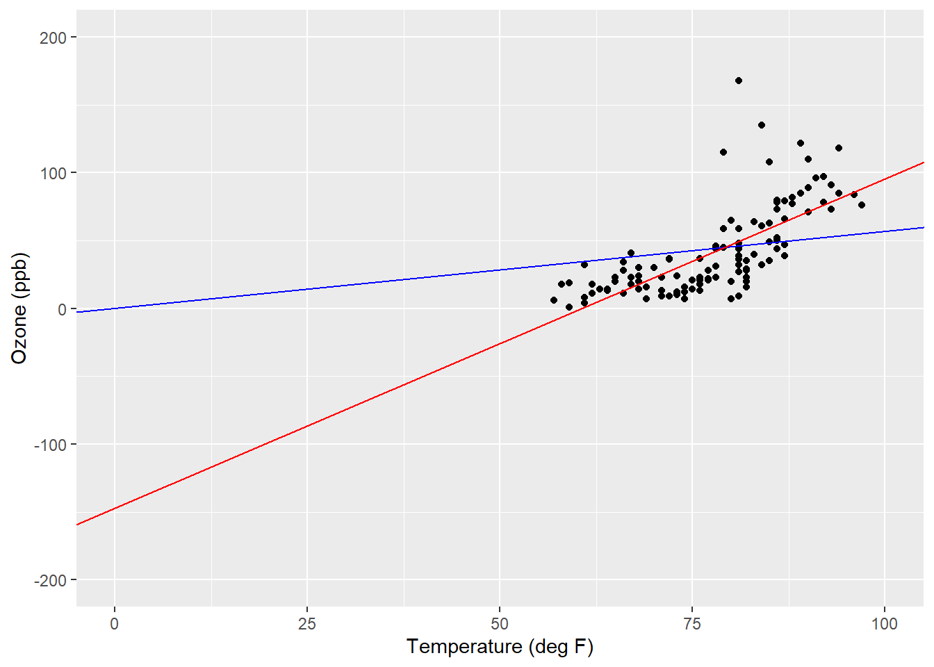
FIGURE 8.11: Regression lines showing y-intercept values for a simple proportions model (blue) and simple linear regression model (red) applied to the ozone data.
By looking at the data like this, we can see the impact of “forcing” the regression line through the origin of the simple proportions model. The range of temperature values is small, generally from 60 to 100 degrees Fahrenheit, and the simple linear regression line compensates for this by providing a negative value for the y-intercept.
8.4.3 Exercises
8.6 Replicate the model that Christensen et al. (1996) fit to the cwd data (see Question 8.5). Fit a simple linear regression using the lm() function with the density of coarse woody debris (cwd_obs) as the dependent variable and the density of trees (TreeDensity) as the independent variable. How do the values for the intercept and slope you find compare to what the original authors found?
8.7 Now, fit a simple proportions model to the cwd data. How does the value for the estimated slope \(\hat{\beta}_1\) compare to the value you found in the simple linear regression?
8.8 Create a scatter plot showing the density of coarse woody debris and density of trees. Add a linear regression line to the scatter plot between the density of coarse woody debris and trees by typing stat_smooth(method = "lm") to your ggplot() code. This will present the simple linear regression line with 95% confidence bands.
8.5 Inference in regression
Up to this point we’ve been discussing regression in the context of being able to make predictions about variables of interest. We can use the principles of least squares to make inference on those variables, too. We can integrate hypothesis tests and other modes of inference into applications of linear regression. This includes performing hypothesis tests for the intercept and slope and calculating their confidence intervals. The components of linear regression can be viewed in an analysis of variance table which can tell us about the strength of the relationship between the independent and dependent variables.
A linear regression can estimate values for the intercept \(\hat{\beta}_0\) and slope \(\hat{\beta}_1\). But how do we know if they are any good? In other words, do the intercept and slope differ from 0? Null hypotheses can be specified for the slope as \(H_0: \hat{\beta}_1 = 0\) with the alternative hypothesis \(H_A: \hat{\beta}_1 \ne 0\). The result of this hypothesis test will reveal if the regression line is flat or if it has a slope to it (either positive or negative).
We can conduct a simple linear regression between any two variables. This section will focus on how good the regression is and how we make inference from it.
8.5.1 Partitioning the variability in regression
We can partition the variability in a linear regression into its components. These include:
- the regression sums of squares \(SS(Reg)\), the amount of variability explained by the regression model,
- the residual sums of squares \(SS(Res)\), the error or amount of variability not explained by the regression model,
- the total sums of squares \((TSS)\), the total amount of variability (i.e., \(TSS = SS(Reg) + SS(Res)\)).
If we have each observation of the dependent variable \(y_i\), its estimated value from the regression \(\hat{y}_i\), and its mean \(\bar{y}\), we can calculate the components as
\[TSS = \sum_{i = 1}^{n} (y_i-\bar{y})^2\] \[SS(Reg) = \sum_{i = 1}^{n} (\hat{y_i}-\bar{y})^2\] \[SS(Res) = \sum_{i = 1}^{n} (y_i-\hat{y_i})^2\]
We can keep track of all of the components of regression in an analysis of variance (ANOVA) table. The table has rows for \(SS(Reg)\), \(SS(Res)\), and \(TSS\). The degrees of freedom for \(SS(Reg)\) are 1 because we’re using one independent variable in a simple linear regression. The degrees of freedom for \(SS(Res)\) are \(n-2\) because we’re estimating two regression coefficients \(\hat\beta_0\) and \(\hat\beta_1\). Just like the \(TSS\) can be found by summing the regression and residual component, so too can its degrees of freedom (\(n-1\)).
Mean square values for the regression (\(MS(Reg)\)) and residual components (\(MS(Res)\)) can be calculated by dividing the sums of squares by the corresponding degrees of freedom. The value for \(MS(Res)\) can be thought of as the “bounce” around the fitted regression line. In a “perfect” regression where you can draw a linear line between all points, \(MS(Res)\) will be close to 0. With natural resources, we often work with data that are messy, so we expect larger values for \(MS(Res)\).
In fact, \(MS(Res)\) is really only meaningful for our calculations. If we take the square root of it, we obtain the residual standard error, the value provided in R output. In the ozone-temperature data, the residual standard error was 23.71 ppb of ozone. If temperature was not correlated with ozone, a higher residual standard error would result. Conversely, if temperature was more highly correlated with ozone, a lower residual standard error would result.
The value in the right-most column of the ANOVA table shows the \(F\) statistic, which is associated with a hypothesis test for the overall regression that tells you if the model has predictive capability. In simple linear regression, the \(F\) test examines a null hypothesis that the slope of your model \(\hat\beta_1\) is equal to zero. In other words, regressions with larger \(F\) values provide evidence against the null hypothesis, i.e., a trend exists between your independent and dependent variable.
The ANOVA table and corresponding calculation can be viewed in a compact form:
| Source | Degrees of freedom | Sums of squares | Mean square | F |
|---|---|---|---|---|
| Regression | 1 | SS(Reg) | MS(Reg) = SS(Reg)/1 | MS(Reg) / MS(Res) |
| Residual | n-2 | SS(Res) | MS(Res) = SS(Res)/n-2 |
|
| Total | n-1 | TSS |
|
|
The anova() function in R produces the ANOVA table. Consider the ozone-temperature regression lm.ozone.reg from earlier in this chapter:
anova(lm.ozone.reg)## Analysis of Variance Table
##
## Response: Ozone
## Df Sum Sq Mean Sq F value Pr(>F)
## Temp 1 61033 61033 108.53 < 2.2e-16 ***
## Residuals 114 64110 562
## ---
## Signif. codes: 0 '***' 0.001 '**' 0.01 '*' 0.05 '.' 0.1 ' ' 1The row labeled Residuals corresponds to the residual sums of squares while the Temp row represents the regression sums of squares. The R output includes a corresponding p-value of the regression (Pr(>F)) which can then be compared to a specified level of significance to evaluate a hypothesis test on the regression (i.e., \(\alpha = 0.05\)). Note the total sums of squares is not shown in the R output, but to summarize we can add it to our table:
| Source | Degrees of freedom | Sums of squares | Mean square | F |
|---|---|---|---|---|
| Temp | 1 | 61033 | 61033 | 108.53 |
| Residual | 114 | 64110 | 562 |
|
| Total | 115 | 125143 |
|
|
DATA ANALYSIS TIP: R attempts to make your life easier by also providing asterisks next to your variables indicating thresholds of significance. Aside from reporting these thresholds, it is always a good practice to report the actual p-value obtained from your statistical analysis. It is more transparent and allows your reader to better interpret your analysis.
As you can see in the figure, there is a healthy amount of “scatter” between the regression line and the ozone-temperature observations. This can be related to the sums of squares values from the regression. The ANOVA table indicates that the sums of squares for Temp is approximately the same as for the residuals (61,033 versus 64,110). More broadly, varying amounts of scatter around regression lines, along with the steepness of slopes, can be related to sums of squares values. Regressions with large values for \(SS(Reg)\) result in steep slopes, while regressions with large values for \(SS(Res)\) result in more scatter around the regression line:
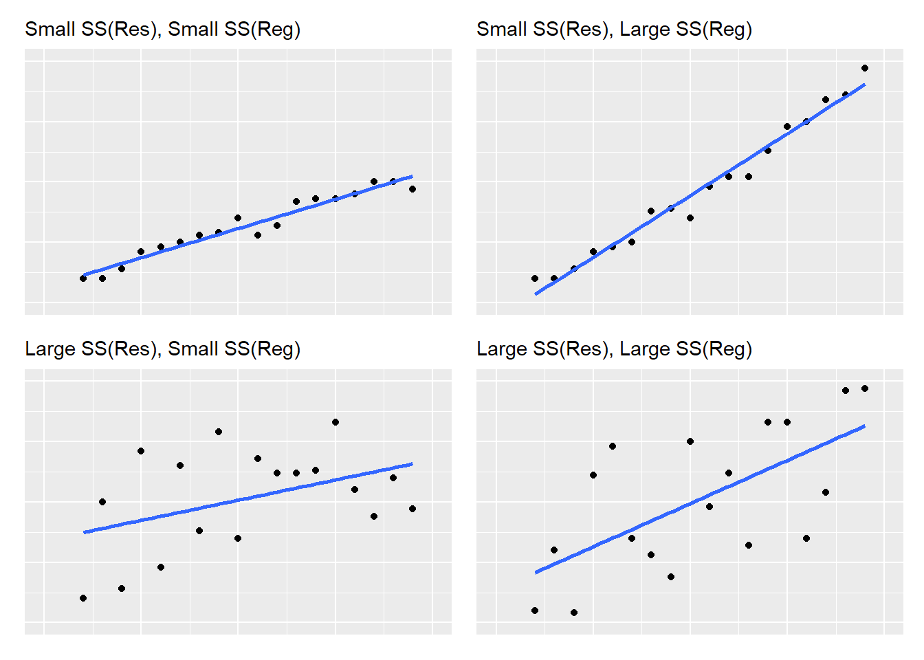
FIGURE 8.12: A visual representation of regression and residual sums of squares values as the relate to linear regression.
After creating a scatter plot of your independent and dependent variables, you will have a solid understanding about the relative values of sums of squares and how they influence your regression.
8.5.2 Coefficient of determination (R-squared)
The coefficient of determination, or more commonly termed, the \(R^2\), measures the strength of the relationship between the dependent and independent variables. If this sounds similar to the Pearson’s correlation coefficient, it’s because it is. In simple linear regression, the \(R^2\) value can be obtained by squaring \(r\), the Pearson correlation coefficient. In doing this, \(R^2\) always takes a value between 0 and 1. The \(R^2\) is a widely used metric to assess the performance of a regression model.
Higher \(R^2\) values indicate a greater portion of \(SS(Reg)\) relative to \(TSS\). As an example application, an \(R^2\) of 0.75 means that 75% of the variability in the response variable is explained by the regression model. In other words,
- if \(R^2\) = 1, all of the variability is explained by the regression model (i.e., large \(SS(Reg)\)) and
- if \(R^2\) = 0, all of the variability is due to error (i.e., small \(SS(Reg)\)).
Values can be calculated by:
\[R^2 = \frac{SS(Reg)}{TSS} = 1-\frac{SS(Res)}{TSS}\]
In R output, \(R^2\) values are shown as Multiple R-squared values. In our example, 48.77% of the variability in the ozone is explained by temperature. An adjusted \(R^2\) value, \(R_{adj}^2\), can also be determined and is provided in R output. The \(R_{adj}^2\) value incorporates how many \(k\) independent variables are in your regression model and “penalizes” you for additional variables, as seen in the equation to determine the value:
\[R_{adj}^2 = 1-\bigg(\frac{(1-R^2)(n-1)}{n-k-1}\bigg)\]
Values for \(R_{adj}^2\) will decrease as more variables are added to a regression model (e.g., in multiple regression, the focus of Chapter 9). Similarly, \(R_{adj}^2\) can never be greater than \(R^2\). Interestingly, a mathematical proof can show that the value of \(R^2\) will never decrease when new variables are added, even when those variables have no correlation with your response variable of interest.
In our example, the \(R_{adj}^2\) for the ozone regression is 48.32%, slightly less than the \(R^2\) value. In simple linear regression, reporting \(R^2\) is appropriate because \(k = 1\). In applications when \(k>1\), \(R_{adj}^2\) is best to report.
8.5.3 Inference for regression coefficients
We learned earlier that the \(F\) statistic in regression examines whether or not the slope of \(\hat\beta_1\) is equal to zero. Another way to examine the slope of our regression line is to make inference on \(\hat\beta_1\) directly. Statistical tests are run on the regression coefficient associated with the slope parameter to examine the null hypothesis \(H_0: \hat\beta_1 = 0\). The t test statistic follows a t distribution with \(n-2\) degrees of freedom:
\[t=\frac{\hat\beta_1}{\sqrt{MS(Res)\bigg(\frac{1}{S_{xx}}\bigg)}}\]
Although it’s less common in practice, you can also examine the intercept with a null hypothesis \(H_0: \hat\beta_0 = 0\) using the following test statistic:
\[t=\frac{\hat\beta_0}{\sqrt{MS(Res)\bigg(\frac{1}{n}+\frac{\bar{x}^2}{S_{xx}}\bigg)}} \]
You can also test whether or not \(\hat\beta_0\) or \(\hat\beta_1\) is different from a constant value other than 0 (termed \(\beta_{0,0}\) and \(\beta_{1,0}\)). To do this, replace the numerator in the above equations with \(\hat\beta_0-\beta_{0,0}\) or \(\hat\beta_1-\beta_{1,0}\), respectively. In R, the summary() function provides inference for the regression coefficients in the Std. Error, t value, and Pr(>|t|) columns. Recall the lm.ozone.reg model:
summary(lm.ozone.reg)##
## Call:
## lm(formula = Ozone ~ Temp, data = air)
##
## Residuals:
## Min 1Q Median 3Q Max
## -40.729 -17.409 -0.587 11.306 118.271
##
## Coefficients:
## Estimate Std. Error t value Pr(>|t|)
## (Intercept) -146.9955 18.2872 -8.038 9.37e-13 ***
## Temp 2.4287 0.2331 10.418 < 2e-16 ***
## ---
## Signif. codes: 0 '***' 0.001 '**' 0.01 '*' 0.05 '.' 0.1 ' ' 1
##
## Residual standard error: 23.71 on 114 degrees of freedom
## (37 observations deleted due to missingness)
## Multiple R-squared: 0.4877, Adjusted R-squared: 0.4832
## F-statistic: 108.5 on 1 and 114 DF, p-value: < 2.2e-16The standard error of the regression coefficients are calculated in the denominators of the test statistics for \(\hat\beta_0\) and \(\hat\beta_1\) and the corresponding t-statistics are provided in R output. To gauge how “good” your regression coefficients are, relative to your regression estimates, values for standard errors should be small and t statistics large. Of course, R makes it easy for the analysts by providing the corresponding p-value for the intercept and slope in the rightmost column.
The confidence interval for the regression coefficient has a familiar form: estimate ± t x the standard error of estimate. After specifying a level of significance \(\alpha\), a \((1-\alpha)100\)% confidence interval for \(\beta_1\) is
\[\hat\beta_1=t_{n-2,\alpha/2}{\sqrt{MS(Res)\bigg(\frac{1}{S_{xx}}\bigg)}}\]
and a \((1-\alpha)100\)% confidence interval for \(\beta_0\) is
\[\hat\beta_0 =t_{n-2,\alpha/2}\sqrt{MS(Res)\bigg(\frac{1}{n}+\frac{\bar{x}^2}{S_{xx}}\bigg)}\]
With a p-value close to zero, in the ozone regression we end up rejecting the null hypothesis and conclude that each of our regression coefficients are “good.” After calculating the upper and lower bounds of the confidence interval, another way to assess the importance of the regression coefficients is to determine whether or not the value 0 is contained within it. For example, if 0 is included in the confidence limits for the slope coefficient, it indicates you’re dealing with a flat regression line whose slope is not different than 0.
In R, the confint() function provides the confidence intervals for a model fit with lm():
confint(lm.ozone.reg)## 2.5 % 97.5 %
## (Intercept) -183.222241 -110.768741
## Temp 1.966871 2.890536Different confidence levels can be specified by adding the level = statement. For example, if we wanted to view the 80% confidence intervals instead of the default 95%:
confint(lm.ozone.reg, level = 0.80)## 10 % 90 %
## (Intercept) -170.568057 -123.422925
## Temp 2.128191 2.7292158.5.4 Making predictions with a regression model
The ability to make predictions is one of the main reasons analysts perform regression techniques. For something that’s relatively easy to measure (the independent variable), we can use regression to predict a hard-to-measure attribute (our dependent variable). After fitting a regression equation, you can write a customized function in R that applies your regression equation to a different data set or new observations that are added to an existing data set.
For a built-in approach in R, the predict() function allows you to apply regression equations to new data. For example, consider we have three new measurements of Temp and we would like to predict the corresponding level of Ozone based on the simple linear regression model we developed earlier. The three measurements are contained in the ozone_new data:
ozone_new <- tribble(
  ~Temp,
  65,
  75,
  82
)
The first argument of predict() is the model object that created your regression and the second argument is the data in which you want to apply the prediction. We’ll use the mutate() function to add a column called Ozone_new that provides the predicted ozone value:
ozone_new %>%
  mutate(Ozone_pred = predict(lm.ozone.reg, ozone_new))
## # A tibble: 3 x 2
## Temp Ozone_pred
## <dbl> <dbl>
## 1 65 10.9
## 2 75 35.2
## 3 82 52.2A word of caution on the application of regression equations: they should only be used to make predictions about the population from which the sample was drawn. Extrapolation happens when a regression equation is applied to data from outside the range of the data used to develop it. For example, we would be extrapolating with our regression equation if we applied it to estimate ozone levels on days cooler than 50 degrees Fahrenheit. There are no observations in the data set used to develop the original regression lm.ozone.reg that were cooler than 50 degrees Fahrenheit.
As you seek to use other equations to inform your work in natural resources, it is important to understand the methods used in other studies that produced regressions. Having knowledge of the study area, population of interest, and sample size will allow you to determine which existing regression equations you can use and what the limitations are for applying equations that you develop to new scenarios.
8.5.5 Exercises
8.9 Print out the ANOVA table you developed earlier in question 8.6 that estimated the density of coarse woody debris based on the density of trees. Using manual calculations in R, calculate the \(R^2\) value based on the sums of squares values provided in the ANOVA table.
8.10 Using manual calculations in R, calculate the \(R_{adj}^2\) value for the regression that estimated the density of coarse woody debris based on the density of trees.
8.11 Perform a literature search to find a study that performed linear regression using data from an organism that interests you. What were the independent and dependent variables used and what were the \(R_2\) values that were reported? Are these findings surprising to you?
8.12 With the air data set, explore the relationship between ozone levels (Ozone ) and wind speed (Wind).
- Using
ggplot(), make a scatter plot of these variables and add a linear regression line to the plot. Are ozone levels higher on windy or calm days? - Fit a simple linear regression model of
Ozone(response variable) withWindas the explanatory variable. Type the resulting coefficients for the \(\hat\beta_0\) and \(\hat\beta_1\). - Based on the summary output from the regression, calculate the Pearson correlation coefficient between
OzoneandWind. - Find the 90% confidence limits for the \(\hat\beta_0\) and \(\hat\beta_1\) regression coefficients.
- Use your developed model to make ozone predictions for two new observations: when wind speed is 6 and 12 miles per hour.
8.13 A store wishes to know the impact of various pricing policies for milk on monthly sales. Using a data set named milk, they performed a simple linear regression between milk price (price) in dollars per gallon and sales in hundreds of gallons (sales). The following output results:
##
## Call:
## lm(formula = price ~ sales, data = milk)
##
## Residuals:
##      Min       1Q   Median       3Q      Max
## -0.50536 -0.15737 -0.02143  0.17388  0.42411
##
## Coefficients:
##             Estimate Std. Error t value Pr(>|t|)
## (Intercept)  5.65357    0.78876   7.168 9.54e-05 ***
## sales       -0.07054    0.02389  -2.953   0.0183 *
## ---
## Signif. codes:  0 '***' 0.001 '**' 0.01 '*' 0.05 '.' 0.1 ' ' 1
##
## Residual standard error: 0.2882 on 8 degrees of freedom
## Multiple R-squared:  0.5215, Adjusted R-squared:  0.4617
## F-statistic:  8.72 on 1 and 8 DF,  p-value: 0.01834
Using the R output, answer the following questions as TRUE or FALSE.
- The price of milk was the independent variable in this simple linear regression.
- There were 8 observations in the milk data set.
- The Pearson correlation coefficient between milk price and number of sales was 0.7221.
- For every dollar increase in the price of milk, sales decrease by seven cents.
- For the median residual, the regression line predicts a value greater than its observed value (i.e., the regression “overpredicts” this value).
8.6 Model diagnostics in regression
Often in statistics we perform some analyses, then conduct some different analyses to see if it was even appropriate to conduct those analyses in the first place. Only then can we conclude whether or not it was appropriate to employ specific statistical methods. This is exactly what we’ll do in regression, by visually inspecting our model’s results and comparing them to what is expected.
Now that we’ve learned how to apply it in practice, we’ll take a step back and visit the assumptions of linear regression.
8.6.1 Assumptions in regression
There are four core assumptions in simple linear regression. Assume we have \(n\) observations of an explanatory variable \(x\) and a response variable \(y\). Our goal is to study or predict the behavior of \(y\) for given values of \(x\). The assumptions are:
- The means of the population under study are linearly related through the simple linear regression equation:
\[\mu_i = \beta_0 + \beta_1x_i {\mbox{ for }} i = 1, 2, 3, ...n\]
- Each population has the same standard deviation (or constant variance). Written mathematically,
\[\sigma = \sigma_1 = \sigma_2 = \sigma_3 = ... = \sigma_n\]
- The response measurements are independent normal random variables (normality). This assumption relies on the requirement that your response variable is normally distributed. As we saw in Chapter 2, the normal distribution is the foundation for statistical inference and its mean and standard deviation are denoted by \(\mu\) and \(\sigma\), respectively:
\[Y_i = N(\mu_i = \beta_0 + \beta_1x_i, \sigma)\]
- Observations (e.g., \(x_i\) and \(y_i\)) are measured without error. This may be an intuitive assumption, however, it can be overlooked in many applications. It is essential to have a thorough understanding of how the data were collected and processed before performing regression (and other statistical techniques). Two common problems in natural resources that lead to a violation of this assumption occur when (1) technicians measure experimental units with faulty equipment and (2) analysts are uncertain of the units associated with variables when performing statistical analyses (e.g., feet versus meters versus decimeters).
The US Geological Survey: https://www.usgs.gov/products/data-and-tools/data-management/manage-quality
The US Department of Agriculture - Forest Service, Forest Inventory and Analysis: https://www.fia.fs.fed.us/library/fact-sheets/data-collections/QA.pdf
It is a good idea to become acquainted with any QA/QC processes that are used in your organization or discipline prior to analyzing with data.
8.6.2 Diagnostic plots in regression
8.6.2.1 Residual plots
You can check the conditions for regression inference by looking at graphs of the residuals, termed residual plots. Residual plots display the residual values \(y_i-\hat{y}_i\) on the y-axis against the fitted values \(\hat{y}_i\) on the x-axis. The ideal plot displays an even dispersion of residuals as you increase the fitted values \(\hat{y}_i\). The residual should be evenly dispersed around zero, with approximately half of them positive and half of them negative. A trend line drawn through the residuals should be relatively flat and centered around 0.
In R, we will calculate predictions of ozone with the predict() function, and then manually calculate the residual value:
air <- air %>%
  mutate(Ozone_pred = predict(lm.ozone.reg, air),
         resid = Ozone - Ozone_pred)
We’ll plot the residuals using ggplot() to assess our regression. Adding the default setting for stat_smooth(se = F) helps to visualize the trend in the residuals:
p.air.resid <- ggplot(air, aes(x = Ozone_pred, y = resid)) +
  geom_point() +
  ylab("Residual") +
  xlab("Fitted value") +
  stat_smooth(se = F)
p.air.resid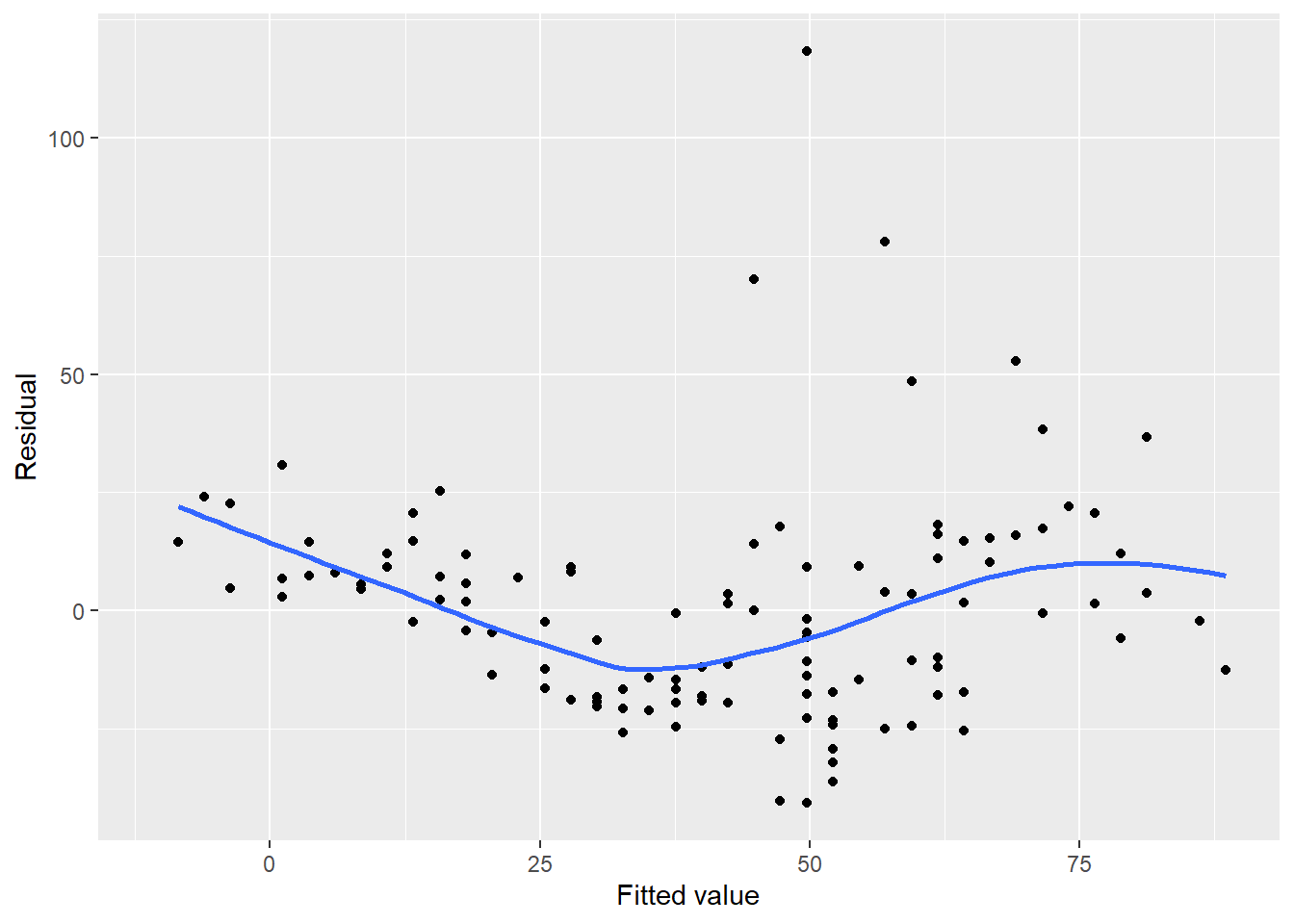
FIGURE 8.13: Residual plot for ozone in New York City.
Notice a few concerns with the ozone residual plot. First, there appears to be a trend in the plot with negative residuals in the middle of the data and positive residuals on the tails of the data, forming the U-shaped smoothed trend line. There also appear to be greater values for residuals as the fitted values increase. We will remedy these issues in the regression later on in the chapter.
Compare the previous residual plot to one from a regression fit to 50 observations of Iris versicolor from the iris data set. The regression estimates the width of sepal flowers using their length as the independent variable:
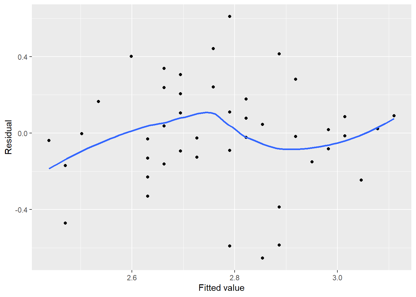
FIGURE 8.14: Residual plot for sepal width on Iris versicolor flowers.
In this case, no serious trends exist in the residuals, all residuals are evenly distributed between -0.5 and 0.5 cm, and no residuals appear set apart from the rest. In other words, the residual plot for iris sepal width is what we strive for in linear regression and helps us to check off that our regression meets the qualifications for Assumption #2.
We could continue to make manual calculations in R that determine the residuals and other values useful in our regression model diagnostics. However, the broom package can help. Built on the tidyverse, the broom package summarizes key information about statistical objects and stores them in tibbles:
# install.packages("broom")
library(broom)
The augment() function from the package extracts important values after performing a regression. We can apply it to the lm.ozone.reg output and view the results in a tibble called air.resid:
air.resid <- augment(lm.ozone.reg)
air.resid
## # A tibble: 116 x 9
## .rownames Ozone Temp .fitted .resid .hat .sigma .cooksd
## <chr> <int> <int> <dbl> <dbl> <dbl> <dbl> <dbl>
## 1 1 41 67 15.7 25.3 0.0200 23.7 0.0119
## 2 2 36 72 27.9 8.13 0.0120 23.8 0.000719
## 3 3 12 74 32.7 -20.7 0.0101 23.7 0.00393
## 4 4 18 62 3.58 14.4 0.0330 23.8 0.00651
## 5 6 28 66 13.3 14.7 0.0222 23.8 0.00447
## 6 7 23 65 10.9 12.1 0.0246 23.8 0.00339
## 7 8 19 59 -3.70 22.7 0.0430 23.7 0.0215
## 8 9 8 61 1.16 6.84 0.0361 23.8 0.00162
## 9 11 7 74 32.7 -25.7 0.0101 23.7 0.00605
## 10 12 16 69 20.6 -4.59 0.0162 23.8 0.000313
## # ... with 106 more rows, and 1 more variable: .std.resid <dbl>The tibble contains a number of columns:
.rownames: the identification number of the observation,OzoneandTemp: the values for the dependent (\(y\)) and independent (\(x\)) variable, respectively,.fitted: the predicted value of the response variable \(\hat{y}_i\),.resid: the residual, or \(y_i-\hat{y}_i\),
.hat: the diagonals of the hat matrix from the regression, indicating the influence of observations,.sigma: the estimated residual standard deviation when the observation is dropped from the regression,.cooksd: Cook’s distance, a value indicating the influence of observations, and.std.resid: the standardized residuals
Below we’ll discuss more of these values in depth and plot them to evaluate trends.
8.6.2.2 Standardized residuals
In addition to the residual plot, you can also check the conditions for regression by looking at their standardized values. Standardized residuals represent the residual value \(y_i-\hat{y_i}\) and divide them by their standard deviation. Whereas the residual values are in the units of your response variable, standardized residuals correct for differences by understanding the variability of residuals.
Think back to the normal distribution and the empirical rule. If the data are drawn from a normal distribution, we know that approximately 95% of observations will fall between two standard deviations of the mean. For standardized residuals, we should expect most values should be within \(\pm2\). We can add reference lines to visualize this with the ozone data:
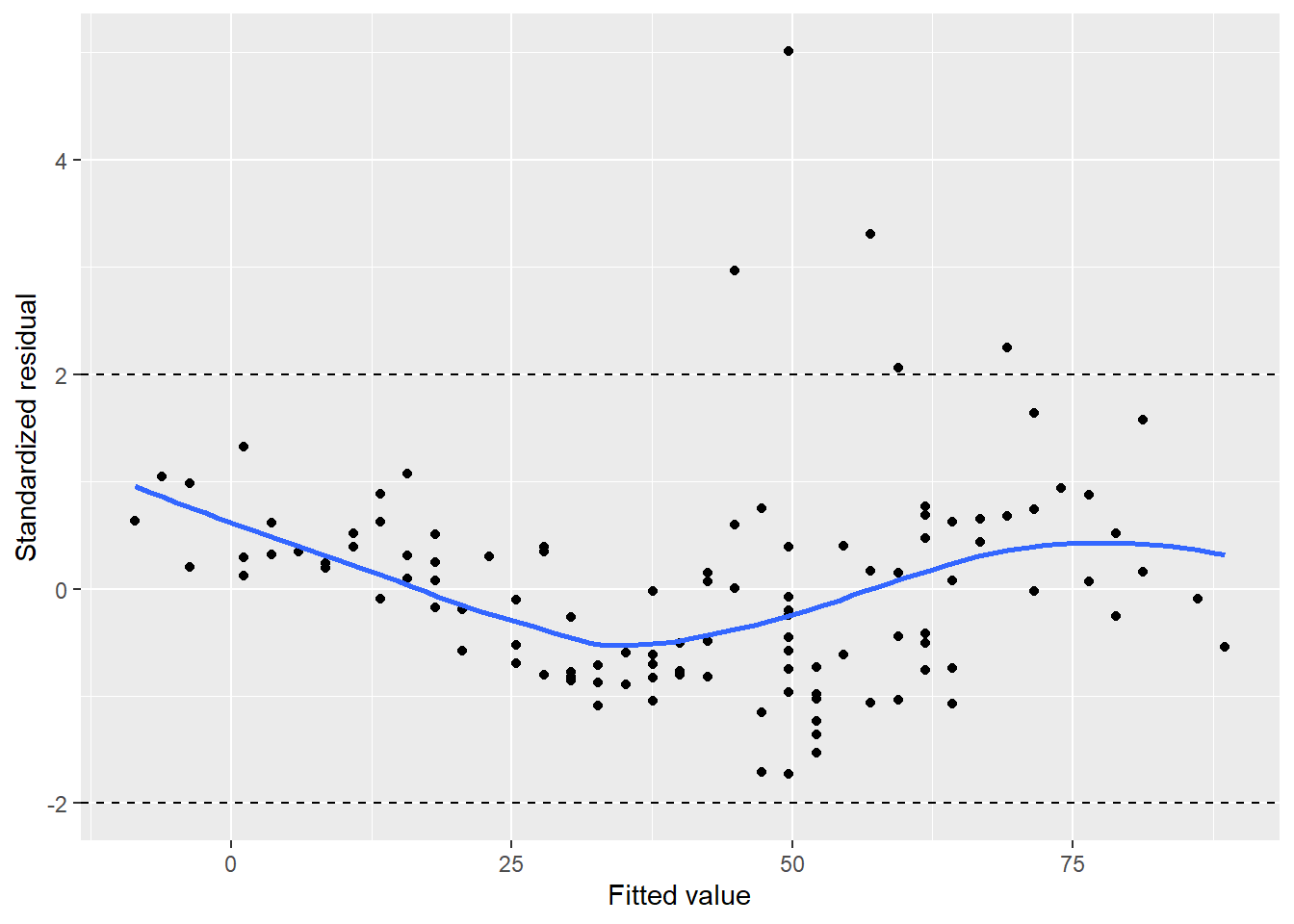
FIGURE 8.15: Standardized residuals for ozone in New York City.
We can see five observations with a standardized residual greater than 2, which may indicate some adjustments needed in our regression model.
8.6.2.3 Square root of standardized residuals
By taking the square root of the standardized residuals, you rescale them so that they have a mean of zero and a variance of one. This eliminates the sign on the residual, with large residuals (both positive and negative) plotted at the top and small residuals plotted at the bottom.
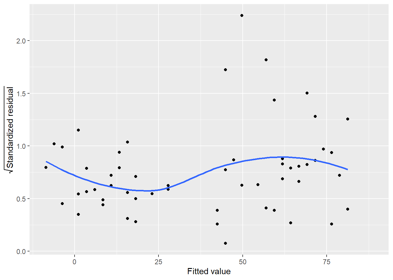
FIGURE 8.16: Square root of standardized residuals for ozone in New York City.
In implementation, the trend line for this plot should be relatively flat. In the ozone example, there is some nonlinearity to the trend line. In particular, note the approximately five observations that continue to stand out as we visualize different representations of the residuals in this regression.
8.6.2.4 Cook’s distance
Cook’s distance is a measurement that allows us to examine specific observations and their influence on the regression. Specifically, it quantifies the influence of each observation on the regression coefficients. On the graph, the observation number is plotted along the x-axis with the distance measurement plotted along the y-axis.
In implementation, the Cook’s values indicate influential data points and can be used to determine where more samples might be needed with your data. Plotting the values as a bar graph allows you to easily spot influential data points.
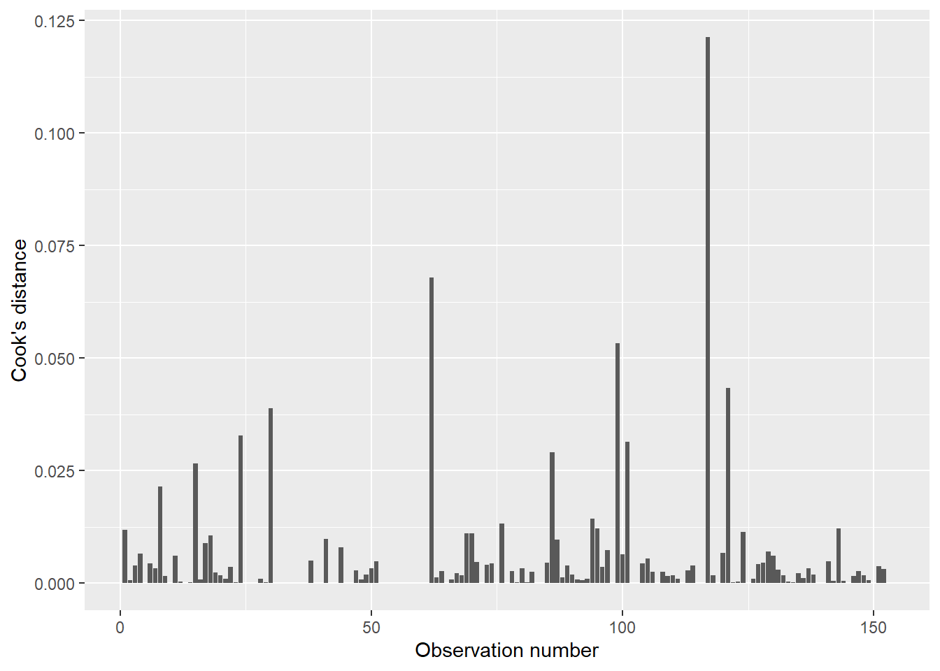
FIGURE 8.17: Cook’s distance for ozone in New York City.
For example, observation numbers 117 and 62 present the highest Cook’s values (0.121 and 0.067, respectively). It is worth checking these influential data points to ensure they are not data entry errors. Open the air data set and you’ll see: while these two observations do not appear to be errors in data entry, they are the two largest recorded measurements of ozone (168 and 135 ppb, respectively). What likely makes these specific points influential is that they occurred on days with relatively mild temperatures (81 and 84 degrees Fahrenheit, respectively).
8.6.2.5 The diagPlot() function
The series of diagnostics plots shown above for the ozone regression can be replicated with the diagPlot() function below. The function requires a regression object termed model and uses ggplot() to stylize them:
diagPlot <- function(model){
# Residuals
p.resid <- ggplot(model, aes(x = .fitted, y = .resid)) +
  geom_point() +
  geom_hline(yintercept = 0, col = "black", linetype = "dashed") +
  ylab("Residual") +
  xlab("Fitted value") +
  stat_smooth(se = F)

# Standardized residuals
p.stdresid <- ggplot(model, aes(x = .fitted, y = .std.resid)) +
  geom_point() +
  geom_hline(yintercept = 2, col = "black", linetype = "dashed") +
  geom_hline(yintercept = -2, col = "black", linetype = "dashed") +
  ylab("Standardized residual") +
  xlab("Fitted value") +
  stat_smooth(se = F)

# Square root of standardized residuals
p.srstdresid <- ggplot(model, aes(x = .fitted,
                                  y = sqrt(abs(.std.resid)))) +
  geom_point() +
  ylab(expression(sqrt("Standardized residual"))) +
  xlab("Fitted value") +
  stat_smooth(se = F)

# Cook's distance
p.cooks <- ggplot(model, aes(x = seq_along(.cooksd), y = .cooksd)) +
  geom_bar(stat = "identity") +
  ylab("Cook's distance") +
  xlab("Observation number")

  return(list(p.resid = p.resid, p.stdresid = p.stdresid,
              p.srstdresid = p.srstdresid, p.cooks = p.cooks))
}
We can apply the function to the data set created by the augment() function in broom, i.e., the data with the residual values and other columns:
p.diag <- diagPlot(air.resid)Extract one of the plots by connecting the function name and plot type with $. Or, add the diagnostic plots in a 2x2 panel by using the patchwork package:
install.packages("patchwork")
library(patchwork)(p.diag$p.resid | p.diag$p.stdresid) /
(p.diag$p.srstdresid | p.diag$p.cooks)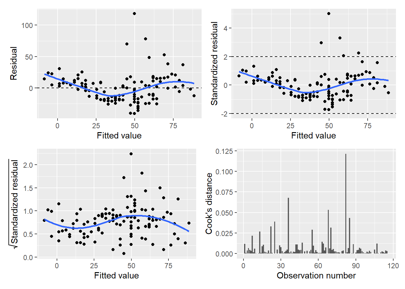
FIGURE 8.18: Panel graph showing four diagnostic plots of the ozone regression model.
8.6.3 How to remedy poor regressions: transformations
After inspecting the diagnostic plots for your regression, you may notice some issues with the performance of your regression model. Fortunately, many techniques exist that can remedy these situations so that you result in a statistical model that meets assumptions. Some of these techniques involve different adjustments within linear regression, or more advanced regression techniques can be evaluated.
The residual plot reveals a lot about the performance of a linear regression model. The appearance of the residuals can be thought of in the context of the assumptions of linear regression presented earlier in this chapter. For example, consider a residual plot with the following appearance:
## # A tibble: 81 x 5
##    ID      my_x resid1 my_rand  resid
##    <chr>  <dbl>  <dbl>   <dbl>  <dbl>
##  1 ID_1  -10     110    0.906   79.6
##  2 ID_1   -9.75  105.   0.628   45.8
##  3 ID_1   -9.5    99.8  0.677   47.5
##  4 ID_1   -9.25   94.8  0.0522 -15.0
##  5 ID_1   -9      90    0.541   28.7
##  6 ID_1   -8.75   85.3  0.0244 -17.9
##  7 ID_1   -8.5    80.8  0.553   24.7
##  8 ID_1   -8.25   76.3  0.992   55.7
##  9 ID_1   -8      72    0.314    2.58
## 10 ID_1   -7.75   67.8  0.410    7.82
## # ... with 71 more rows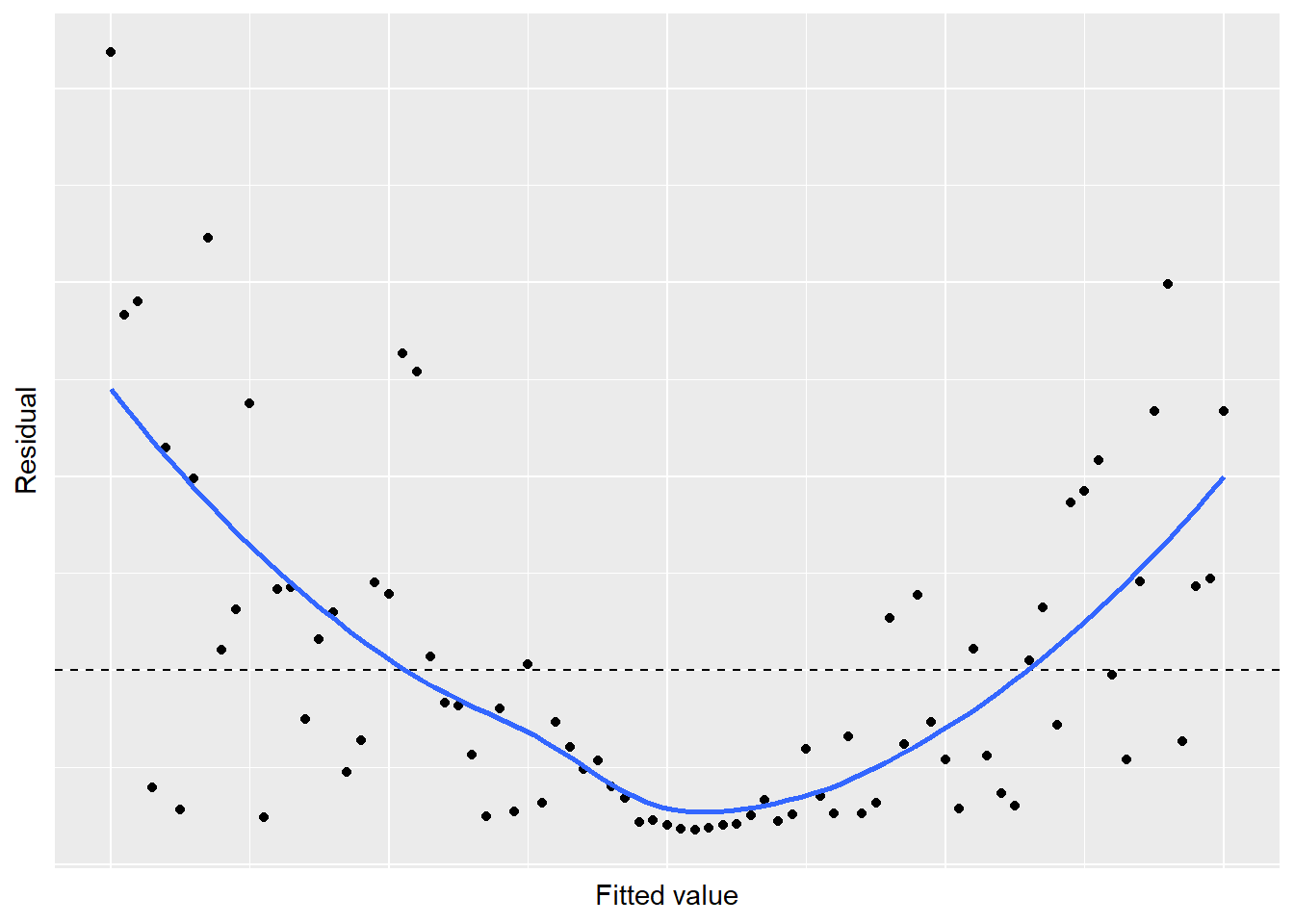
FIGURE 8.19: Simulated residual plot showing violation of the linear relationship in regression.
A U-shaped trend exists in the residuals, indicating some concerns with the regression. Likewise, our residual plot of the ozone-temperature regression displays a similar trend. This patterns violates Assumption 1: there is not a linear relationship between the two variables and a nonlinear trend exists. To remedy regressions that appear like this, consider using nonlinear or polynomial regression techniques (discussed in Chapter 9).
Next, consider a residual plot with the following appearance. While the trend line for the residuals may be centered around zero, the magnitude of the residuals increases as the fitted values increase:
## # A tibble: 81 x 5
##    ID     my_x resid1  my_rand   resid
##    <chr> <dbl>  <dbl>    <dbl>   <dbl>
##  1 ID_1  0      0       9.58     0
##  2 ID_1  0.125  0.141   1.36     0.192
##  3 ID_1  0.25   0.312 -14.5     -4.53
##  4 ID_1  0.375  0.516   4.56     2.35
##  5 ID_1  0.5    0.75   -6.47    -4.86
##  6 ID_1  0.625  1.02  -11.6    -11.8
##  7 ID_1  0.75   1.31    1.05     1.38
##  8 ID_1  0.875  1.64  -11.3    -18.5
##  9 ID_1  1      2      -0.0860  -0.172
## 10 ID_1  1.12   2.39   -1.09    -2.61
## # ... with 71 more rows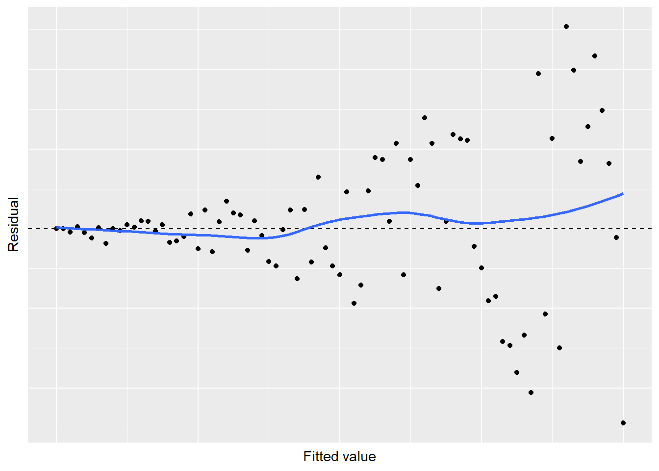
FIGURE 8.20: Simulated residual plot showing violation of the constant variance in regression.
A “megaphone” shape exists in the residuals, indicating some problems with the regression. This pattern violates Assumption 2: the variance is not constant as values increase. Transforming your data can be a way to remedy the problem of non-constant variance. A few “tips and tricks” are noted here, depending on the types of variables in your analysis:
Use the square-root transformation when all \(y_i >0\). This approach works well with count data, i.e., with integers \(i = 1, 2, 3, ... ,n\): \(y_i^2*=\sqrt(y_i)\).
Use the logarithm transformation when all \(y_i >0\). This approach works well to transform both \(y_i\) and \(x_i\): \(y_i^* = log(y_i)\).
Use the reciprocal transformation when you have non-zero data: : \(y_i^* = 1/y_i\).
Use the arc sine transformation on proportions, i.e., with values between 0 and 1: \(y_i^* = arcsin\sqrt{y_i}\).
Note that after transforming variables, your interpretation of the results will change because the units of your variable have been altered. This is another reminder to be mindful of units and as a best practice, always type them into the labels on your axes for any figures and tables you produce.
Finally, consider a residual plot that looks generally good with randomness around 0, except for one or two “outlier” observations:
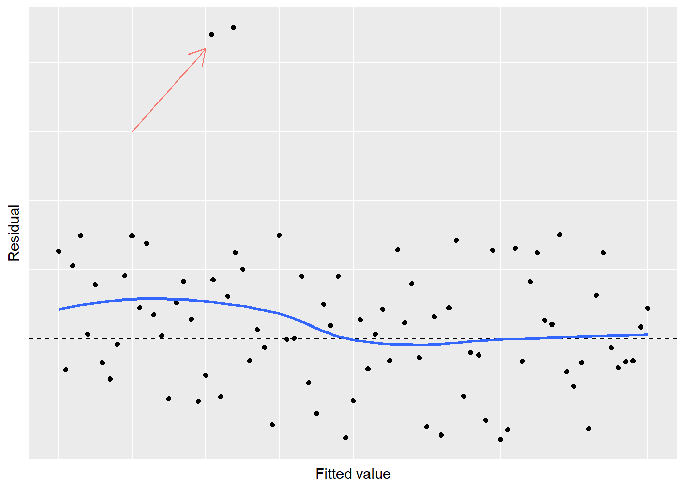
FIGURE 8.21: Simulated residual plot showing violation of normality in regression.
When you observe a few residuals that stand out from the rest, a violation of normality exists. Another graph that can examine the normality of your response variable is the quantile-quantile plot, or Q-Q plot. The Q-Q plot displays the kth observation against the expected value of the kth observation. For any mean and standard deviation, you would expect a straight line to result from data which are normally distributed. In other words, if the data on a normal Q-Q plot follow a straight line, we are confident that we don’t have a serious violation of the assumption that the model deviations are normally distributed.
In R, the Q-Q plot can be generated using stat_qq() and stat_qq_line(). As an example, we can plot the ozone measures from the air data set:
ggplot(air, aes(sample = Ozone)) +
  stat_qq() +
  stat_qq_line()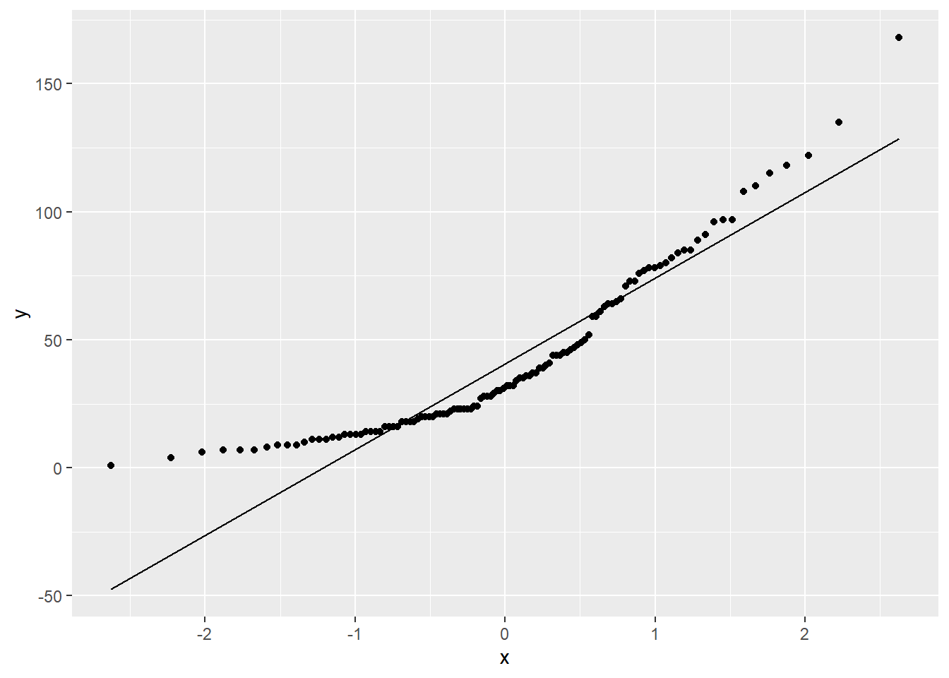
FIGURE 8.22: A quantile-quantile plot of ozone measurements from New York City.
In the diagnostic plots for the regression on ozone measurements, we have noticed some issues that are also apparent in the Q-Q plot. The overall trend line of the values in the Q-Q plot show “sweeps” that do not follow a straight line. To remedy this violation of normality, check data entry and consult other regression techniques depending on the nature of your data.
8.6.4 Exercises
8.15. Recall the regression you developed earlier in question 8.6 that estimated the density of coarse woody debris based on the density of trees.
- With the regression object, run the
augment()function from the broom package to obtain the data set with residual values and other variables. Write R code to calculate the mean and standard deviations of all residual values. - Inspect the regression output by plotting the diagnostic plots using the
diagPlot()function. Investigate the plots of residuals, standardized residuals, square root of standardized residuals, and Cook’s distance. Write two to three sentences that describe the diagnostic plots and any concerns you might have about the fit of the regression. - Create a quantile-quantile plot for the density of coarse woody debris and describe the pattern you see. After your assessment of the plot, are you confident in stating that the data are distributed normally?
8.16 Recall back to question 8.12 which fits the regression of New York City ozone levels with wind speed.
- Provide the output for the residual plot from this regression model. What is the general trend in the residual plot? Which core assumption is violated in this regression and what indicates this violation?
- One way to remedy the violation observed here is to perform a polynomial regression. Polynomial regression is a type of linear regression in which the relationship between the independent variable \(x\) and the dependent variable \(y\) is modeled as an nth degree polynomial. In other words, we can add a squared term of our independent variable
Windto create a second-degree polynomial model. Create a new variable in the air data set using themutate()function that squares the value ofWind. Then, perform a multiple linear regression using bothWindandWindsqto predict the ozone level. You can combine them in the code by adding aWind + Windsqto the right of the tilde~in thelm()function. How do the \(R^2\) and \(R_{adj}^2\) values compare with this model and the one you developed in question 8.12? - Now, provide the output for the residual plot for this new regression model. What has changed about the characteristics of the residual plot? What can you conclude about the assumptions of regression?
- Another way to remedy the residual plots observed in 8.16.a is to log-transform the response variable
Ozone. Log-transforming data is often used as a way to change the data to meet the assumptions of regression (and get a better-looking residual plot). Create a new variable in the air data set calledlog_Ozone. Provide the output for the residual plot this new regression model. What can you conclude about the assumptions of regression?
8.7 Summary
Regression is one of the most commonly used tools in the field of statistics. To estimate one attribute from another, it is first useful to evaluate the correlation between variables. If a correlation exists, simple linear regression techniques can be used to estimate one variable from another. The analysis of variance table can help us to understand the proportion of the model that is explained by the regression (i.e., the regression sums of squares) versus the error (i.e., the residual sums of squares).
Just as statistical inference allows us to assess differences between means and proportions, inference can be performed with regression coefficients. These inferential procedures include performing hypothesis tests on the intercept and slope and providing confidence intervals. Understanding the stability of the regression coefficients will allow us to make reliable predictions for the response variable. Combining our inference with a visual inspection of regression output through diagnostic plots, we can determine whether or not our regression model is appropriate and meets each of the core four assumptions.
The lm() function in R provides a large volume of output for linear regression models and will be used extensively in future chapters. Combining the numerical output with visual assessments of residuals and other model diagnostics, we can evaluate the performance of our regression model. With a thorough grasp of regression, we can begin learning more about more advanced estimation techniques to understand phenomenon in the natural world.