Communicating statistical results with visualizations
Introduction
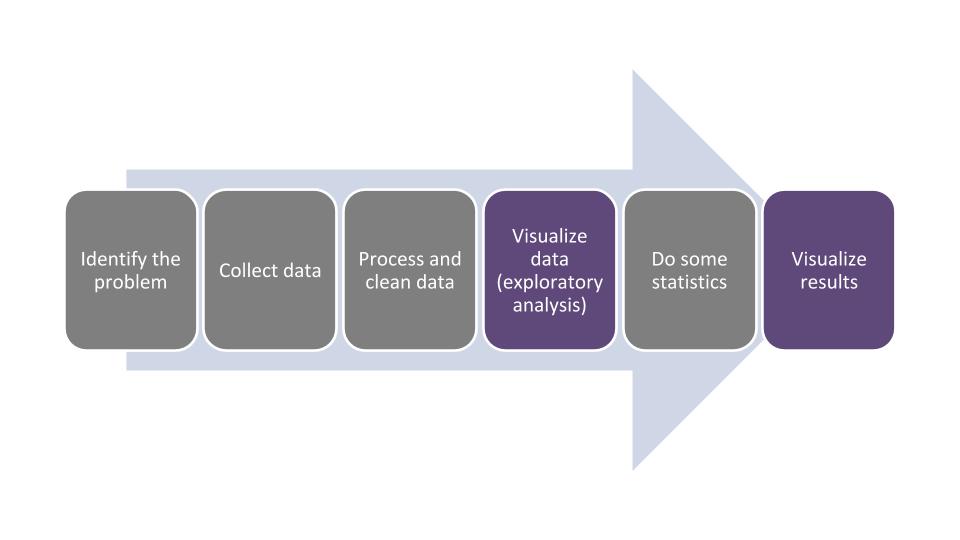
As we have discussed, good statistical analyses begin and end with visualizations. By visualizing your data after conducting statistical analyses, your audience will understand your findings, provided you have displayed the results in a clear and succinct format. Ending a statistical analysis with quality visualizations of the results typically represents the end of the data analysis life cycle:
Do not underestimate the importance and dedication needed to create and share quality statistical graphics:
“Anyone can run a regression or ANOVA! Regression and ANOVA are easy. Graphics are hard.”
This quote by statistician Andrew Gelman (2011) is overwhelmingly true, particularly as we live in a time when data can be viewed, downloaded, and analyzed on a seemingly endless basis. Just as there are minimum standards for creating good graphics, such as choosing the appropriate type of figure to plot the data and labeling x- and y-axes appropriately with units, we can easily do “too much” with our graphics, e.g., by plotting too many colors in a single figure or not describing our graphics with enough information.
It is disappointing when quality statistical analyses are represented poorly with inadequate visualizations. Researchers and technicians likely spend considerable time and effort in collecting, summarizing, and analyzing natural resources data. It can be frustrating when all of that time and effort goes wasted when results are not presented clearly. This chapter will discuss some concepts and strategies for creating effective visualizations that resonate with your audience.
Strategies for presenting statistical results clearly
For all of the work and effort many of us go through in learning and applying quantitative methods to data, presenting statistics for statistics sake is rarely the primary motivation of our work. We use statistics to help inform other processes to better understand how the world works. For example, an analysis of variance might be performed to help understand the impacts of an experimental treatment on a response variable. Unfortunately, your audience likely does not care to know the specific p-values associated with your output, but they are certainly interested in evaluating the impacts of the experimental treatment and what it means to their costs, time, and effort.
There has recently been an increased recognition of the importance of storytelling in business and academic environments. Before, during, and after conducting your statistical analysis, be cognizant of the story that your analysis will help tell. Kurnoff and Lazarus (2021), authors of the book Everyday Business Storytelling, provide evidence which states that people remember stories, not data. Lean on your data and statistical output to tell a larger story about the process or phenomena under examination.
Consider your audience when presenting your statistical results. A colleague, collaborator, or supervisor may be interested in seeing your statistical output directly from R, but the majority of the people interested in your work prefer to see a summarized version of it that is presented in an appealing way. Assume that anyone that does not have a natural resources degree cannot understand the jargon used within your discipline. When creating and presenting graphs for the general public, use easy-to-understand units and supplement your visualizations with photos and text to convey key messages.
Data and visualizations have the benefit in that they can help persuade others and provide a research-based approach to inform decision making. But using too many visualizations can overwhelm your audience, lowering the effectiveness of your data and potentially losing the trust and confidence in you, the data analyst. This is often found in scientific and business presentations, with a term that Kurnoff and Lazarus (2021) term the “Frankendeck,” a slide deck with a hodgepodge of information, including too much data and visualizations. Presentations and reports that do not distill and synthesize statistical results can be rendered incoherent and ineffective. Be economical with the amount of statistical results and visualizations you present, but always be willing to share more detailed results with those that ask.
Exercises
15.1 The same data set or summary of a statistical analysis can be used to create different visualizations depending on your audience. Using a data set or results from a statistical analysis that you are familiar with, create two to three different visualizations using tables or figures of different styles. For example, one visualization could show a bar plot displaying mean values and error bars denoting standard errors across different levels of a categorical variable. This visualization might be appropriate for “the researcher.” Another visualization could present a word cloud of the data showing differences in the number of observations within each categorical variable. This visualization might be appropriate for a broader audience, i.e., “the general public.”
15.2 Find a presentation slide deck you recently delivered that included data, or find one online to use as a case study. With respect to the data and statistical results presented in the slides, make several notes for how you can improve its layout and design. Share a specific slide on social media and ask your friends and followers for their candid feedback on how it can be improved.
15.3 Explore several popular websites and blogs dedicated to data visualization and presenting data effectively. Make notes about how you can improve your own data visualizations. A few worth exploring include:
Choosing between a table, figure, or data dashboard
Tables, figures, and data dashboards are three common methods to present data and statistical results. We can use them in different ways.
Tables are the preferred option under three scenarios. First, when we want our audience to know precise numbers or text, tables are best. As an example, when purchasing a brand new car, we would like to know that it costs exactly $22,495, not “about $20,000.” Second, tables are useful to compare individual values, say values from one experiment compared to another. Lastly, tables are also useful when we are presenting several variables each with different units of measure. As an example, a table might include the number of visitors to a national park, how many days they’re staying at the park, and how much money they spent during their stay.
When you construct tables, you should follow these guidelines, which are common across nearly all professions:
- Every table should have a caption that is numbered (typically placed at the top of the table).
- Tables should have column headers that are labeled with their appropriate units.
- The cells of a table should contain the values from the data or a summary of it.
- Footnotes should be used to explain what you want your audience to understand from a specific attribute in the table.
Figures are the preferred option under two scenarios. First, when trends or relationships between different values exist, figures are appropriate. For example, figures are fitting to show how values change over time, or how relationships exist between the same values for different populations. Second, figures are useful for photographs, maps, or other illustrations that might be a part of a project.
Figures have an advantage in that color can be added to enhance the interpretation of results. Follow these guidelines to construct effective figures:
- Similar to tables, every figure should have a caption that is numbered (typically placed at the bottom of the figure).
- Each figure should have a clearly labeled x and y axis with their appropriate units.
- If a legend appears on the figure, be sure it is labeled appropriately.
It is best to adhere to a few best practices when creating tables and figures. First, you want to make tables and figures stand alone. That is, the audience should be able to understand your message by looking only at the table or figure by itself. If someone navigates to a random page in your report, you want them to understand the key takeaways without having to read the entire report. Second, by numbering all of your tables and figures, you can refer to them in your text. Third, when using captions, do not assume your audience knows all of the abbreviations you use, so be sure to write out all of them. Fourth, there is no need to repeat information in one table or figure that is already in another table or figure. It is a good practice to be economical with your results and respectful of your audience’s attention. Finally, keep the same general format and style throughout your written report and document. This includes using the same style of fonts, headings, and other attributes that are found in tables and figures.
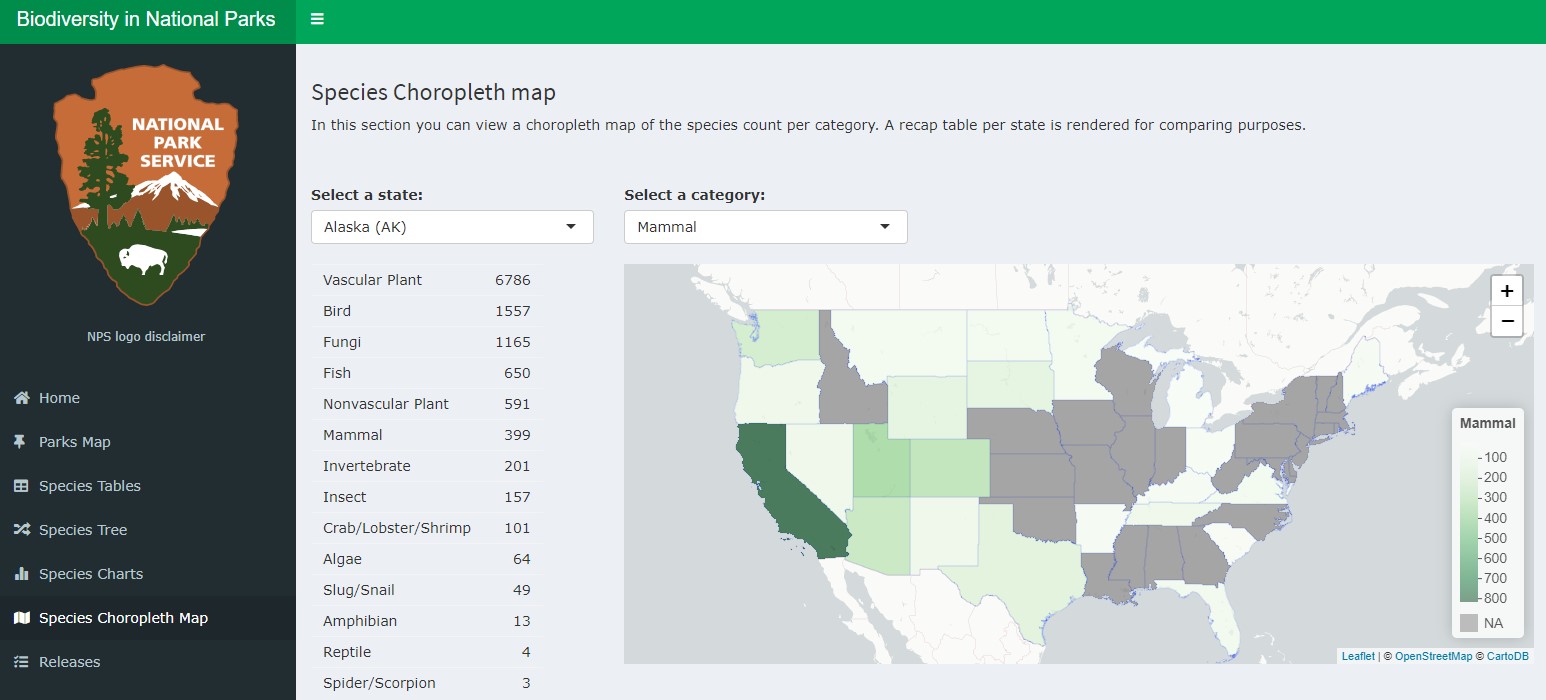
Interactive data dashboards have arisen as a popular method to disseminate large amounts of information in a variety of formats. Whereas tables and figures are static representations of data, interactive data visualizations allow a user to select which variables and types of graphics they are interested in seeing. Interactive data visualizations are best used with data sets that contain a large number of observations and numerous variables.
To create data dashboards, the shiny package creates web applications using R code. It contains a user interface that can be customized depending on user needs. Visualizing your data with a dashboard can help you and others explore your data, evaluate different statistical models and their fit to validation data, and investigate statistical oddities such as outliers and unexpected distributions of data.
You can begin by creating simple web applications designed with the shiny package, then move on to more complex ones depending on you and your audience’s needs. The best resource for learning the package is the text Mastering Shiny by Wickham (2022).
Data can also be analyzed in R and used in other applications that showcase data. StoryMaps developed by Esri are popular across many natural resources disciplines, in particular because ArcGIS software is widely used across resource management agencies and companies. One excellent example is the US Department of Agriculture Forest Service’s (2022) A guide to the forest products industry of the southern United States, a StoryMap that displays timber product output data and the locations of primary wood processing plants and mills across the region. The Texas A&M Forest Service (2022) has similarly used ArcGIS software to create My City’s Trees, a web application that uses tree inventory data from urban areas and allows users to produce custom analyses and reports.
Evaluating statistical graphics
As you develop your own statistical graphics and observe visualizations developed by others, think critically about the elements that are effective in conveying the results. Wickham (2011) outlines the four C’s of critiquing statistical graphics, discussed in the next sections.
Content
With content, ask yourself: how do I want to present my data? As an example, here are two formats to present tree heights from the elm data set:
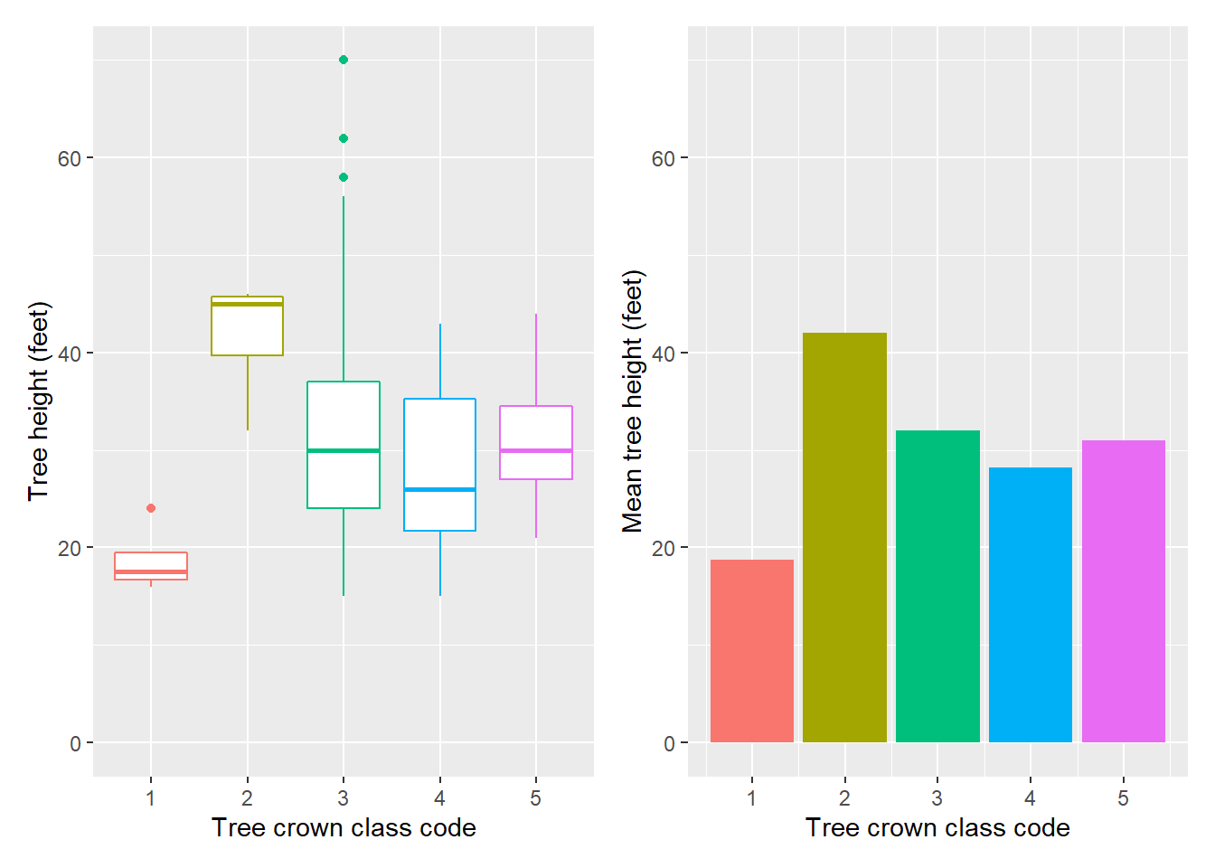
These figures present the tree height by crown class code indicating the relative crown position of the tree: open grown, dominant, co-dominant, intermediate, or suppressed. On the left, we see the distribution of observations in the form of box plots. We can see that there is a relationship between the two variables. On the right, we see those data summarized. This bar chart shows the mean tree height by crown class. When constructing your own tables and figure, consider whether the content should include a depiction of the raw data (i.e., the box plot) or a summarized version of it (i.e., the bar plot).
Construction
Fortunately, most of the default settings available in the ggplot2 package will allow for the construction of effective figures. In some cases, adding different themes and elements to figures may be required. Become acquainted with the components of tables (e.g., captions, column headers, and footnotes) and figures (e.g., axis labels, captions, and legends) and how to change their attributes using the ggplot() function. With natural resources data, a few common elements of graphics that are often modified within the ggplot() function include:
- changing the position of the legend (e.g.,
theme(legend.position = "top")) or removing the legend entirely (theme(legend.position = "none")),
- changing the attributes of the x or y-axis (with
scale_x_continuous() or scale_y_continuous()),
- printing a panel of figures with a single data set (using
facet_wrap() or facet_grid()) or multiple data sets (using functions available in the patchwork package), and
- altering the color palette of your graphs to make them friendly to color-blind individuals (using functions available in the colorspace package).
For additional methods to customize your graphics with ggplot2, consult Wickham (2016).
Context
When you think about the context of a table or figure, consider whether it represents an idea, or if it represents real data that you collected. R software is quite good for plotting real data that exists in data sets, but consider other software to create visualizations that represent concepts or ideas. For example, flow charts and Venn diagrams can represent thought processes and concepts that do not necessarily rely on quantitative data.
Consumption
When you think about the consumption of a visualization that you design, ask yourself: who is the audience? Are there some audiences that prefer one kind of visualization over another? What is the format of the table or figure? Is it in a report, presentation, or manuscript? Always think about how the audience will be consuming your table or figure.
As an example, you don’t want to include a table with 20 columns and 50 rows of data in a presentation on a slide that you show for 10 seconds. That’s simply not enough time for the audience to digest that information. Instead, use a table in a presentation that only shows the key results, and perhaps put the large table with 50 rows of data in the appendix of a written report.
Exercises
15.4 The kable() function available in the knitr package in R creates simple tables for a number of documents. Learn more about the kable() function by reading through the section labeled Tables in Xie et al. 2019: https://bookdown.org/yihui/rmarkdown/r-code.html#tables. Use the ant data set from the stats4nr package to create the following tables:
- A table that displays the first eight rows of the ant data set.
- A table that displays the mean values for species richness in the bog and forest ecosystems, with an appropriate caption.
15.5 Find a figure from a scientific article or report that you recently read. Try to “copy the artist” by re-creating the figure from the article and coding it in ggplot(). Inspect the figure and note the approximate values contained in the figure. Choose a relatively simple figure, i.e., a bar plot or line graph where you can find the values for relatively few data points. If you require more precise values, web applications like eleif (https://eleif.net/photo_measure.html) can be used to measure specific distances on an image.
15.6 Explore the gallery of Shiny applications available at RStudio’s webpage: https://shiny.rstudio.com/gallery/. Which two or three Shiny projects resonate with you in how they allow a user to interact with the data?
Automate your work
Automation of your analytical work can be described as employing automatic processes and systems for collecting, analyzing, and archiving data. Although the two terms are not necessarily interchangeable, automation and reproducibility of your work often can be done in parallel. Your analysis is reproducible when others can reproduce the results if they have access to the original data, code, and documentation (Essawy et al. 2020).
Make your work reproducible
Integrating concepts of reproducibility in your work sends the signal that your analysis is high quality, trustworthy, and transparent (Sandve et al. 2013). In addition to being helpful to others, integrating actions to increase the reproducibility of your work also helps you as an analyst to better understand where you “left off” on an analysis as you spend time away from working on it. Some example actions you can take to improve your reproducibility are outlined in Powers and Hampton (2019). A few example ones include:
- Engage in sound data management practices with a plan in place on how you will collect, store, analyze, and archive data.
- Use coding scripts in R to “wrangle” data in their raw format, and annotate and comment within your code.
- Use version control systems for your R code such as Git (https://gitscm.com/) and GitHub (https://github.com/).
- Share code with collaborators and colleagues to promote reproducibility.
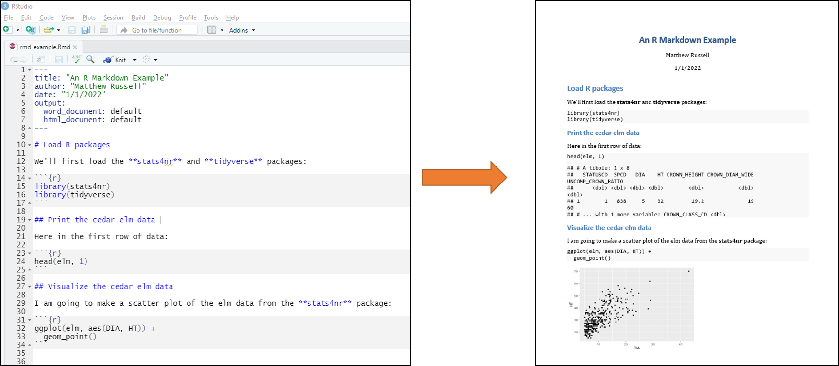
In R, one of the best tools that facilitates automation and reproducibility of your work is R Markdown (Xie et al. 2019). An R Markdown document is written with markdown, a coding style that uses plain text format. The value in using R Markdown is that you can embed R code, tables and figures, and written text to create a dynamic documents. These documents can include PDFs, Microsoft Word documents, HTML websites, and books (like this one). After code is written with R Markdown, it can be knit to one of the various output documents.
If you are using RStudio in your R session, the rmarkdown package comes preloaded. To start a new R Markdown document in RStudio, navigate to File > New File > R Markdown in the toolbar. Within these R Markdown files (.Rmd extension), headings and sections can be labeled with hashtags, text can be written, and R code can be written into “chunks.”
Syntax in R Markdown files can be specified to make text appear in italics, bold, and other common settings to create written text. R code that performs statistical operations can be suppressed in a knitted document so that your audience does not see all of the code written to produce a report. For performing repetitive analyses such as running a new analysis on the same data structure (e.g., preparing a quarterly sales report), R Markdown documents are well suited to make these tasks reproducible, saving you time and effort in the future.
Automate your analysis workflow
Implement methods and techniques that automate your statistical analyses. Before your statistical analysis, write code to visualize its characteristics. Importantly, write this code as a series of functions which you can use in a subsequent analysis. Packages like inspectdf allow an analyst to inspect, compare, and visualize different data sets in R. These methods can specify a data-checking routine that can help you save time, money, and resources. Identifying potential data inaccuracies or inconsistencies soon after data collection can help eliminate any statistical errors or inappropriate decisions that are made from those data further down the line.
During your statistical analysis, create and maintain a core suite of functions that you regularly apply to your data. While it is tempting to copy and paste code you used from a previous analysis (or within the same file), this can result in errors when copying, pasting, and replacing elements of code. Follow Wickham and Grolemund’s (2017) advice to write a function whenever you have copied and pasted a block of code more than twice.
The tidyverse has a number of supporting packages that can help in automating your workflow. A few specific packages include:
- tidymodels is a collection of packages for modeling and machine learning,
- stringr provides a set of functions designed to facilitate the use of strings of text,
- lubridate provides a set of functions to make working with time and date variables easier.
For more detail, consider the tidymodels and broom packages in the tidyverse. As we’ve seen, a data analyst’s best friend in the tidyverse is the group_by() statement. With the elm data, we can fit a simple linear regression predicting HT using DIA. Adding the group_by() statement specifies the model for each of the five different crown classes. The tidy() function available in the broom package provides a set of functions that put model output into data frames. Here, we can see that the models fit to each of the crown classes result in a different set of coefficients and other attributes like p-values:
elm_coef<- elm %>%
  group_by(CROWN_CLASS_CD) %>%
  do(broom::tidy(lm(HT ~ DIA, .)))

elm_coef
## # A tibble: 10 x 6
## # Groups:   CROWN_CLASS_CD [5]
##    CROWN_CLASS_CD term        estimate std.error statistic  p.value
##             <dbl> <chr>          <dbl>     <dbl>     <dbl>    <dbl>
##  1              1 (Intercept)   10.6      0.875     12.2   6.70e- 3
##  2              1 DIA            1.08     0.109      9.92  1.00e- 2
##  3              2 (Intercept)   36.0      6.45       5.58  5.05e- 3
##  4              2 DIA            0.340    0.341      0.997 3.75e- 1
##  5              3 (Intercept)   15.9      0.973     16.3   4.29e-42
##  6              3 DIA            1.48     0.0810    18.2   8.89e-49
##  7              4 (Intercept)   15.1      3.34       4.51  7.46e- 5
##  8              4 DIA            1.69     0.407      4.16  2.05e- 4
##  9              5 (Intercept)   18.1      4.06       4.45  4.00e- 4
## 10              5 DIA            1.81     0.552      3.28  4.70e- 3
The addition of the group_by() statement allows for the same model form to be fit across different groupings of the data. From here, the elm_coef data set can be used to visualize the coefficients, assess any patterns in the residuals, and make predictions on new observations.
After your statistical analysis, use many of the principles outlined in this chapter to create tables and figures that your audience will value. Become familiar with the kinds of graphics that others in your discipline use to present data, and practice how to create them in R. Wickham’s (2016) book on ggplot2 has a plethora of information on designing customized themes and styles to showcase the best (and sometimes, worst) of your data and analysis. When designing tables, use packages like kable and others to generate and customize tables that fit your audience’s needs.
Exercises
15.7 With some R script you have used to analyze a data set, create a new R Markdown file that produces a report that includes text, R code, tables, and figures. Knit the R Markdown document to an HTML format to view how it would appear on the web.
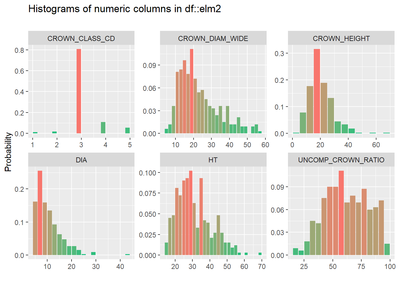
15.8 Use several functions found in the inspectdf package to examine the airquality data set:
- Use the
inspect_types() function to determine the types of variables in the data (e.g., numerical or factor variables).
- Use the
inspect_na() function to determine the number of NA values for each variable.
- Use the
inspect_num() function to create a histogram of all quantitative variables in the data set.
Summary
Just like every analysis should start with visualization, it should also end with it. The choice of whether to present results from your analysis as a table, figure, or some other interactive display should be considered throughout all aspects of the data analysis life cycle. The content, construction, context, and consumption of a visualization should be considered as you are creating and presenting it to others, whether in the form of a written document or oral presentation. You can implement several practices that automate your work in R that make it reproducible and easy to implement and interpret by yourself and others in the future.
Having high-quality visualizations of your statistical results can lend credibility to your work. Devote time to learning good data visualization skills and practice them often to add more tools to your statistical analysis toolbox.
References
Essawy, B.T., J.L. Goodall, D. Voce, M. M. Morsy, J.M. Sadler, Y.D. Choi, D.G. Tarboton, and T. Malik. 2020. A taxonomy for reproducible and replicable research in environmental modelling. Environmental Modelling & Software 134: 104753.
Gelman, A. 2011. Why tables are really much better than graphs: rejoinder. Journal of Computational and Graphical Statistics 20: 36–40.
Kurnoff, J., L. Lazarus. 2021. Everyday business storytelling: create, simplify, and adapt a visual narrative for any audience. Wiley: Hoboken, NJ. 279 p.
Powers, S.M., and S.E. Hampton. 2019. Open science, reproducibility, and transparency in ecology. Ecological Applications 29: e01822.
Sandve, G.K., A. Nekrutenko, J. Taylor, and E. Hovig. 2013. Ten simple rules for reproducible computational research. PLOS Computational Biology 9: e1003285.
Texas A&M Forest Service. 2022. An introduction to My City’s Trees. Available at: https://mct.tfs.tamu.edu/app
USDA Forest Service. 2022. The southern forest products industry, an ArcGIS StoryMap. Available at: https://usfs.maps.arcgis.com/apps/MapSeries/index.html?appid=7f8429df087e4c86951a7e69d93207a7
Wickham, H. 2011. Graphical critique and theory. Presentation slides. Available at: https://vita.had.co.nz/papers/critique-theory.pdf
Wickham, H. 2016. ggplot2: elegant graphics for data analysis (2nd ed.). New York: Springer. 276 p.
Wickham, H., and G. Grolemund. 2017. R for data science: import, tidy, transform, visualize, and model data. O’Reilly Media. 520 p. Available at: https://r4ds.had.co.nz/
Wickham, H. 2022. Mastering Shiny. Available at: https://mastering-shiny.org/index.html
Xie, Y., J.J. Allaire, G. Grolemund. 2019. R Markdown: the definitive guide. Chapman and Hall/CRC. 338 p.