Chapter 10 Analysis of variance
10.1 Introduction
There are lots of practical situations where there are more than two populations of interest that we want to evaluate. If we had just two populations, we could run a two-sample t-test to compare their means. Analysis of variance, abbreviated ANOVA or sometimes AOV, extends these methods to problems involving more than two populations.
The ANOVA process compares the variation from specific sources with the variation among individuals that should be similar. In particular, ANOVA tests whether several populations have the same means by comparing how far apart they are with how much variation there is within a sample.
This chapter will discuss how to use the ANOVA model to make inference between population means and draw conclusions about their differences. Similar to concepts in regression, we’ll construct an ANOVA table and examine residual plots to evaluate the assumptions about ANOVA models.
10.2 One-way analysis of variance
R.A. Fisher introduced the term variance and proposed its formal analysis in a 1918 article (Fisher 1928). His first application of ANOVA occurred a few years later and the method became widely known after being included in his book Statistical Methods for Research Workers (Fisher 1925), which was updated in numerous subsequent editions of the book. Much of the early work with ANOVA used agricultural trials and experiments in England, and the method was adopted in medicine in the mid-1900s. (Unfortunately, Fisher’s work was closely integrated into the science of eugenics, a difficult point in the history of the discipline of statistics.)
The purpose of ANOVA is to assess whether the observed differences among sample means are statistically significant. Consider an example data set that investigates iron levels in Chesapeake Bay, a large estuary in the eastern United States.
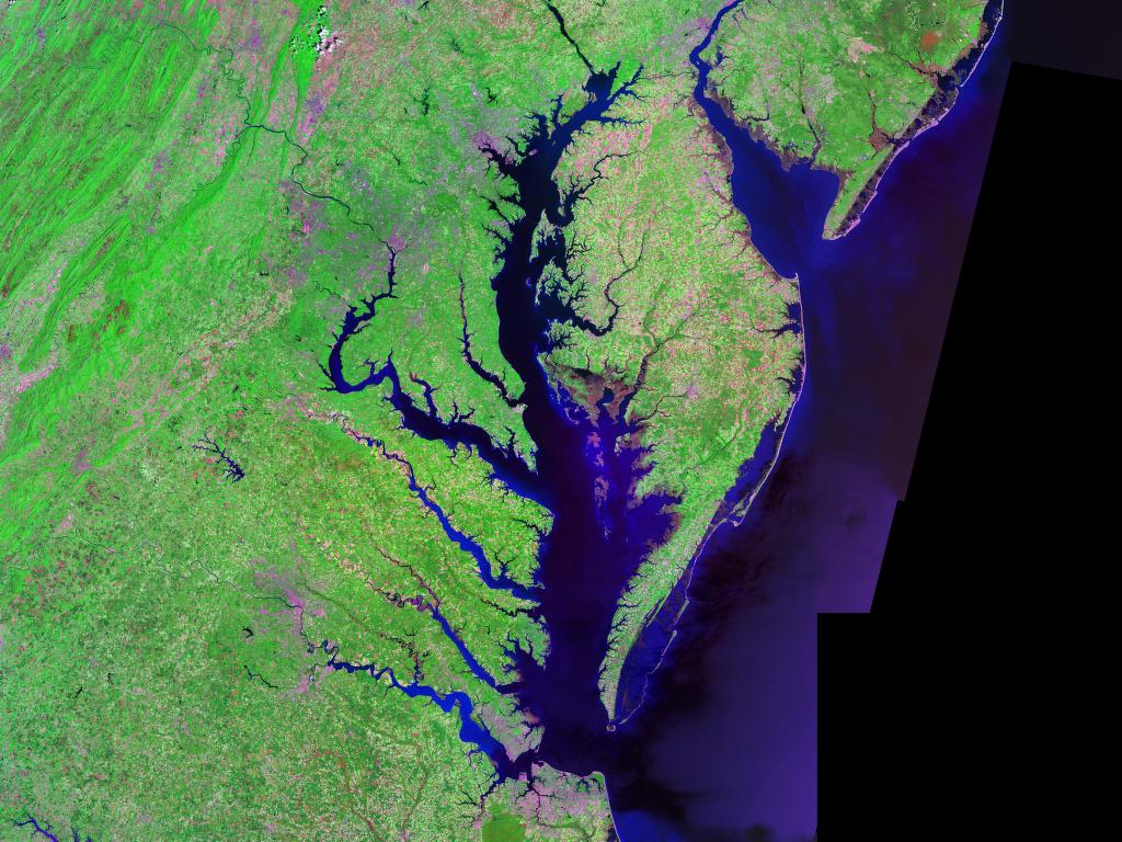
FIGURE 10.1: Map of Chesapeake Bay, eastern United States. Image: Landsat/NASA.
Iron levels were measured at several water depths in Chesapeake Bay (Sananman and Lear 1961). The researchers were interested to know if changing water depths influence the amount of iron content in the water.
Experimenters took three measurements at six water depths: 0, 10, 30, 40, 50, and 100 feet. The response variable was iron content, measured in mg/L. The data are contained in iron from the stats4nr package:
library(stats4nr)

iron
## # A tibble: 18 x 2
## depth iron
## <dbl> <dbl>
## 1 0 0.045
## 2 0 0.043
## 3 0 0.04
## 4 10 0.045
## 5 10 0.031
## 6 10 0.043
## 7 30 0.044
## 8 30 0.044
## 9 30 0.048
## 10 40 0.098
## 11 40 0.074
## 12 40 0.154
## 13 50 0.117
## 14 50 0.089
## 15 50 0.104
## 16 100 0.192
## 17 100 0.213
## 18 100 0.224We can make a box plot of the iron level at various water depths:
library(tidyverse)

p.iron <- ggplot(iron, aes(factor(depth), iron)) +
  geom_boxplot()+
  ylab("Iron content (mg/L)") +
  xlab("Water depth (feet)")
p.iron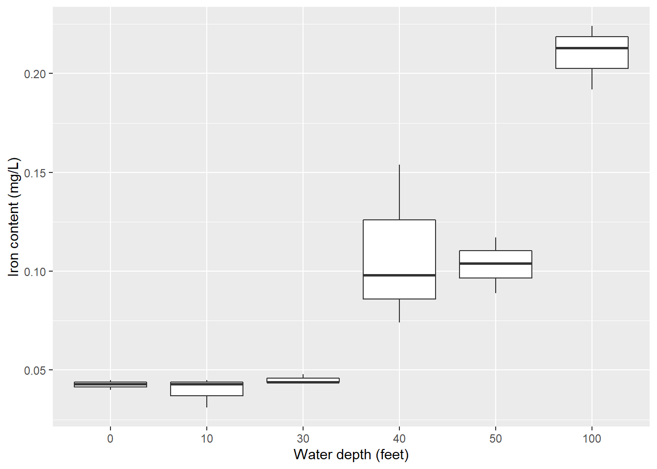
So, it appears that changing water depths influences iron content in the bay. But what else can we say about these relationships? That is, is there a statistical difference in the iron content at different water depths? Alas, the ANOVA method will allow us to examine the influence of factors (e.g., water depths) on a response variable of interest (e.g., iron levels).
First, understanding a few key definitions is essential to understanding the notation associated with ANOVA.
- Treatments or levels are the individual experimental conditions defining a population, e.g., the water depths.
- Experimental units are the individual objects influenced by a treatment, e.g., the water samples.
- Responses are measurements obtained from the experimental units, e.g., iron content.
The parameters of the ANOVA model are the population means \(\mu_1, \mu_2, ..., \mu_i\) with the common standard deviation \(\sigma\) across all \(i\) treatments. We can use the sample mean to estimate each \(\mu_i\). Similar to the two-sample t-test, we can pool the standard deviations across all of our treatments or levels. The one-way ANOVA model analyzes data where chance variations are normally distributed.
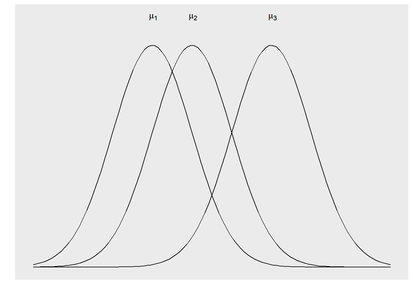
FIGURE 10.2: Three different distributions that can be examined in an analysis of variance.
The null hypothesis in the ANOVA is that there are no differences among the means of the populations. The alternative hypothesis is that there is some difference across population means. That is, not all means are equal:
\[H_0: \mu_1=\mu_2=...=\mu_i\]
\[H_A: \mbox{at least one mean different from the rest}\]
The basic conditions for inference in ANOVA are that we have a random sample from each population and that each population is normally distributed. We will perform the ANOVA F-test to examine the hypothesis.
Like all inference procedures, ANOVA is valid only in some circumstances. The conditions under which we can use ANOVA include:
- We have i independent simple random samples, one from each population. We measure the same response variable for each sample.
- The ith population has a normal distribution with unknown mean \(\mu_i\).
- All the populations have the same standard deviation \(\sigma\), whose value is unknown.
10.2.1 Partitioning the variability in ANOVA
Just like in regression, recall that the sums of squares represent different sources of variation in the data. In ANOVA, these values include the total (TSS), between group (SSB), and within group sums of squares (SSW). Large values of SSB reflect large differences in treatment means, while small values of SSB likely indicate no differences in treatment means. The calculations are:
\[TSS = \sum(x_{ij}-\bar{x})^2\]
\[SSB = \sum n_i(\bar{x_i}-\bar{x})^2\]
\[SSW = \sum (n_i-1){s_i^2}\]
where \(x_{ij}\) is the jth observation from the ith treatment, \(\bar{x}\) is the overall sample mean, \(n_i\) is the number of observations in treatment i, \(\bar{x}_i\) is the sample mean of the ith treatment, and \(s_i\) is the sample standard deviation of treatment i.
We can use the ANOVA table to make inference about the factors of interest under study. In the table, p is the number of treatments or independent comparison groups minus 1.
| Source | Degrees of freedom | Sums of squares | Mean square | F |
|---|---|---|---|---|
| Within | p | SSW | MSW = SSW/p | MSB / MSW |
| Between | n-p-1 | SSB | MSB = SSB/n-p-1 |
|
| Total | n-1 | TSS |
|
|
So, the ANOVA F test can be conducted by determining the test statistic \(F_0 = \frac{MSB}{MSW}\). Similar to a test comparing variances of two populations, the ANOVA F-test is always an upper-tailed test.
In the iron data set we can perform a one-way ANOVA with the lm() function and view the ANOVA table with the anova() function. First, we’ll Convert the water depth variable (currently stored as a number) to a factor variable. This is because the water depths are labeled as numbers, but they represent categorical variables in our treatment of them in the ANOVA:
iron <- iron %>%
  mutate(depth.fact = as.factor(depth))

iron.aov <- lm(iron ~ depth.fact, data = iron)

anova(iron.aov)
## Analysis of Variance Table
##
## Response: iron
## Df Sum Sq Mean Sq F value Pr(>F)
## depth.fact 5 0.064802 0.0129605 35.107 9.248e-07 ***
## Residuals 12 0.004430 0.0003692
## ---
## Signif. codes: 0 '***' 0.001 '**' 0.01 '*' 0.05 '.' 0.1 ' ' 1In R, variation between groups (SSB) is labeled by the name of the grouping factor, i.e., depth.fact. Variation within groups (SSW) is labeled Residuals. In the case of the iron data, we see that with a small p-value of the ANOVA F-test (9.248e-07), we reject the null hypothesis that all means are equal and conclude that at least one mean differs from the rest. Hence, iron content is not equal across all water depths.
We can run the diagPlot() function presented in Chapter 8 to visualize the diagnostic plots from ANOVA output, along with supporting functions from the broom and patchwork packages:
library(broom)
library(patchwork)

iron.resid <- augment(iron.aov)

p.diag <- diagPlot(iron.resid)

(p.diag$p.resid | p.diag$p.stdresid) /
(p.diag$p.srstdresid | p.diag$p.cooks)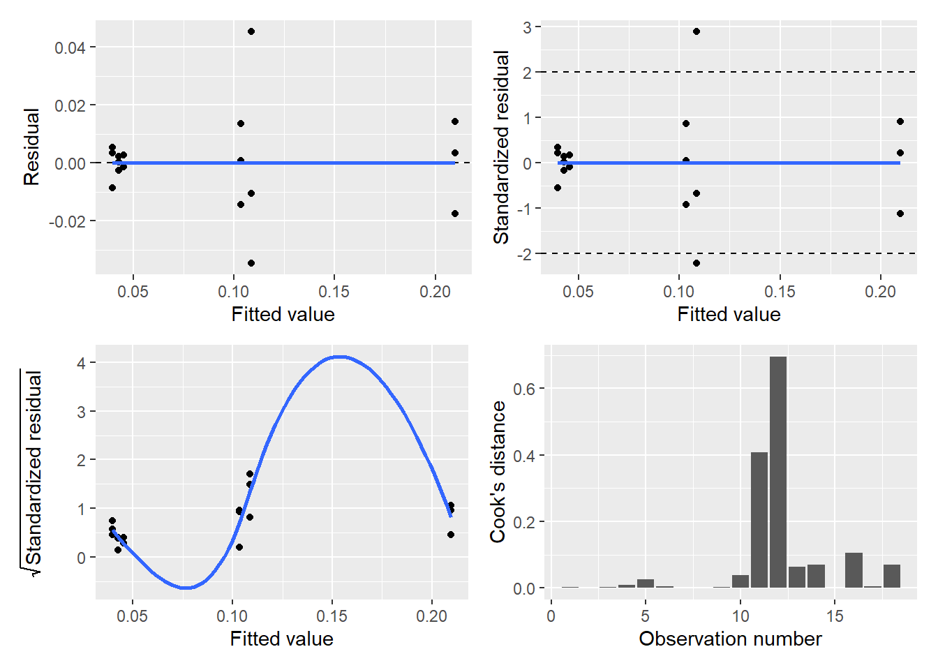
Interpreting the diagnostic plots is a little tricky because our iron data are “grouped” at different water depths. However, the diagnostic plots look satisfactory for this ANOVA model.
10.2.2 Exercises
10.1 Cannon et al. (1997) measured the number of tree species after logging in several rainforests in Borneo. Treatments included forests that were never logged, logged one year ago, and logged eight years ago.
- Read in the logging data set from the stats4nr package and find out how many observations are in the data.
- Create a violin plot showing the distribution of the number of tree species across the three treatments. Describe in a few sentences the differences you observe across treatments.
- Perform a one-way analysis of variance that determines the effects of logging treatment on tree species diversity using a level of significance \(\alpha = 0.05\). What is the conclusion of your analysis?
- Run a series of diagnostic plots for this analysis using the
diagPlot()function. After inspecting the plots, is there any aspect of the results that gives you pause or urges you to transform the data?
10.2 Analysis of variance is widely used in natural resources. Describe a study you might be aware of that uses ANOVA, or do a literature search to find a peer-reviewed article that uses ANOVA in your discipline. Try searching “analysis of variance” and “your discipline/study area.” Include the following in your response:
- What did the study examine (e.g., the response variable and units) and what were the treatments or levels used?
- What were the significant (or non-significant) results of the study?
- Provide a citation for your chosen article.
10.3 Two-way analysis of variance
The purpose of a two-way analysis of variance is to understand if two independent variables and their interaction have an effect on the dependent variable of interest. Treatment groups are formed by making all possible combinations of the two factors. For example, if the first factor has three levels and the second factor has two levels, there will be \(3\times2=6\) different treatment groups.
For example, consider an experiment that plants three different varieties of winter barley at four different dates during the year. We have 12 treatment groups and measure the yield after a growing season. Say we take \(n = 10\) samples from each treatment group. In a two-way ANOVA the degrees of freedom are calculated as follows:
- There are \(4-1 = 3\) degrees of freedom for the planting date.
- There are \(3-1 = 2\) degrees of freedom for the barley variety.
- There are \(2*3 = 6\) degrees of freedom for the interaction between planting date and variety.
An important attribute of a two-way ANOVA is that there are three null hypotheses under investigation. In the case of the barley-planting date experiment, these hypotheses are:
- The population means of the first factor are equal (planting date).
- The population means of the second factor are equal (variety).
- There is no interaction between the two factors (planting date*variety).
Due to the three hypotheses in a two-way ANOVA, this indicates there are three F-tests to conduct for each hypothesis. For the two main effects, you can investigate each independent variable one at a time. This is an approach similar to a one-way analysis of variance.
Two-way ANOVAs also include an evaluation of the interaction effect, or the effect that one factor has on the other factor. For example, some barley varieties might grow faster if planted at different dates, and this interaction is important to separate out from their individual effects. Two-way ANOVAs also incorporate an error effect, calculated by determining the sum of squares within each treatment group.
The key assumptions in a two-way ANOVA analysis include the following:
- The populations from which the samples were obtained must be normally or approximately normally distributed.
- The samples must be independent.
- The variances of the populations must be equal.
- The groups must have the same sample size.
The two-way ANOVA table has several more rows to take into account the two main effects and their interaction. Like all ANOVA tables we’ve looked at, the mean square values are taken by dividing the sums of squares by their degrees of freedom. The important consideration is the number of levels or treatments in main effect A (a) and B (b).
| Source | Degrees of freedom | Sums of squares | Mean square | F |
|---|---|---|---|---|
| Main effect A | a-1 | SS(A) | MS(A) = SS(A)/a-1 | MS(A)/MSW |
| Main effect B | b-1 | SS(B) | MS(B) = SS(B)/b-1 | MS(B)/MSW |
| Interaction effect | (a-1)(b-1) | SS(AB) | MS(AB) = SS(AB)/(a-1)(b-1) | MS(AB)/MSW |
| Error (Within group) | n-ab | SSW | MSW = SSW/(n-ab) |
|
| Total | n-1 | TSS |
|
|
As an example, consider the moths data set from the stats4nr package. The data contain the number of spruce moths found in trees after 48 hours (Brase and Brase 2017). Moth traps were placed in four different locations in trees (top, middle, lower branches, and ground). Three different types of lures were placed in the traps (scent, sugar, chemical). There were five observations for each treatment at each level:
library(stats4nr)
moths
## # A tibble: 60 x 3
## Location Lure Moths
## <chr> <chr> <dbl>
## 1 Top Scent 28
## 2 Top Scent 19
## 3 Top Scent 32
## 4 Top Scent 15
## 5 Top Scent 13
## 6 Top Sugar 35
## 7 Top Sugar 22
## 8 Top Sugar 33
## 9 Top Sugar 21
## 10 Top Sugar 17
## # ... with 50 more rows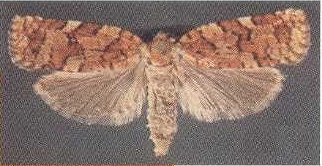
FIGURE 10.3: Western spruce budworm moth. Image: Utah State University
To visualize the data, we’ll create a box plot showing the distribution of the number of moths by trap location, using fill = Lure within the aes() statement in ggplot(). This provides a different colored box plot for each lure treatment:
ggplot(moths, aes(Location, Moths, fill = Lure)) +
  geom_boxplot() +
  ylab("Number of moths") +
  xlab("Location")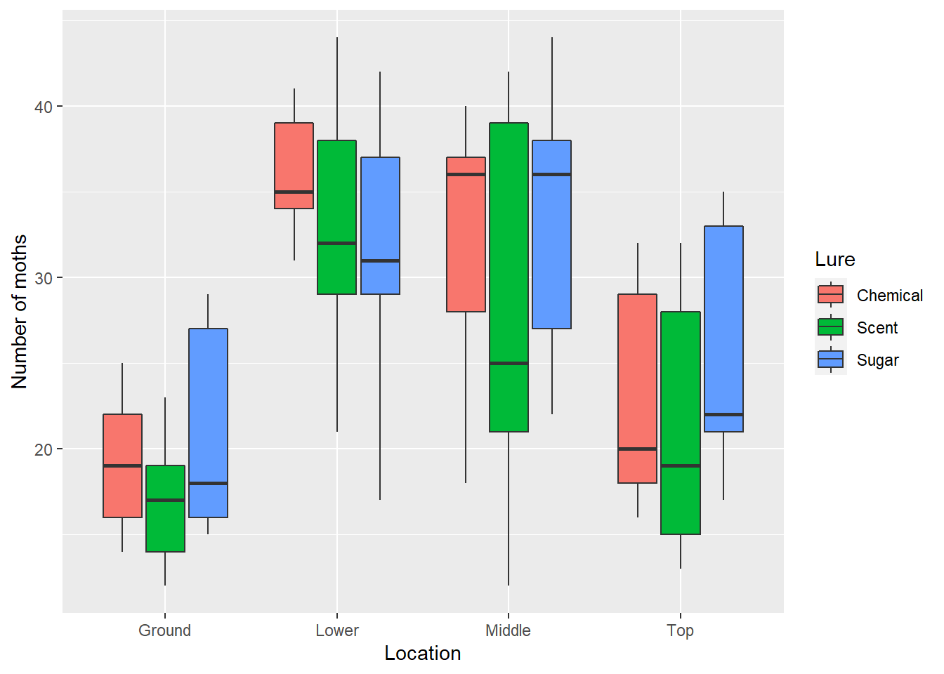
We can see that there are fewer spruce moths counted at ground level than other locations. The null hypotheses for this test are:
- The population means of
Locationare equal. - The population means of
Lureare equal. - There is no interaction between
LocationandLure.
To perform two-way ANOVAs in R, we can use the lm() function. We could type Moths ~ Location + Lure + Location*Lure for the model, however, R will recognize the shorthand Moths ~ Location*Lure to specify the two main effects plus their interaction:
moths.aov <- lm(Moths ~ Location * Lure, data = moths)
anova(moths.aov)
## Analysis of Variance Table
##
## Response: Moths
## Df Sum Sq Mean Sq F value Pr(>F)
## Location 3 1981.38 660.46 10.4503 2.094e-05 ***
## Lure 2 113.03 56.52 0.8943 0.4156
## Location:Lure 6 114.97 19.16 0.3032 0.9322
## Residuals 48 3033.60 63.20
## ---
## Signif. codes: 0 '***' 0.001 '**' 0.01 '*' 0.05 '.' 0.1 ' ' 1At the \(\alpha = 0.05\) level of significance, the results of our two-way ANOVA hypotheses are:
- The null hypothesis that population means of Location are equal is rejected.
- The null hypothesis that population means of Lure are equal is accepted.
- The null hypothesis that there is no interaction between Location and Lure is accepted.
So, we can conclude that the placement of the trap within a tree influences the number of moths captured while the type of lure used does not. There is not an interaction between the location of the trap and the lure type.
10.3.1 Exercises
10.3 An experiment was conducted with four levels of main effect A and five levels of main effect B. Answer the following questions.
- What are the degrees of freedom for the F statistic that is used to test for the interaction in this analysis?
- Explain how hypothesis testing in a two-way ANOVA differs from that in a one-way ANOVA. Write two to three sentences.
10.4 The CO2 data set is built into R and contains carbon dioxide uptake in plant grasses at two locations (Quebec and Mississippi) and two treatments (chilled and nonchilled). Load the data by typingCO2 <- tibble(CO2) and complete the following questions:
- Subset the CO2 data set so that you are only working with a CO2 concentration of 500 mL/L. How many total observations are in the data?
- Write R code to perform a two-way ANOVA at a level of significance \(\alpha = 0.10\) that determines the effect of location and treatment on carbon dioxide uptake rates (
uptake). What are the null hypotheses of this analysis? - What is the outcome of the ANOVA in terms of each of the hypothesis tests, i.e., are the null hypotheses accepted or rejected?
10.5 The butterfly data set is found in the stats4nr package and contains the wing length (in mm) of 60 mourning cloak butterflies from Kéry (2010). Butterfly data were simulated at different elevations and populations, with the hypothesis that butterflies from different populations that were hatched at different elevations would be subject to different climate conditions and predators. Load the data and complete the following questions:
- How many levels of elevation and different populations were evaluated in the data?
- Create a box plot that shows the distribution of wing lengths by the different elevations and populations. What do you notice about the distributions of wing lengths?
- Write R code to perform a two-way ANOVA at a level of significance \(\alpha = 0.10\) that determines the effect of population and elevation on wing lengths. What are the null hypotheses of this analysis?
- What is the outcome of the ANOVA in terms of each of the hypothesis tests, i.e., are the null hypotheses accepted or rejected?
10.4 Multiple comparisons
In the example with iron levels, we concluded that at least one mean at a certain water depth was different from another. But doesn’t it make sense that we’ll want to know which specific water depths are significantly different? After performing an ANOVA and concluding that you reject the null hypothesis, i.e., that at least one population mean is different, you should be left wanting to know more information about these differences.
The method of multiple comparisons allows us to assess significant differences across specific treatment groups, assuming we’ve already found a significant overall effect in the ANOVA F-test. While it might be intuitive to use what we learned in Chapter 4 and conduct pooled t-tests, in this approach, this would test \(H_0: \mu_i = \mu_j\) versus \(H_A: \mu_i \ne \mu_j\) for each pair \(\mu_i\) and \(\mu_j\) with \(i \ne j\). However, a problem arises when performing multiple tests. The level of significance \(\alpha\) represents the probability of rejecting the null hypothesis when in fact it is true. To combat this, we will calculate an error-rate that adjusts the Type I error depending on how many levels or treatments we’re comparing.
This experiment-wise error rate, which we denote \(\alpha_E\), reflects all comparisons under consideration in our ANOVA. Hence, \(\alpha_E\) represents the probability of making at least one false rejection when comparing multiple populations. If you consider m different independent comparisons,
\[\alpha_E = 1-(1-\alpha)^m \ge \alpha\] For \(\alpha = 0.05\) and various levels of m, the experiment-wise Type 1 error probabilities change. Note how our experiment-wise Type I error increases as the number of independent comparisons increases.
| m | Experiment-wise error rate |
|---|---|
| 1 | 0.0500 |
| 2 | 0.0975 |
| 5 | 0.2262 |
| 10 | 0.4012 |
| 15 | 0.5367 |
So, statisticians quickly realized that while the ANOVA F-test was important to understand whether or not a treatment influences a response variable, also important is finding out which specific treatments differ from one another with their influence on the response. Multiple comparison procedures were developed to compensate for increases in \(\alpha_E\). Multiple comparison procedures, also known as pairwise tests of significance, should be carried out if and only if the null hypothesis in the ANOVA was rejected. In other words, if your ANOVA F-test did not yield a significant result, you can conclude your analysis. There is no need to look for significant differences among treatments.
If your ANOVA F-test indicated to reject the null hypothesis and you conclude that at least one mean is different from the rest, a multiple comparison analysis is appropriate. There are many specific methods for doing multiple comparisons that range from more to less conservative approaches. Commonly used multiple comparison tests used in natural resources fields include Tukey’s honestly significant difference (HSD), Scheffé, and Bonferroni. A more conservative test is one that requires greater differences between two means to declare them significantly different. To determine which multiple comparison test is appropriate for you, consult the literature in your discipline and seek feedback from colleagues.
Regardless of the specific multiple comparison test chosen, each are variants on the two-sample t-test. Standard deviations are pooled across treatments being evaluated and are adjusted for the number of tests being evaluated simultaneously. For illustration, we’ll use an example using the Bonferroni multiple comparison procedure.
10.4.1 One-way ANOVA
In R, the pairwise.t.test() function calculates all possible comparisons between different groups. It can also conduct multiple comparisons so that we can determine which locations are significantly different from others.
We’ll use pairwise.t.test() to obtain the p-values which test for significance differences among the iron content across water depths. For a one-way ANOVA, we’ll provide the function three arguments: the response variable (iron), the variable representing the treatment or level (depth.fact), and the p-value adjustment method for the multiple comparison test. In our case we’ll use the Bonferroni method (p.adj = "bonferroni"):
pairwise.t.test(iron$iron, iron$depth.fact, p.adj = "bonferroni")##
## Pairwise comparisons using t tests with pooled SD
##
## data: iron$iron and iron$depth.fact
##
## 0 10 30 40 50
## 10 1.00000 - - - -
## 30 1.00000 1.00000 - - -
## 40 0.01825 0.01302 0.02472 - -
## 50 0.03359 0.02380 0.04578 1.00000 -
## 100 2.7e-06 2.2e-06 3.2e-06 0.00048 0.00029
##
## P value adjustment method: bonferroniThe output provides a matrix of p-values that make multiple comparisons across the different depths where iron content was sampled. At the level of significance \(\alpha=0.05\), nearly all comparisons can be considered significantly different except:
- 0 and 10 feet,
- 0 and 30 feet,
- 10 and 30 feet, and
- 40 and 50 feet.
This makes intuitive sense because the box plot of data shown previously indicates clusters of iron levels between 0 and 30 feet, 40 and 50 feet, and 100 feet. As you will notice, the output from pairwise.t.test() is manageable with a small number of treatments being evaluated, however, it can quickly become messy to interpret the matrix table with an increasing number of treatments in your study. Fortunately, functions in the agricolae package can help to distill the output from multiple comparisons:
install.packages("agricolae")
library(agricolae)
The LSD.test() function from agricolae also provides output on the multiple comparison tests. We’ll create the lsd.iron R object to store this output:
lsd.iron <- LSD.test(iron.aov, "depth.fact", p.adj = "bonferroni")
lsd.iron$groups
## iron groups
## 100 0.20966667 a
## 40 0.10866667 b
## 50 0.10333333 b
## 30 0.04533333 c
## 0 0.04266667 c
## 10 0.03966667 cThe output here can be much more detailed, containing summaries such as averages, confidence limits, and quantile values for iron content at each of the different water depths. Under $groups, you’ll see the mean value for each water depth along with lowercase letters. Different letters denote significant differences across water level depths, while groups with the same letter indicate no significant differences. Again, the clustered nature of the data are apparent, with groups of 0 and 30 feet (group c), 40 and 50 feet (group b), and 100 feet (group a).
10.4.2 Visualizing differences across groups
After looking at the R output, you will soon learn which treatments or levels are significantly different from others. However, visualizing your results in an effective manner can help your audience interpret your analysis and its findings. With ANOVAs that employ multiple comparison procedures, these can take the form of tables or figures.
A well-designed table with appropriate units can help to convey your results in a compact form. The table should include the treatment name and columns indicating mean and standard deviation values, with letters denoting significant differences.
| Water depth (ft) | Mean iron content (mg/L) | SD iron content (mg/L) | Significance |
|---|---|---|---|
| 0 | 0.0427 | 0.0025 | a |
| 10 | 0.0397 | 0.0076 | a |
| 30 | 0.0453 | 0.0023 | a |
| 40 | 0.1087 | 0.0411 | b |
| 50 | 0.1033 | 0.0140 | b |
| 100 | 0.2097 | 0.0163 | c |
You might notice that the letters a and c were switched in the table compared to what was shown in the LSD.test output. The specific letters are arbitrary so long as the grouping of levels is consistent. In addition, it makes for easier reading to begin with the letter a in the first row of the table.
Figures are also appropriate to display ANOVA and multiple comparison results. With a study containing a limited number of treatments, bar plots work well to visualize results. To make a bar plot using ggplot(), we can first make a tidy data set that summarizes the raw data and provides the number of observations and mean and standard deviation values. This is accomplished by grouping the data by treatment (i.e., depth.fact()) and then summarizing:
iron_summ <- iron %>%
  group_by(depth.fact)  %>%
  summarize(n.iron = n(),
            mean.iron = mean(iron),
            sd.iron = sd(iron))

iron_summ
## # A tibble: 6 x 4
## depth.fact n.iron mean.iron sd.iron
## <fct> <int> <dbl> <dbl>
## 1 0 3 0.0427 0.00252
## 2 10 3 0.0397 0.00757
## 3 30 3 0.0453 0.00231
## 4 40 3 0.109 0.0411
## 5 50 3 0.103 0.0140
## 6 100 3 0.210 0.0163A bar plot that shows mean values with error bars depicting variability shows the range of data across treatments. For the error bars, we can create an R object called limits that contains maximum and minimum values, or \(\pm\) one standard deviation around the mean:
limits <- aes(ymax = mean.iron + sd.iron,
              ymin = mean.iron - sd.iron)
Our ggplot() code to make a bar plot will contain the following important elements:
geom_errorbar(limits, width = 0.25)will add the error bars defined inlimitsthat display \(\pm\) one standard deviation around the mean. Thewidth()statement controls the width of the error bar lines relative to the bars.geom_text()will add the letter denoting significant differences, which can be typed manually. Addingvjust = -4will vertically adjust the text labels so that their labels allow space between the error bars.scale_y_continuous()adjusts the scale of the y-axis, a trick that is often needed when adding error bars that extend the plotting area.
p.iron <- ggplot(iron_summ, aes(depth.fact, mean.iron)) +
  geom_bar(stat = "identity") +
  geom_errorbar(limits, width = 0.25) +
  ylab("Iron content (mg/L)") +
  xlab("Water depth (feet)") +
  geom_text(aes(label = c("a", "a", "a", "b", "b", "c")), vjust = -6) +
  scale_y_continuous(limits = c(0, 0.3))
p.iron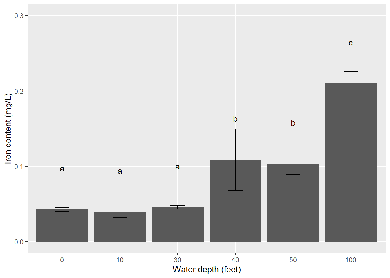
In this example, \(\pm\) one standard deviation around the mean is displayed. Other commonly used error bars in natural resources include \(\pm\) one or two standard errors around the mean. For studies with many treatments (e.g., > 10), faceting (i.e., creating a panel of graphs) or using color can help your reader visualize the results.
10.4.3 Two-way ANOVA
Referring back to the moths data set, you should have observed that trap location within the tree has an effect on the number of moths caught. Our ANOVA results showed that trap location had a significant effect on the number of spruce moths caught, but which specific locations differ? If we consider a level of significance of \(\alpha = 0.025\), we can also use the pairwise.t.test() function to obtain the p-values which test for significance differences among the four locations.
pairwise.t.test(moths$Moths, moths$Location, p.adj = "bonferroni")##
## Pairwise comparisons using t tests with pooled SD
##
## data: moths$Moths and moths$Location
##
## Ground Lower Middle
## Lower 2.3e-05 - -
## Middle 0.00044 1.00000 -
## Top 0.78828 0.00420 0.04791
##
## P value adjustment method: bonferroniWe can see that the middle and ground (\(p = 0.00044\)), lower and top (\(p = 0.00420\)), and lower and ground locations (\(p = 2.3e-05\)) are significantly different from each other at the \(\alpha = 0.025\) level.
We can also compare the result using the LSD.test() function:
lsd.moth <- LSD.test(moths.aov, "Location", p.adj = "bonferroni")
lsd.moth$groups
## Moths groups
## Lower 33.33333 a
## Middle 31.00000 ab
## Top 23.33333 bc
## Ground 19.06667 cThe results for the moths data are more interesting than for the iron data. Whereas the iron content samples were clustered, the moth abundance at different traps located in the tree are more varied. Different letters denote similarities between traps located in the lower and middle portions of the tree (group a), middle and top (group b), and top and ground (group c).
| Trap location | Mean moths | SD moths | Significance |
|---|---|---|---|
| Ground | 19.07 | 5.09 | a |
| Lower | 33.33 | 7.50 | b |
| Middle | 31.00 | 9.79 | bc |
| Top | 23.33 | 7.41 | ac |
We observe that traps placed in the lower portions of trees have the greatest average number of moths and the ground location the lowest. We can also summarize the moth abundance data to create a tidy data set to use in plotting. We will add a variable se.moths that calculates the standard error of the number of moths:
moths_summ <- moths %>%
  group_by(Location) %>%
  summarize(n.moths = n(),
            mean.moths = mean(Moths),
            sd.moths = sd(Moths)) %>%
   mutate(se.moths = sd.moths/sqrt(n.moths))

moths_summ
## # A tibble: 4 x 5
## Location n.moths mean.moths sd.moths se.moths
## <chr> <int> <dbl> <dbl> <dbl>
## 1 Ground 15 19.1 5.09 1.31
## 2 Lower 15 33.3 7.50 1.94
## 3 Middle 15 31 9.79 2.53
## 4 Top 15 23.3 7.41 1.91We will create a bar plot with error bars that displays the mean number of spruce moths captured. Again, we’ll create the minimum and maximum values for the error bars in limits(), but this time using \(\pm\) one standard error of the mean. We also add letters denoting significant differences:
limits <- aes(ymax = mean.moths + se.moths,
              ymin = mean.moths - se.moths)

p.loc <- ggplot(moths_summ, aes(Location, mean.moths)) +
  geom_bar(stat = "identity") +
  geom_errorbar(limits, width = 0.25) +
  geom_text(aes(label = c("a", "b", "bc", "ac")), vjust = -4) +
  scale_y_continuous(limits = c(0, 50)) +
  ylab("Mean moth abundance") +
  xlab("Location of traps")
p.loc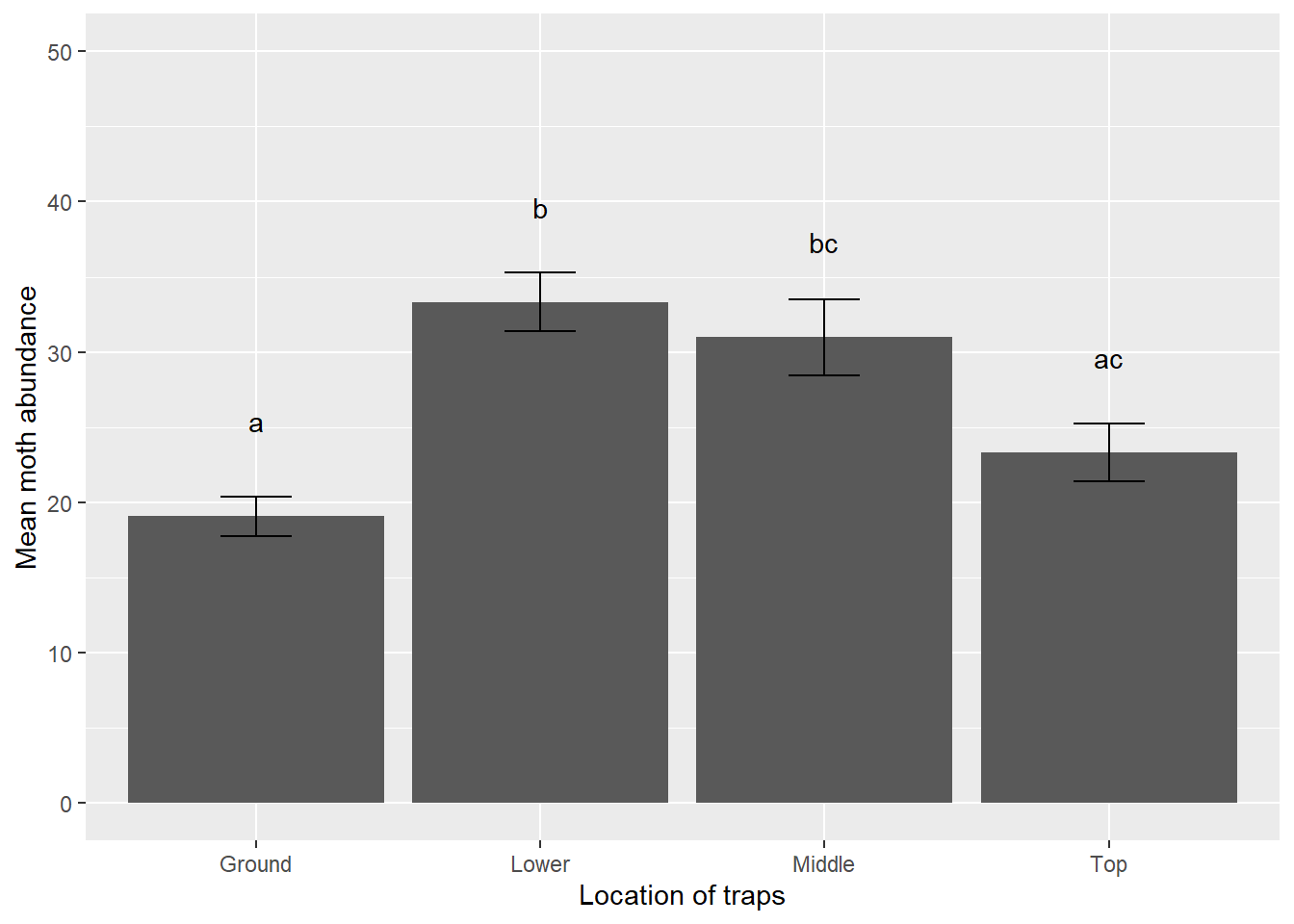
10.4.4 Exercises
10.6 Consider the one-way ANOVA conducted in question 10.1 with the logging data set to answer the following questions.
- Use
pairwise.t.test()to obtain the p-values which test for significance differences across the three types of forests, using the Bonferroni multiple comparison test. Assuming a level of significance of \(\alpha = 0.05\), which forests are significantly different from one other? - Use the
LSD.test()function from the agricolae package to determine which forests are significantly different from one another. - Create a bar plot that shows the mean values of species richness in each of the forests with error bars denoting \(\pm\) one standard deviation. Orient the bars horizontally by adding
coord_flip()to yourggplot()code.
10.7 Use the LSD.test() function on the butterfly data to determine which populations show significantly different wing lengths. Conduct your test at a level of significance of \(\alpha = 0.10\).
10.8 A number of multiple comparison tests are available to compare differences across treatments. Use pairwise.t.test() to obtain the p-values which test for significance differences among the four spruce moth trap locations using the false discovery rate multiple comparison test. This multiple comparison test examines the false discovery rate of treatment differences. (HINT: Type ?p.adjust to learn about other multiple comparison tests available in R.)
Assuming a level of significance \(\alpha = 0.025\), which specific locations are significantly different from each other using the false discovery rate test? How do these compare to what we observed for the Bonferroni test earlier in the chapter? Would you consider the false discovery rate multiple comparison test to be more or less conservative compared to the Bonferroni test?
10.9 For the spruce moth analysis and your response to question 10.8, would you be interested in comparing differences across individual lure types, e.g., chemical vs scent vs sugar? Explain why or why not.
10.10 Make a new bar plot for the mean number of spruce moths by trap location that shows error bars for \(\pm\) two standard errors of the mean of the number of spruce moths captured. Include the letters denoting significant differences. (HINT: You may need to adjust the scale on the y-axis and the location of the letters above the bars to make sure everything fits in your plot.)
10.5 Summary
The lm() function in R was familiar to us in simple linear regression to quantify the relationship between two quantitative variables. In ANOVA, our predictor variable represents a treatment or level and is categorical in nature. The ANOVA process determines if population means of the variable representing the treatment or level are different from one another.
The process of ANOVA does not reveal which specific means are different from one another, only that a difference exists. That is where multiple comparisons come into play. Multiple comparison procedures, which vary in terms of how much evidence is needed to observe a difference, examine which specific treatments or factors vary from one another. Showcasing ANOVA results using tables and figures helps to reveal the results of your analysis in an impactful way.
10.6 References
Brase, C.H., and C.P. Brase. 2017. Understandable statistics: concepts and methods, 11th ed. Cengage Learning, Boston, MA.
Cannon, C.H., Peart, D.R., Leighton, M. 1998. Tree species diversity in commercially logged Bornean rainforest. Science 281: 1366-–1367.
Fisher, R.A. 1918. The correlation between relatives on the supposition of Mendelian inheritance. Transactions of the Royal Society of Edinburgh 52(2): 399-–433.
Fisher, R.A. 1925. Statistical methods for research workers. Oliver and Boyd: Edinburgh.
Kéry, M. 2010. Introduction to WinBUGS for ecologists. Academic Press. 302 p.
Sananman, M., D. Lear. 1961. Iron in Chesapeake Bay waters. Chesapeake Science 2(3/4), 207–209.